R Graphics: Introduction to ggplot2
Purpose of this seminar
This seminar introduces how to use the R ggplot2 package, particularly for producing statistical graphics for data analysis.
First the underlying grammar (system) of graphics is introduced with demonstrations.
Then, usage of ggplot2 for exploratory graphs, model diagnostics, and presentation of model results is illustrated through 3 examples.
Slides with titles surrounded by * provide a more detailed look into a particularly useful ggplot2 tool. These slides can be skipped safely without loss of information necessary to proceed through the seminar.
Background
The ggplot2 package
produces layered statistical graphics.
uses an underlying “grammar” to build graphs component-by-component rather than providing premade graphs.
is easy enough to use without any exposure to the underlying grammar, but even easier to use once you know the grammar.
allows the user to build a graph from concepts rather than recall of commands and options.
Installing ggplot2 from tidyverse
The ggplot2 package is now one component of the suite of packages called tidyverse. Although you can install ggplot2 directly, we recommend installing tidyverse, as it comes with many additional, very useful packages such as:
dplyr: data management (e.g. filtering, selecting, sorting, processing by group)tidyr: tidying/restructuring datahaven: reading data in other formats (Stata, SAS, SPSS)stringr: string variable processing
To learn how to use many of the other tools in tidyverse package, see our R Data Management Seminar
We will use install.packages() to install tidyverse and the following additional packages:
Hmisc: for documentation for statistical summary functions used with ggplot2lme4: mixed effects modelingnlme: needed for dataset (installed with lme4)
#run these if you do not have the packages installed
install.packages("tidyverse", dependencies = TRUE)
install.packages("Hmisc", dependencies = TRUE)
install.packages("lme4", dependencies = TRUE)
Loading packages into the session
Next we load the packages into the current R session with library(). Note that ggplot2 is loaded into the session with library(tidyverse),
#load libraries into R session
library(tidyverse)
library(Hmisc)
library(lme4)
library(nlme)
ggplot2 documentation
https://ggplot2.tidyverse.org/reference/
The official reference webpage for ggplot2 has help files for its many functions an operators. Many examples are provided in each help file.
The ggplot2 book
Read ggplot2: Elegant Graphics for Data Analysis by Hadley Wickham, creator of the ggplot2 package:
- concise at 200 pages, but rich with information
- filled with pictures
This section of the seminar describing the grammar summarizes bits and pieces of chapter 3.
The grammar of graphics
What is a grammar of graphics?
A grammar of a language defines the rules of structuring words and phrases into meaningful expressions.
A grammar of graphics defines the rules of structuring mathematic and aesthetic elements into a meaningful graph.
Leland Wilkinson (2005) designed the grammar upon which ggplot2 is based.
Elements of grammar of graphics
- Data: variables mapped to aesthetic features of the graph.
- Geoms: objects/shapes on the graph.
- Stats: stastical transformations that summarize data,(e.g mean, confidence intervals)
- Scales: mappings of aesthetic values to data values. Legends and axes display these mappings.
- Coordiante systems: the plane on which data are mapped on the graphic.
- Faceting: splitting the data into subsets to create multiple variations of the same graph (paneling).
Data and the ggplot2
Data for plotting with ggplot2 tools must be stored in a data.frame.
You cannot use objects of class matrix, so convert to data.frame before plotting.
Multiple data frames may be used in one plot, which is not usually possible with other graphing systems.
Datasets and the Milk dataset
All datasets used in this seminar are loaded with the R packages used for this seminar.
To create graphs that demonstrate the grammar of graphics, we use the Milk dataset, loaded with the nlme package.
The Milk dataset contains 1337 rows of the following 4 columns:
- protein: numeric, protein content of milk
- Time: numeric, time since calving
- Cow: ordered factor, cow id
- Diet: factor, diet of cow, 3 levels = barley, barley+lupins, lupins
Here are the first few rows of Milk:
#first few rows of Milk
head(Milk)
## Grouped Data: protein ~ Time | Cow
##   protein Time Cow   Diet
## 1    3.63    1 B01 barley
## 2    3.57    2 B01 barley
## 3    3.47    3 B01 barley
## 4    3.65    4 B01 barley
## 5    3.89    5 B01 barley
## 6    3.73    6 B01 barley
The ggplot() function
All graphics begin with specifying the ggplot() function (Note: not ggplot2, the name of the package)
In the ggplot() function we specify the “default” dataset and map variables to aesthetics (aspects) of the graph. By default, we mean the dataset assumed to contain the variables specified. The first layer for any ggplot2 graph is an aesthetics layer.
We then add subsequent layers (of geoms, stats, etc.), producing the actual graphical elements of the plot.
First ggplot() specifiction
In the ggplot() function below:
- data set is
Milk
- Inside of the function
aes()
- Time mapped to x-axis
- protein mapped to y-axis
#declare data and x and y aesthetics,
#but no shapes yet
ggplot(data = Milk, aes(x=Time, y=protein))
Aesthetic mappings and aes()
Aesthetics are the visually perceivable components of the graph.
Map variables to aesthetics using the aes() function. For example, we can map:
- which variables appear on the x-axis and y-axis.
- a classification variable to colors
- a numeric variable to the size of graphical objects
Default aesthetics are inherited by subsequent layers
Mappings specified in aes() in the ggplot() function serve as defaults – they are inherited by subsequent layers and do not need to respecified.
#geom_point inherits x=Time, y=protein
ggplot(data = Milk, aes(x=Time, y=protein)) +
  geom_point()
Overriding default aesthetics
Additional aes() specifications within further layers will override the default aesthetics for that layer only.
#color=Diet only applies to geom_boxplot
ggplot(data = Milk, aes(x=Time, y=protein)) +
  geom_point() +
  geom_boxplot(aes(color=Diet))
Example aesthetics
Which aesthetics are required and which are allowed depend on the geom.
Some example aesthetics:
x: positioning along x-axisy: positioning along y-axiscolor: color of objects; for 2-d objects, the color of the object’s outline (compare to fill below)fill: fill color of objectsalpha: transparency of objects (value between 0, transparent, and 1, opaque – inverse of how many stacked objects it will take to be opaque)linetype: how lines should be drawn (solid, dashed, dotted, etc.)shape: shape of markers in scatter plotssize: how large objects appear
Mapping vs setting
Map aesthetics to variables inside the aes() function. When mapped, the aesthetic will vary as the variable varies.
#color varies as Diet varies
ggplot(data = Milk, aes(x=Time, y=protein)) +
  geom_point(aes(color=Diet))
Set aesthetics to a constant outside the aes() function.
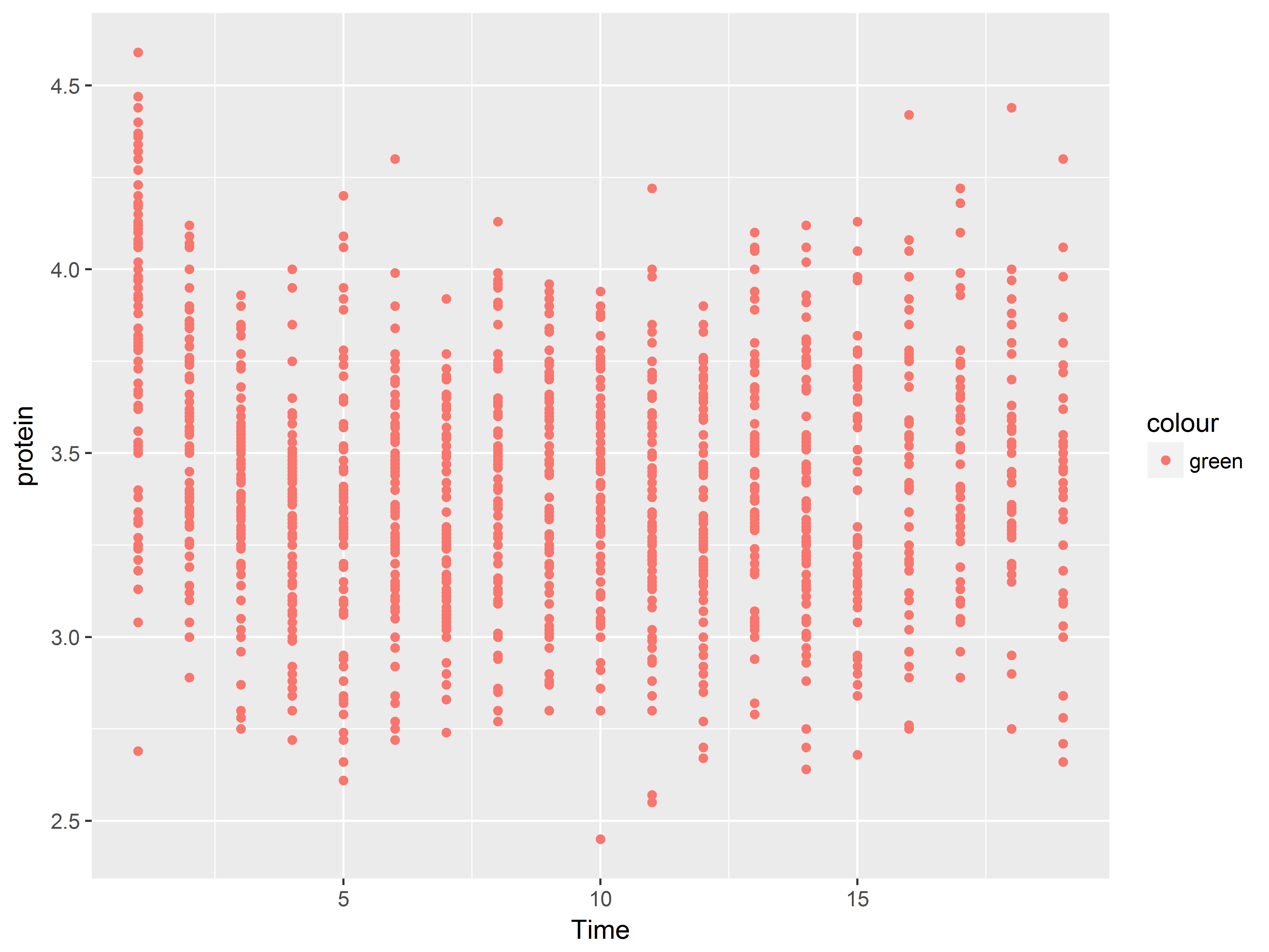
#map color to constant "green" outside of aes
ggplot(data = Milk, aes(x=Time, y=protein)) +
  geom_point(color="green")
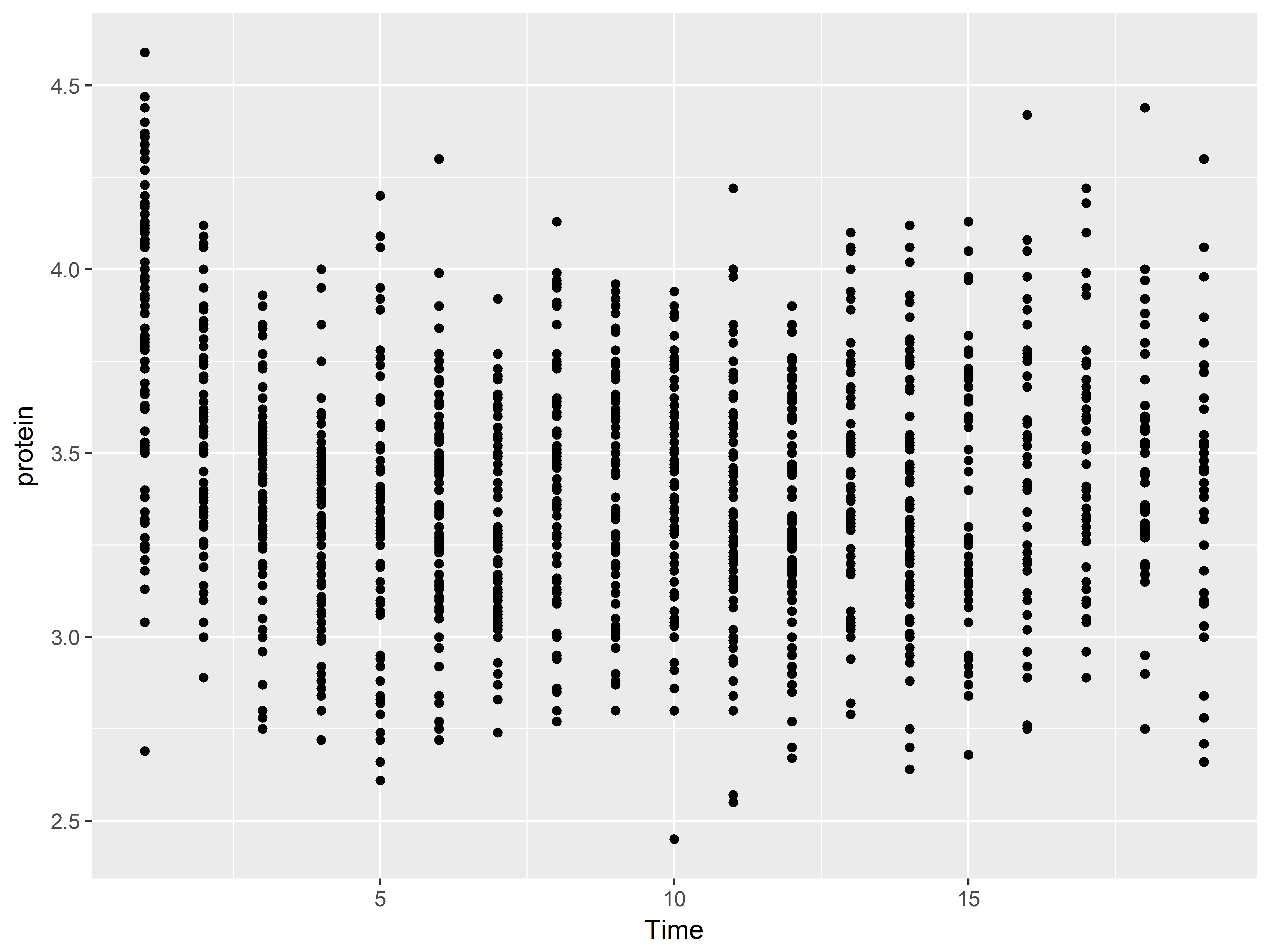
Setting an aesthetic to a constant within aes() can lead to unexpected results, as the aesthetic is then set to a default value rather than the specified value.
#Color set to default red-orange color rather than green
ggplot(data = Milk, aes(x=Time, y=protein)) +
  geom_point(aes(color="green"))
Layers
Graphs in ggplot2 are built layer-by-layer, rather than being premade. As we have already seen, we add more layers with the character +.
A layer consists of graphics produced by either a geom or stat element. We can add layers in a virtually unrestricted way, allowing us to customize our graphs as we see fit..
Remember that layers inherit the aesthetics from the ggplot() function, but they can be respecified for each layer.
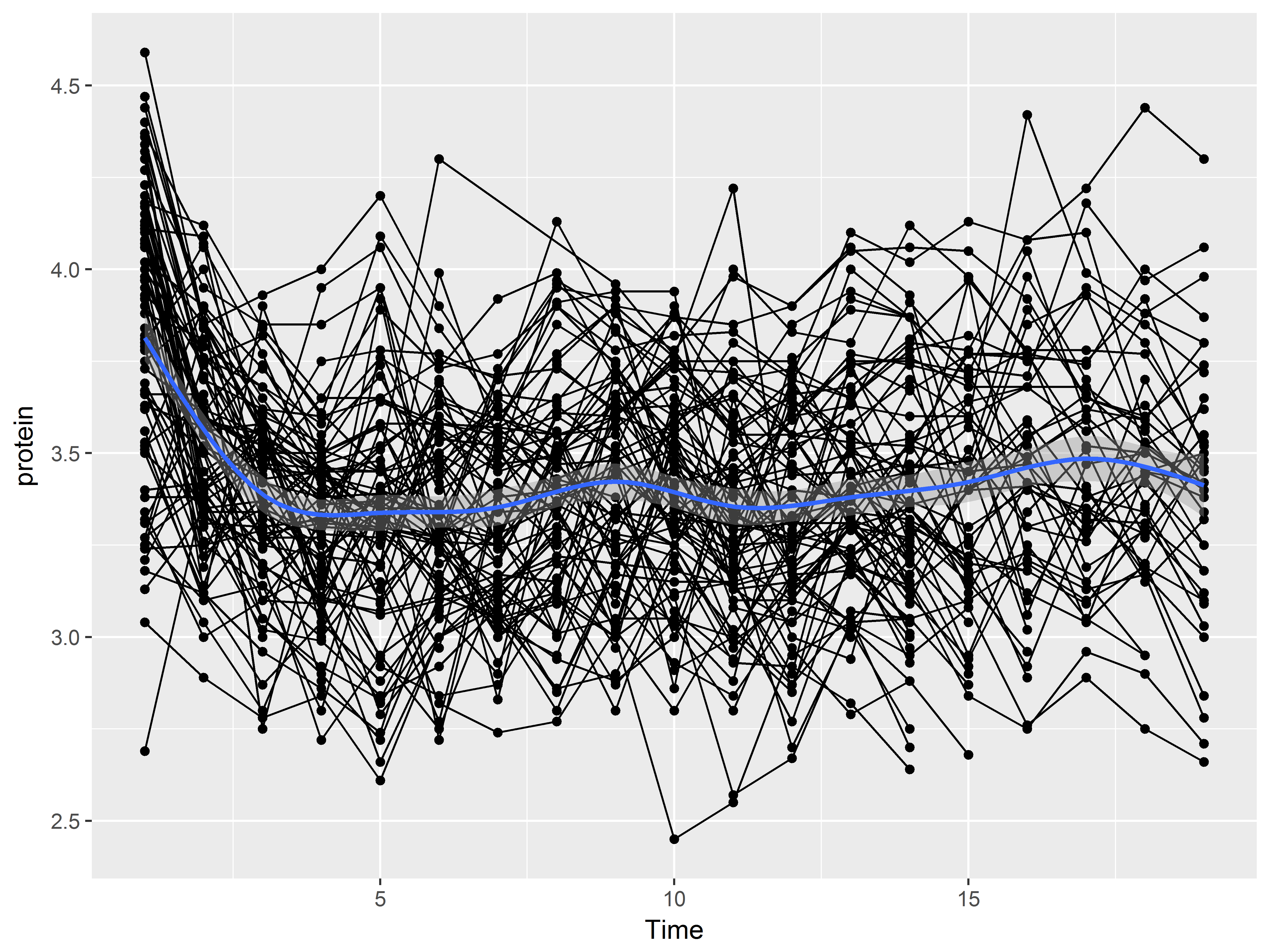
For example, we could construct a graph that begins whose first layer is scatterplot of Time vs protein:
#Color set to default red-orange color rather than green
ggplot(data = Milk, aes(x=Time, y=protein)) +
  geom_point()
Then adds a layer of of line graphs connecting Milk vs Protein by cow (Notice that we added the aesthetic group=cow):
#Color set to default red-orange color rather than green
ggplot(data = Milk, aes(x=Time, y=protein)) +
  geom_point() +
  geom_line(aes(group=Cow))
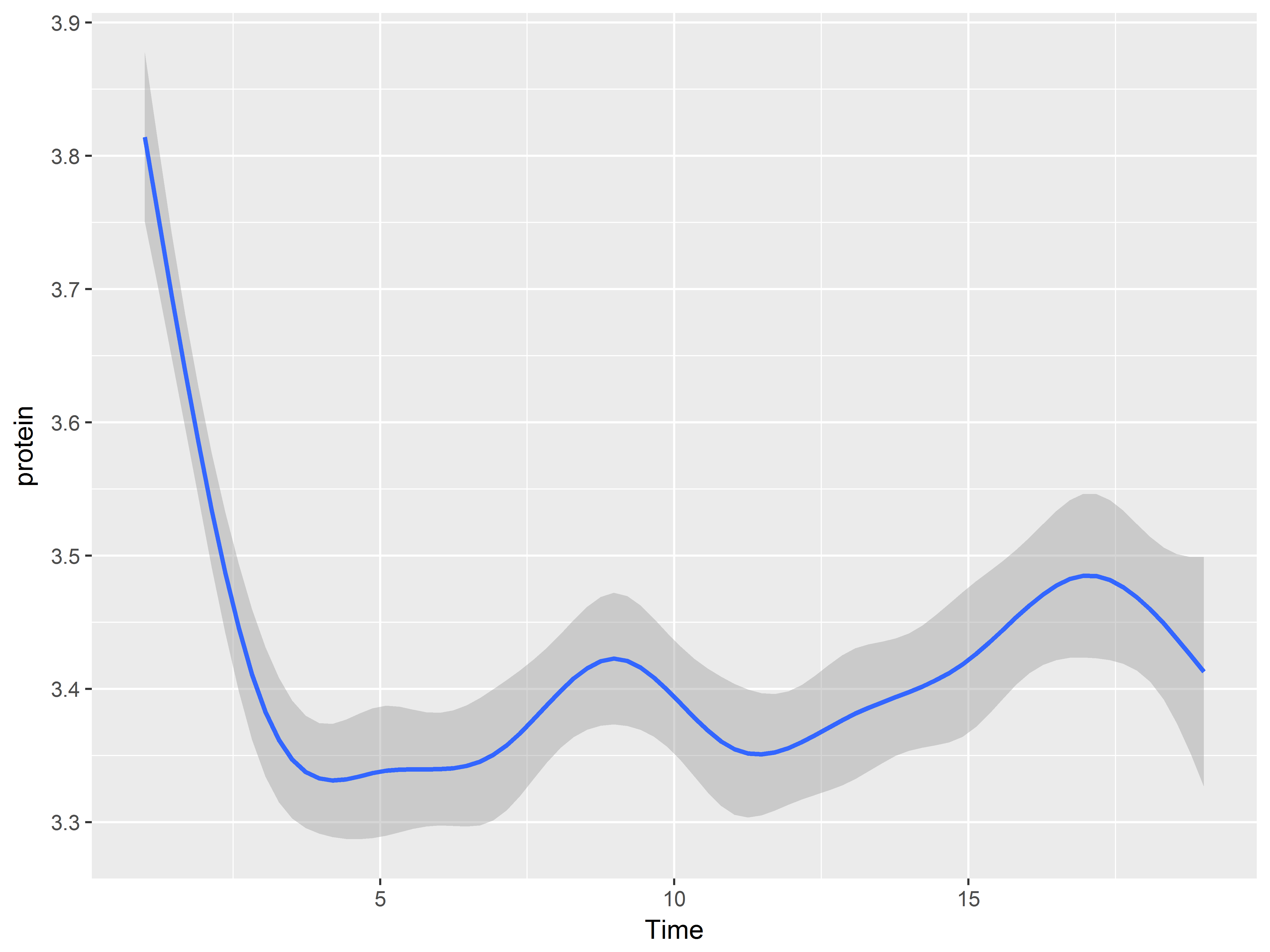
And ends with a layer of a loess smooth estimating the mean relationship:
#Color set to default red-orange color rather than green
ggplot(data = Milk, aes(x=Time, y=protein)) +
  geom_point() +
  geom_line(aes(group=Cow)) +
  geom_smooth()
## `geom_smooth()` using method = 'gam'
Store plot specifications in objects
We can store ggplot specifications in R objects and then reuse the object to keep the code compact. Issuing the object name produces the graph
#store specification in object p and then produce graph
p <- ggplot(data = Milk, aes(x=Time, y=protein)) +
  geom_point()
p
Adding layers to a plot object renders a graphic
When we add layers to a plot stored in an object, the graphic is rendered, with the layers inheriting aesthetics from the original ggplot.
#add a loess plot layer
p + geom_smooth()
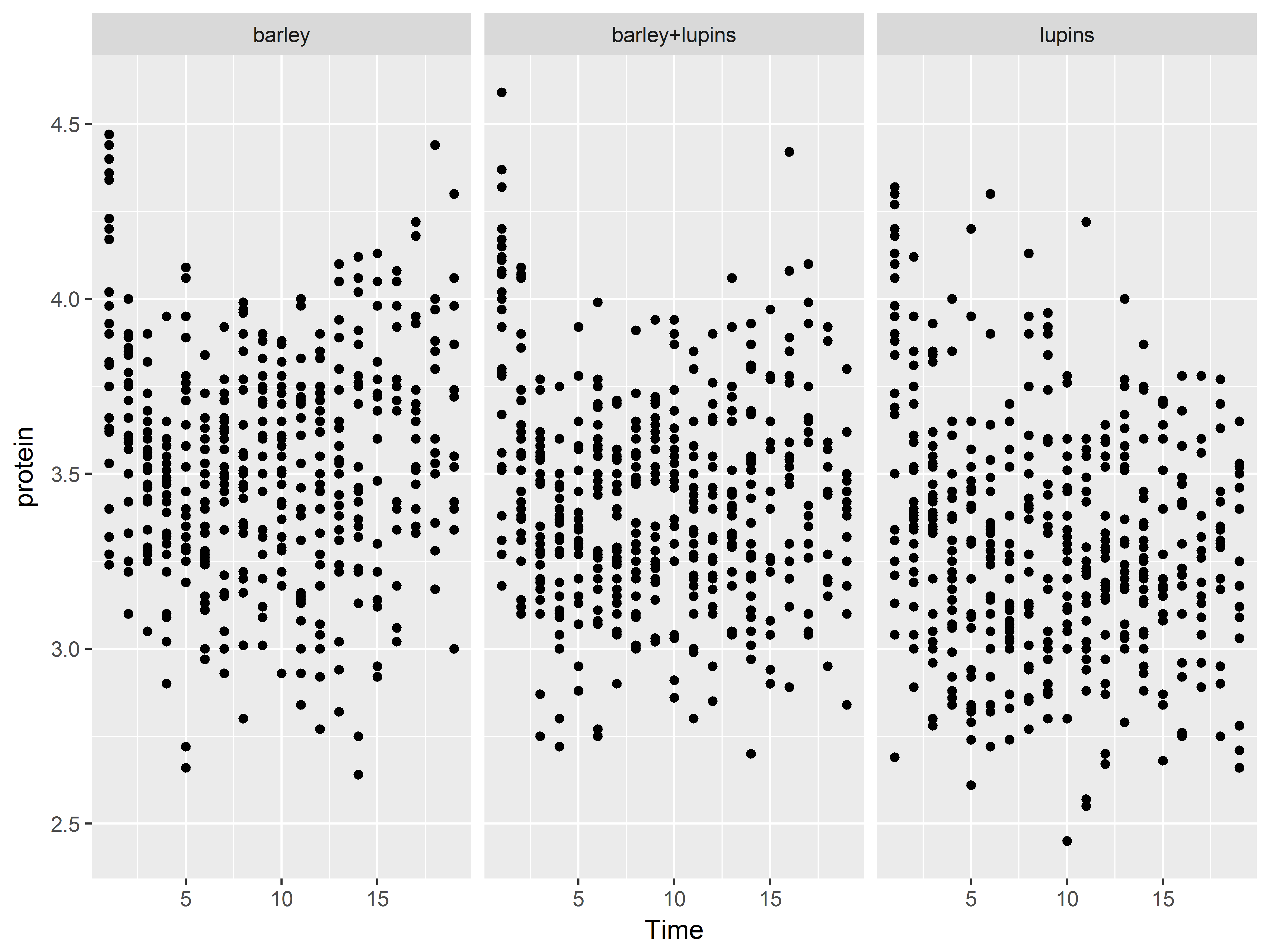
#or panel by Diet
p + facet_wrap(~Diet)
Geoms
Geom functions differ in the geometric shapes produced for the plot:
geom_bar(): bars with bases on the x-axisgeom_boxplot(): boxes-and-whiskersgeom_errorbar(): T-shaped error barsgeom_histogram(): histogramgeom_line(): linesgeom_point(): points (scatterplot)geom_ribbon(): bands spanning y-values across a range of x-valuesgeom_smooth(): smoothed conditional means (e.g. loess smooth)
Geoms and aesthetics
Each geom is defined by aesthetics required for it to be rendered. For example, geom_point() requires both x and y, the minimal specification for a scatterplot.
Geoms differ in which aesthetics they accept as arguments. For example, geom_point() understands and accepts the aesthetic shape, which defines the shapes of points on the graph. In contrast, geom_bar() does not accept shape.
Check the geom function help files for required and understood aesthetics.
Let’s take a look at some commonly used geoms.
Some geom functions require only the x aesthetic.
Geoms that require only the x aesthetic be specified are often used to plot the distribution of a single, continuous variable.
We’ll first map the variable protein to the x-axis in ggplot(), save this specification in an object, and then we’ll subsequently add geom layers.
#define data and x for univariate plots
pro <- ggplot(Milk, aes(x=protein))
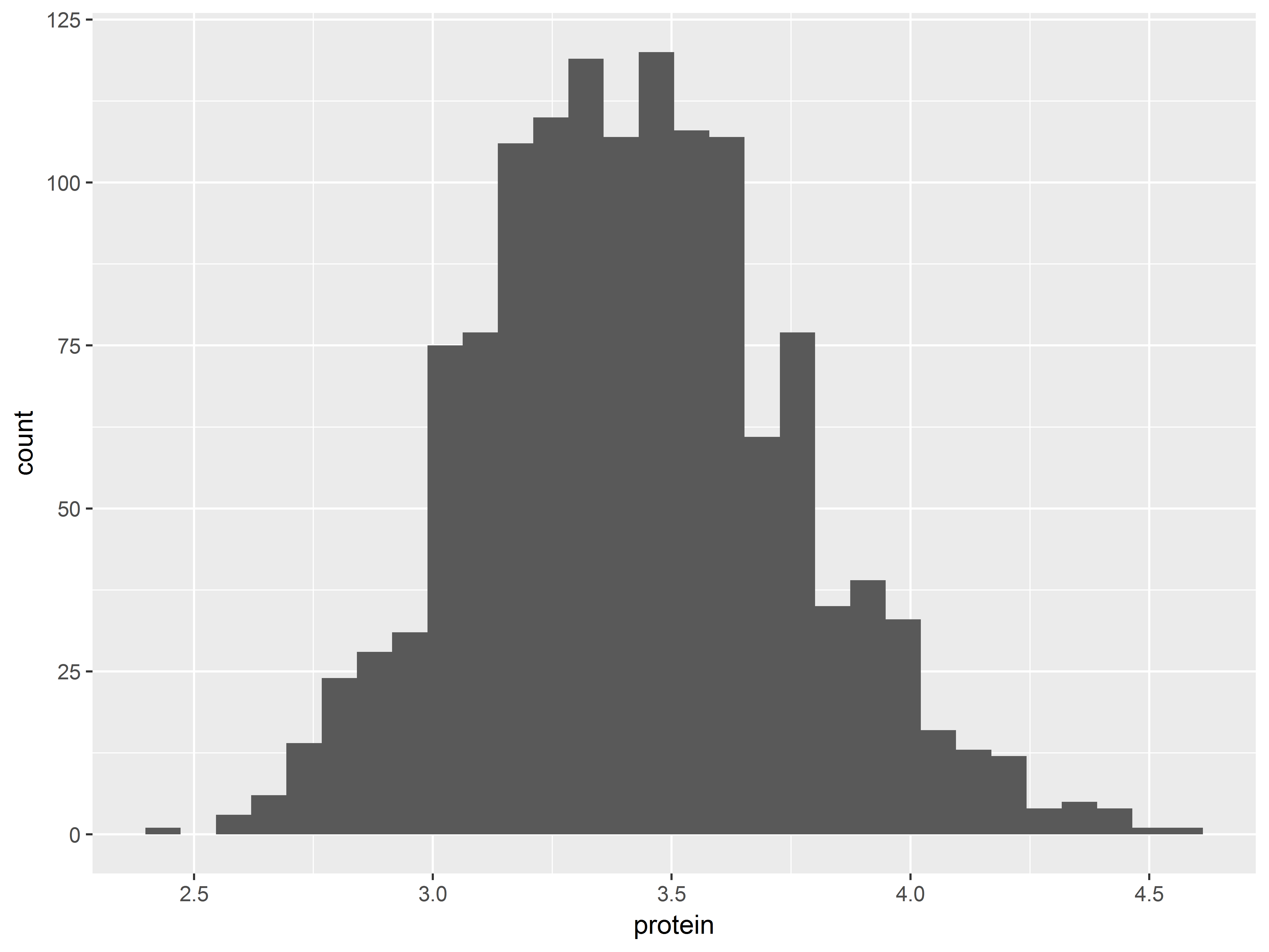
Histograms plot distributions of continuous variables. Remember that geom_histogram() inherits aes(x=protein).
#histogram
pro + geom_histogram()
## `stat_bin()` using `bins = 30`. Pick better value with `binwidth`.
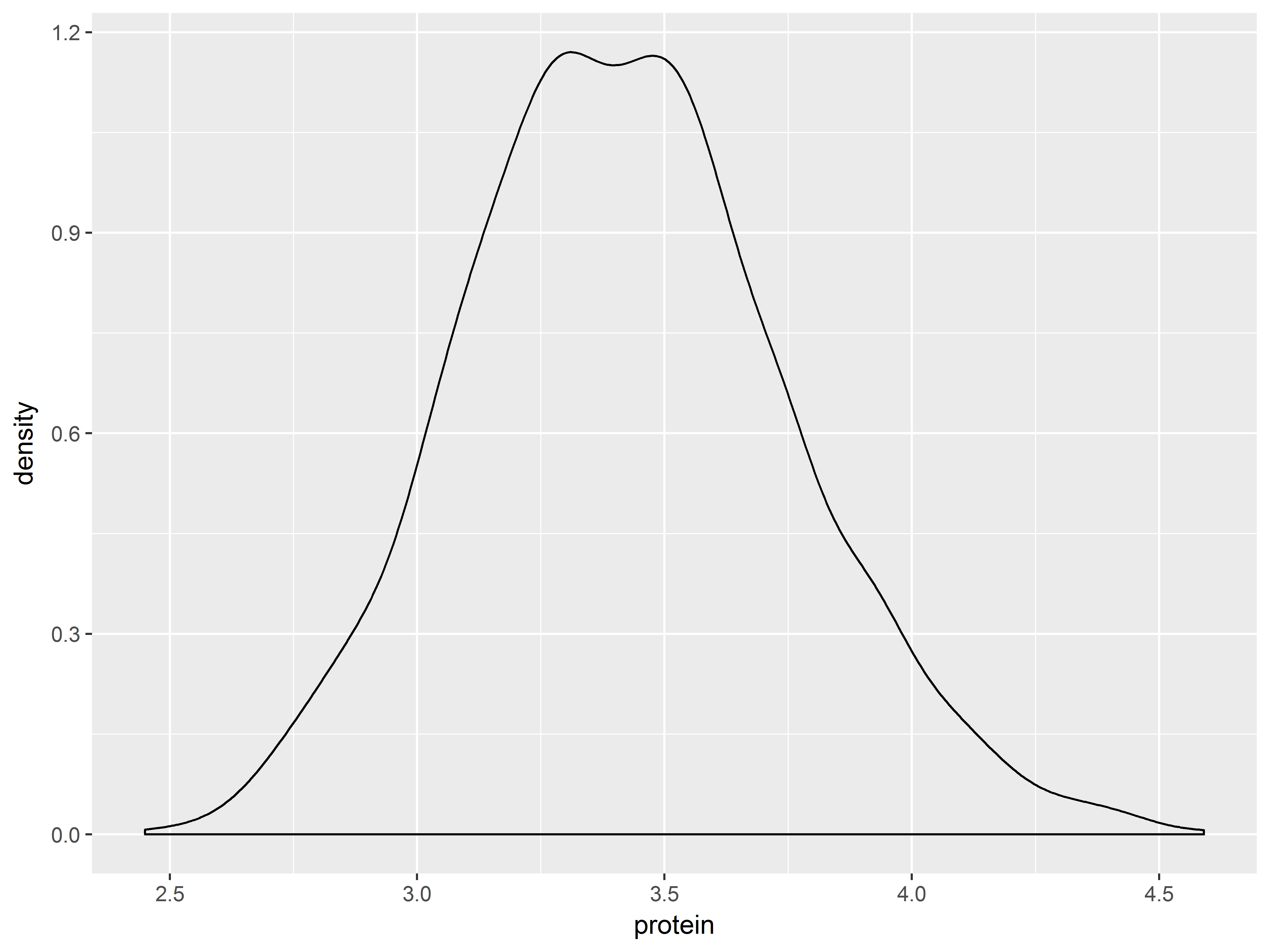
Density plots smooth out histgrams.
#and density plot
pro + geom_density()
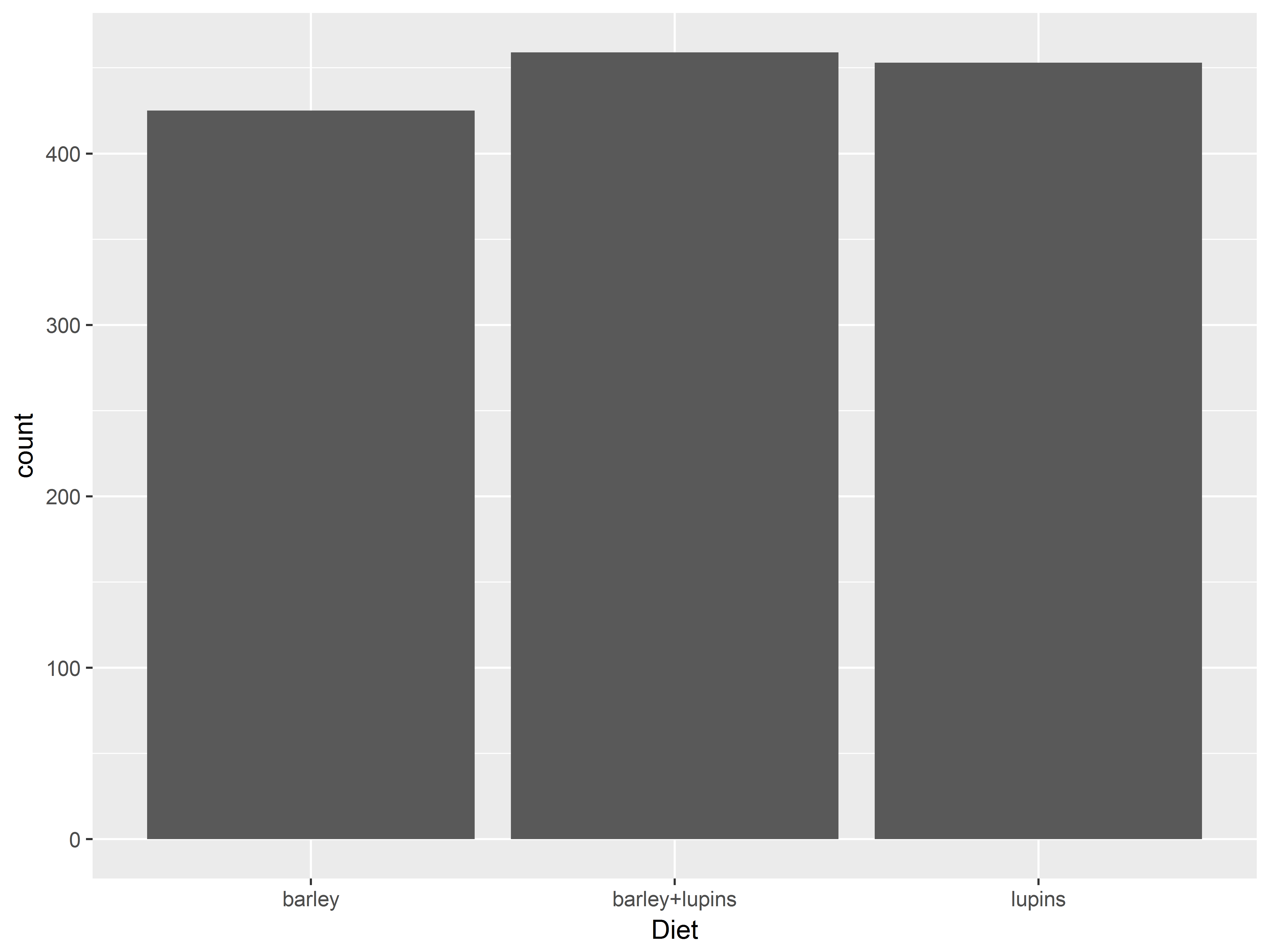
geom_bar() requires only x and summarizes a discrete variable
While histograms and density plots are used to display the distributions of continuous variables, bar plots are often used to display distributions of categorical/discrete variables.
geom_bar() by default produces a bar plot with counts of each x-value, which we specify as Diet below.
#bar plot of counts of Diet
ggplot(Milk, aes(x=Diet)) +
  geom_bar()
Geoms that require more than x
Plots of more than one variable are typically more interesting. Let’s tour some geoms that map variables to both the x and y aesthetics.
First we will save our default aesthetics to an object, where we map Time to the x-axis and protein to the y-axis.
#define data, x and y
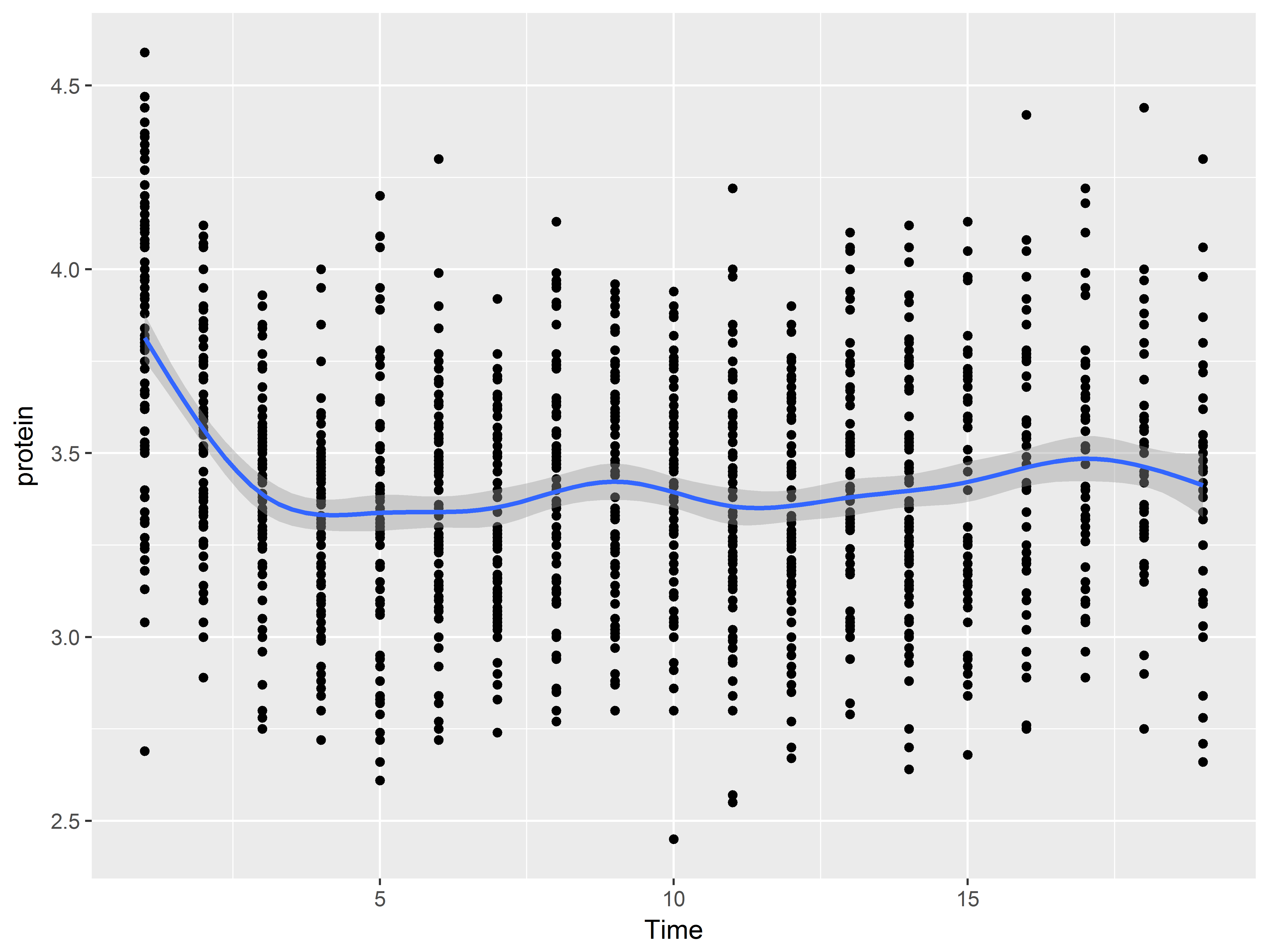
p2 <- ggplot(Milk, aes(x=Time, y=protein))
Here we add a scatterplot layer with geom_point().
#scatter plot
p2 + geom_point()
Here is a loess smooth instead.
#loess plot
p2 + geom_smooth()
## `geom_smooth()` using method = 'gam'
With layering, we can easily accommodate both on the same graph:
#loess plot
p2 + geom_point() +
  geom_smooth()
## `geom_smooth()` using method = 'gam'
Graphics by group
Often, we want to produce separate graphics by a grouping variable, all overlaid on the same group.
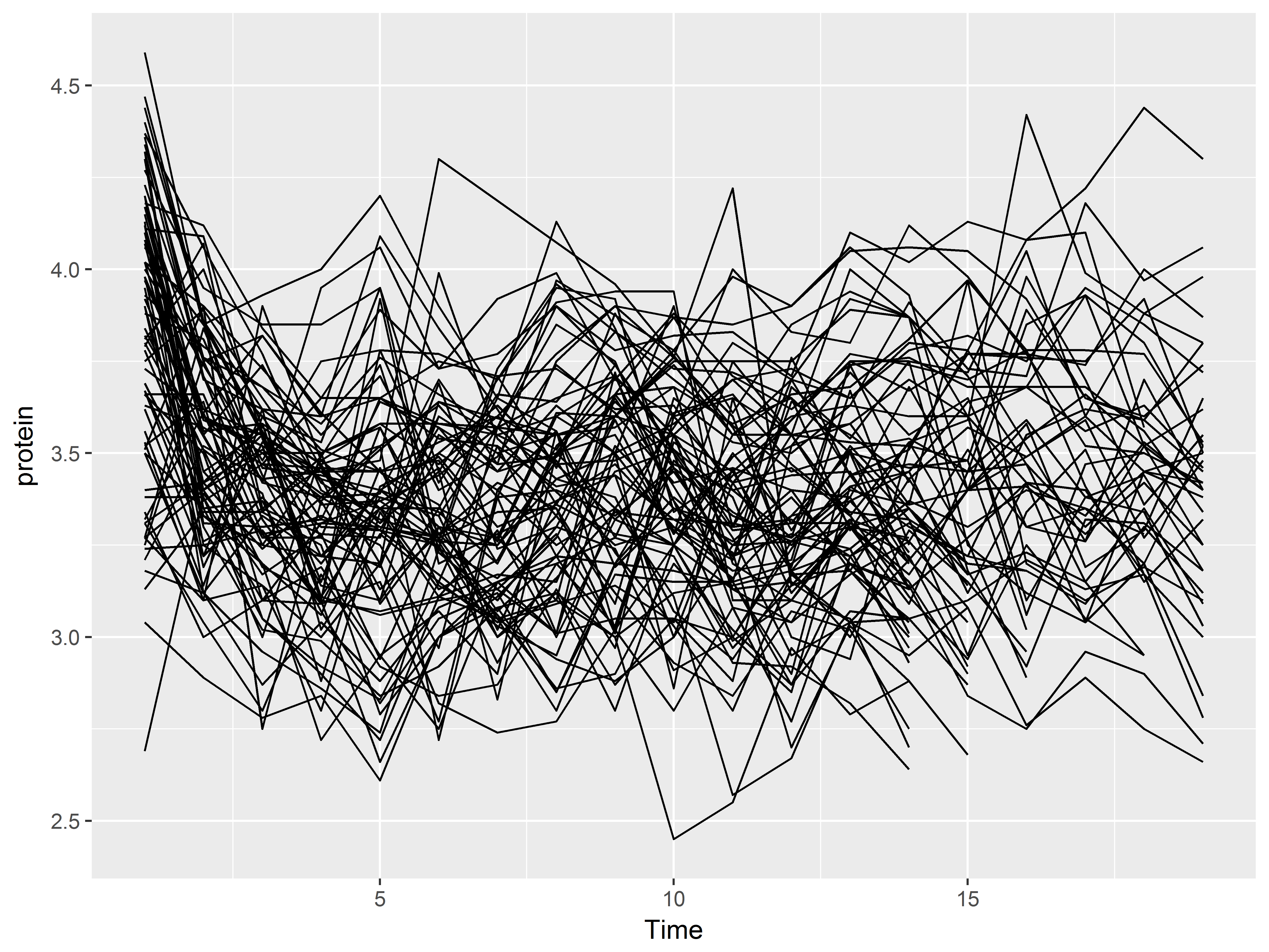
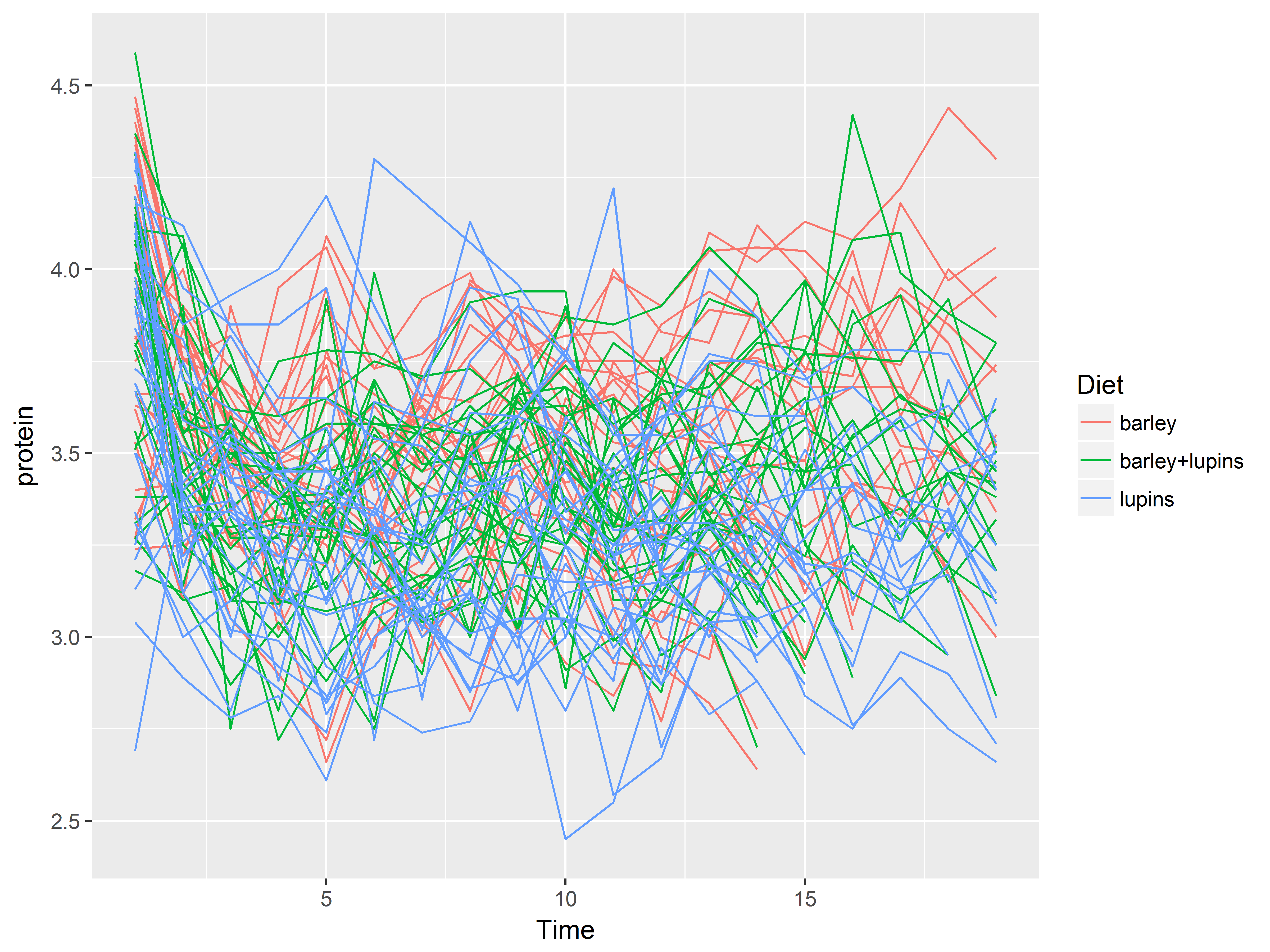
One way to graph by group is to use the group aesthetic. Below, we create line graphs of Time vs protein, individually by Cow. Each line represents the many measurements across time of a single cow.
#lines of protein over Time by group=Cow
p2 + geom_line(aes(group=Cow))
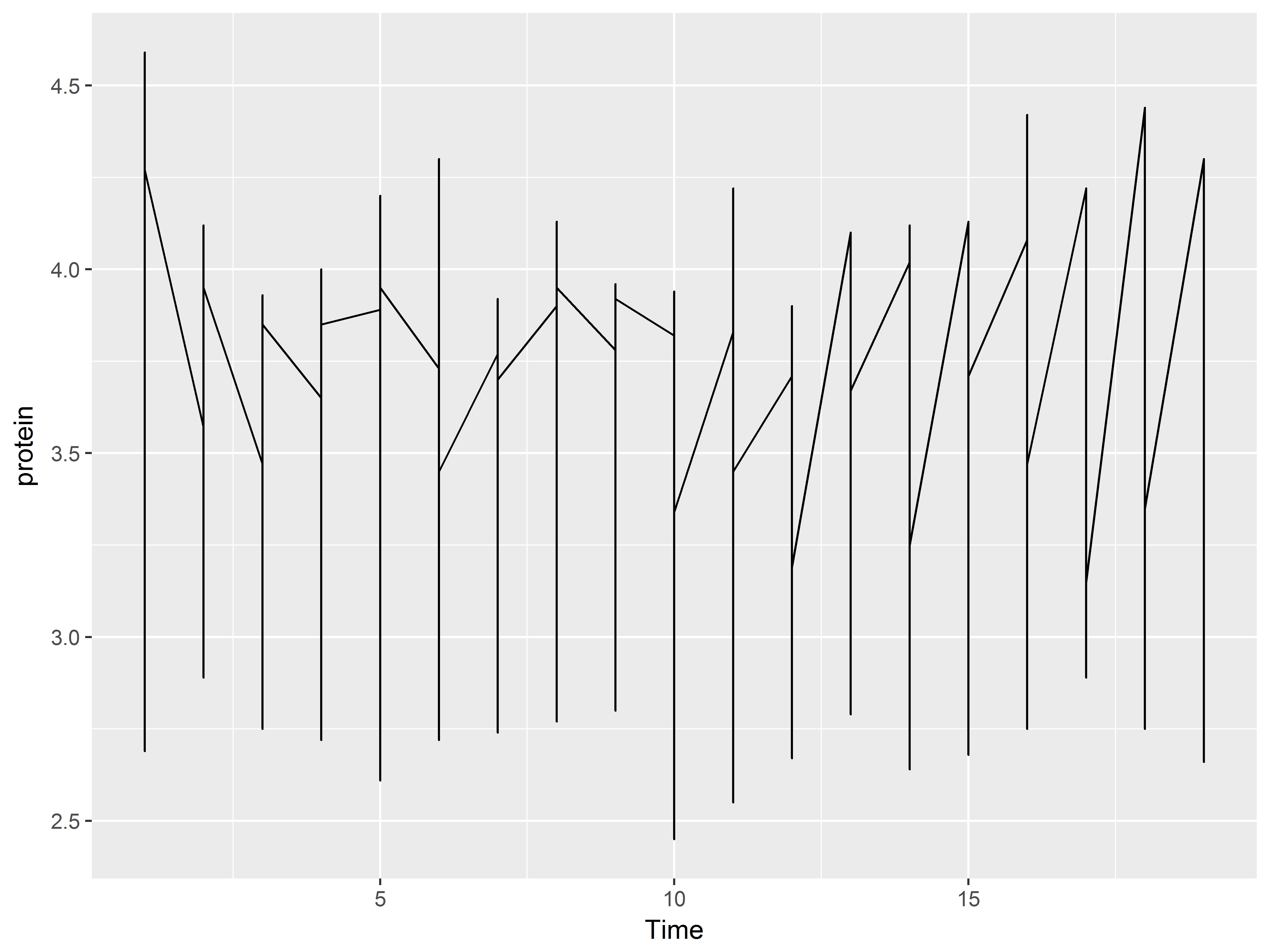
You will usually need to use the group aesthetic for geom_line() because otherwise, a single, nonsensical line graph of the entire dataset will be created as we see below:
#lines of protein over Time by group=Cow
p2 + geom_line()
Mapping variables to most other aesthetics besides x and y will implicitly group the graphics as well.
For example, we can group the data into lines by Cow by coloring them (instead of using group=Cow), but that’s not very useful.
#lines of protein over Time colored by Cow
p2 + geom_line(aes(color=Cow))
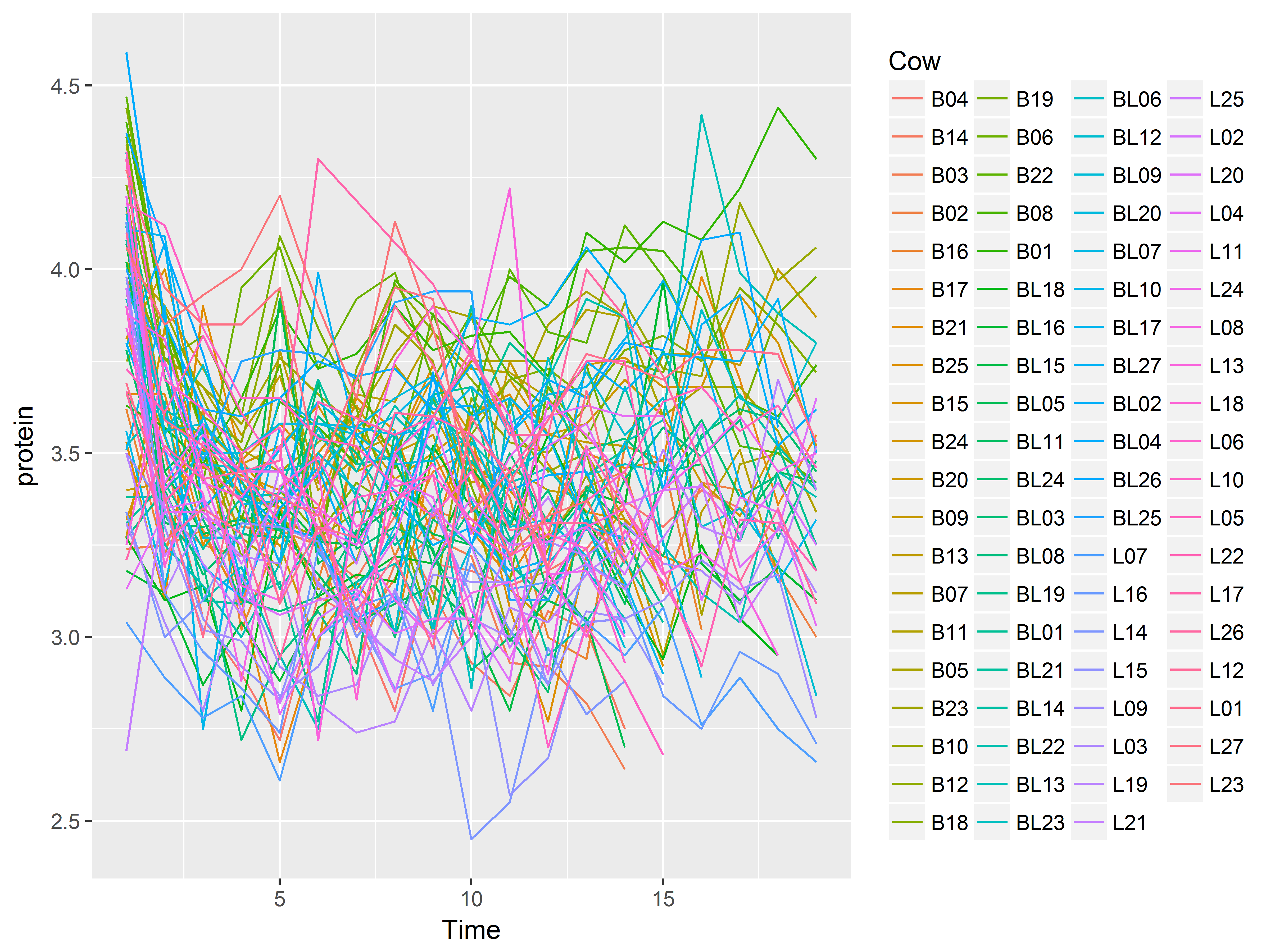
A better plot is lines by Cow, but then grouped by Diet with color. This grouping would potentially allow us to see if the trajectories of Protien over time differed by Diet.
#lines of protein over Time by Cow colored by Diet
p2 + geom_line(aes(group=Cow, color=Diet))
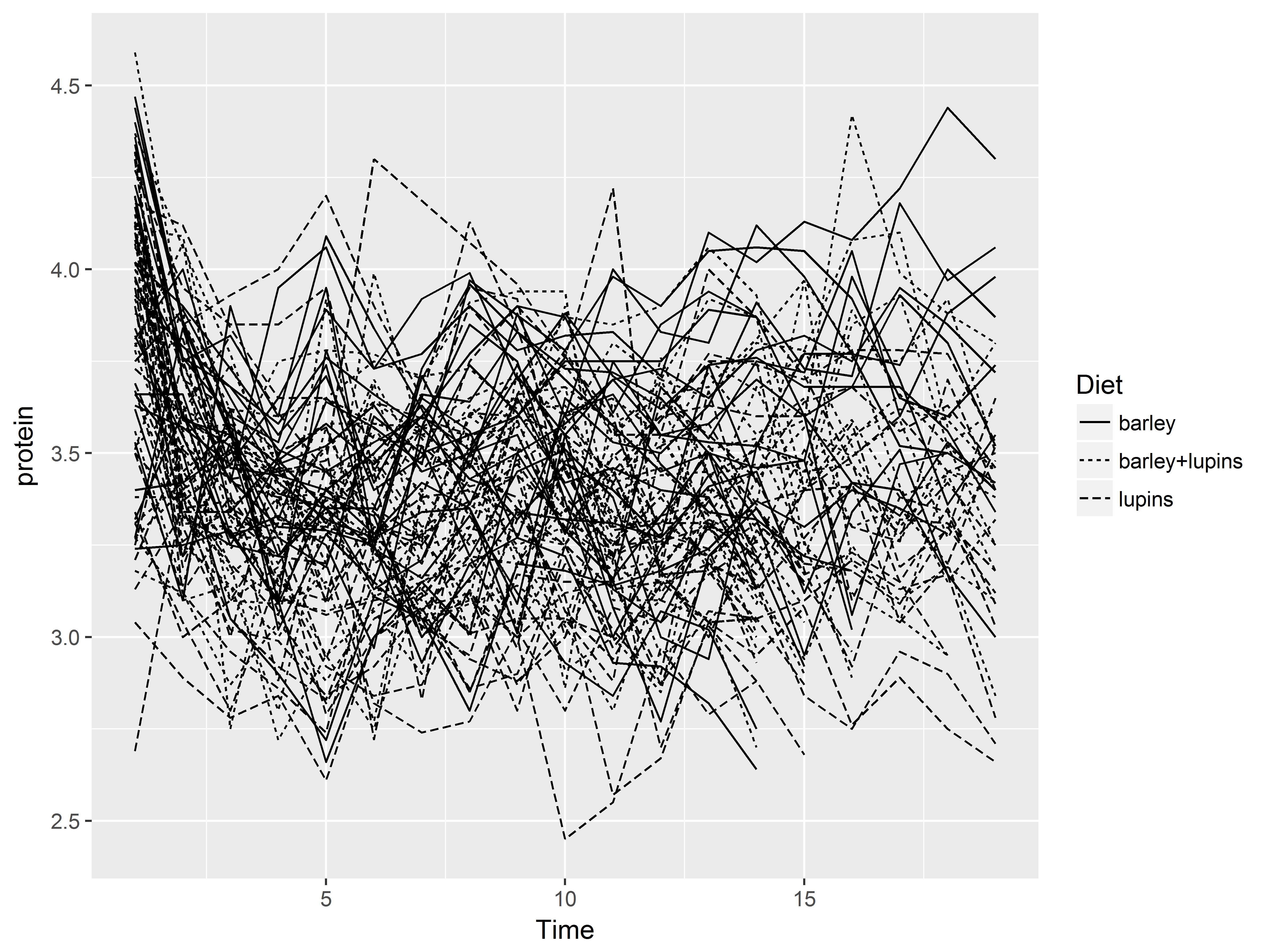
Or we can map Diet to linetype.
#lines of protein over Time by Cow patterned by Diet
p2 + geom_line(aes(group=Cow, linetype=Diet))
Stats
The stat functions statistically transform data, usually as some form of summary. For example:
- frequencies of values of a variable (histogram, bar graphs)
- a mean
- a confidence limit
Each stat function is associated with a default geom, so no geom is required for shapes to be rendered. The geom can often be respecfied in the stat for different shapes.
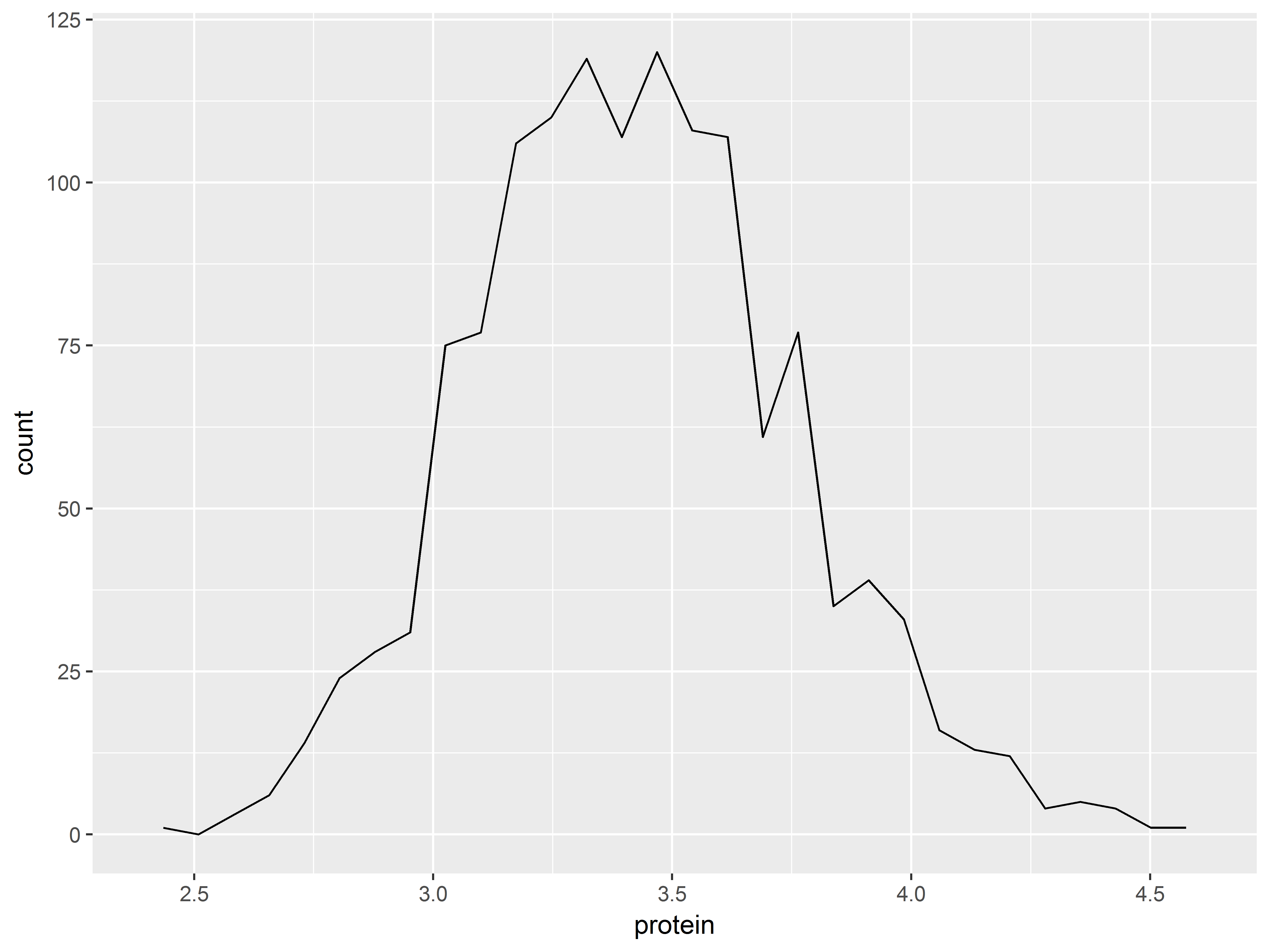
stat_bin() produces a histogram
stat_bin() transforms a continuous variable mapped to x into bins (intervals) of counts. Its default geom is bar, producing a histogram.
#stat_bin produces a bar graph by default
ggplot(Milk, aes(x=protein)) +
  stat_bin()
Respecifying the geom to geom=line changes how the statistical transformation is depicted.
#points instead of bars
ggplot(Milk, aes(x=protein)) +
  stat_bin(geom="line")
## `stat_bin()` using `bins = 30`. Pick better value with `binwidth`.
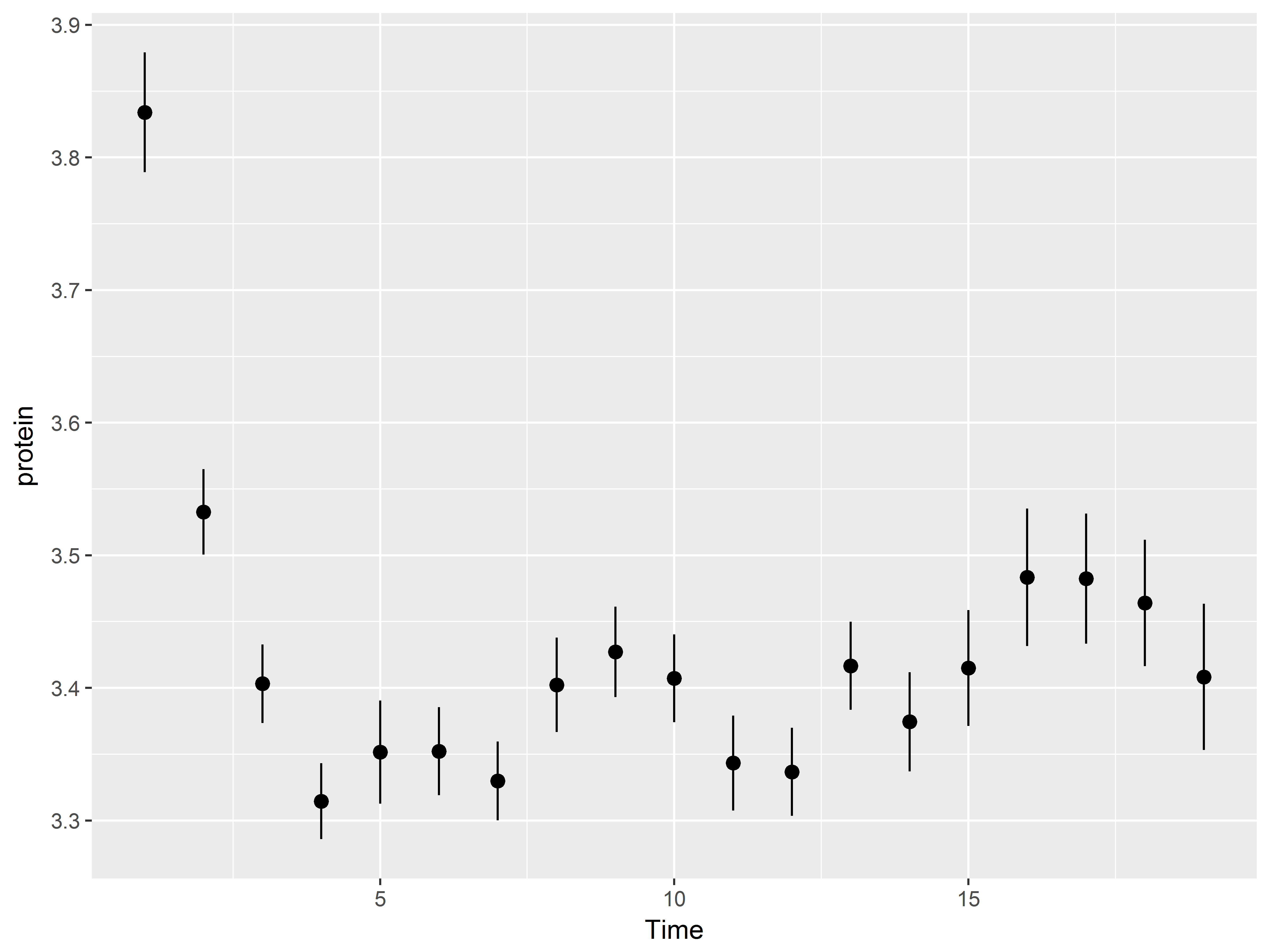
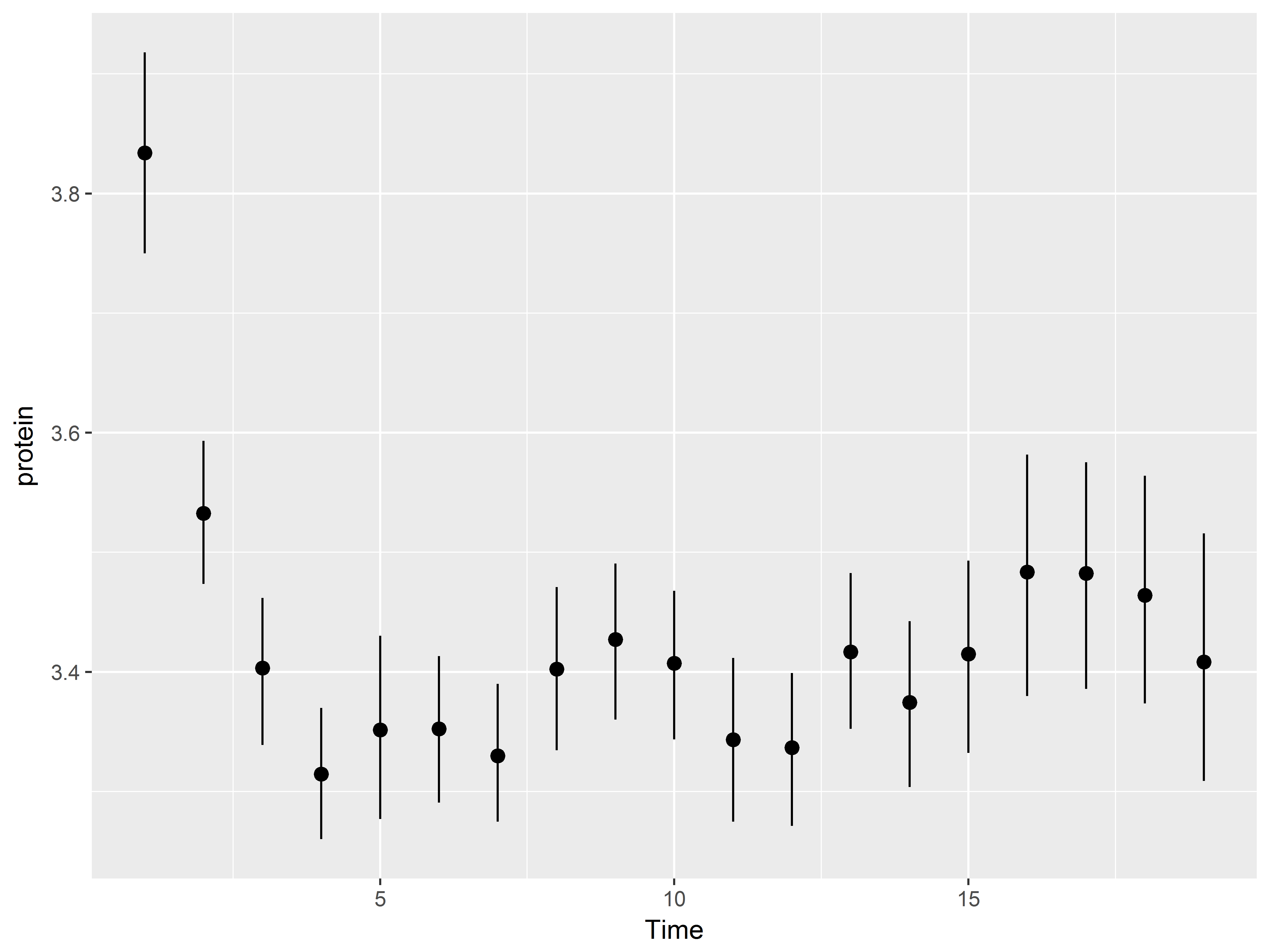
stat_summary() summarizes y at each x
stat_summary() applies a summary function (e.g. mean) to y at each value or interval of x.
The default summary function is mean_se, which returns the mean ± standard error. Thus, stat_summary() plots the mean and standard errors for y at each x value.
The default geom is “pointrange”, which, places a dot at the mean of y (for that x) and extends lines to mean ± s.e.
Below we plot means and standard errors of protein, y, at each Time, x, using the default geom “pointrange”.
#plot mean and se of protein at each Time
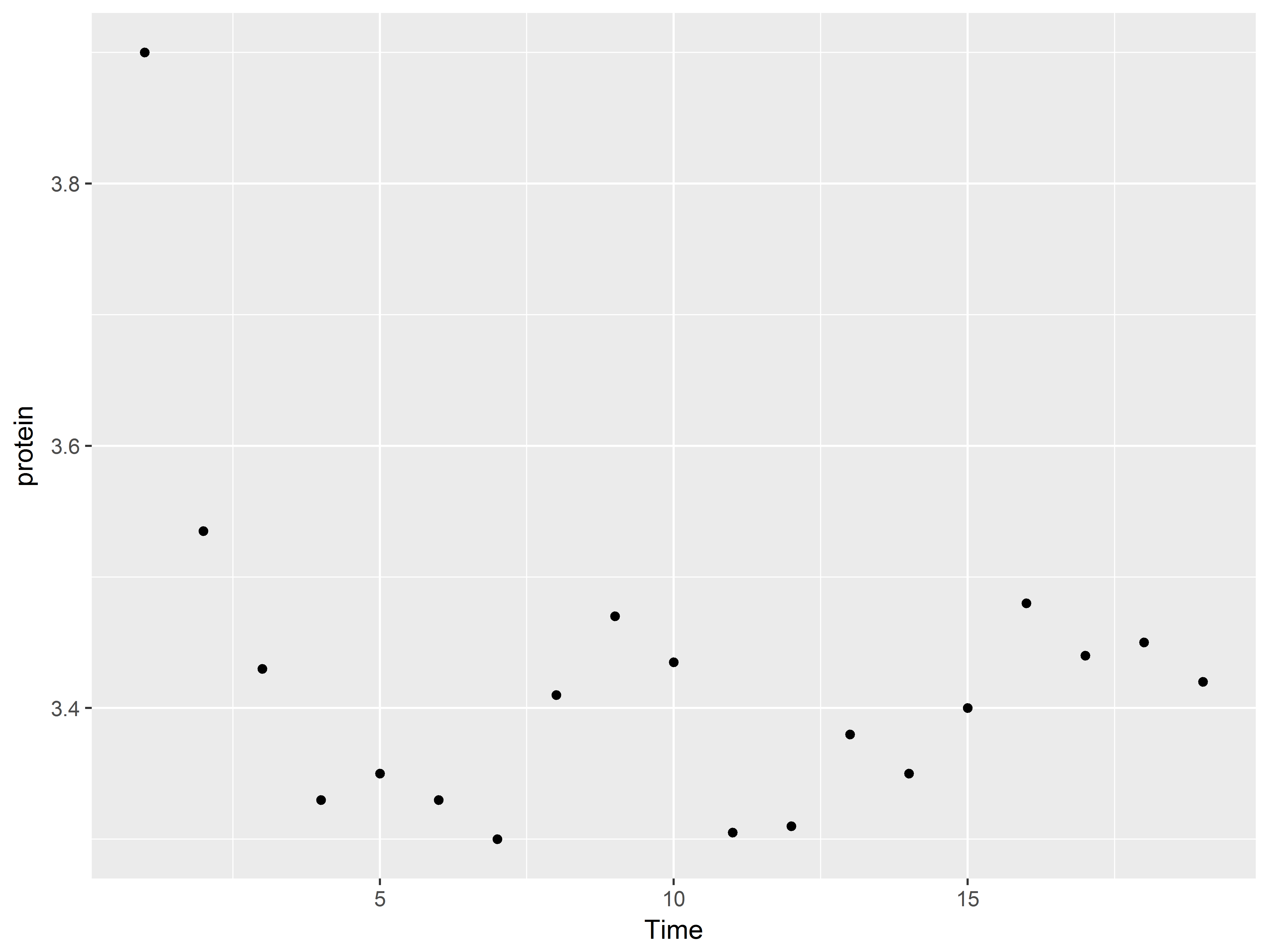
ggplot(Milk, aes(x=Time, y=protein)) +
stat_summary()
Exploring your data graphically has never been so easy!
*Using other summary functions and geoms with stat_summary()*
Generally, functions that accept continuous numeric variables (e.g. mean, var, user-written) can be specified in stat_summary(), either with argument fun.data or fun.y (see below).
The ggplot2 package conveniently provides additional summary functions adapted from the Hmisc package, for use with stat_summary(), including:
mean_cl_boot: mean and bootstapped confidence interval (default 95%)mean_cl_normal: mean and Guassian (t-distribution based) confidence interval (default 95%)mean_dsl: mean plus or minus standard deviation times some constant (default constant=2)median_hilow: median and outer quantiles (default outer quantiles = 0.025 and 0.975)
It is not necessary to load the Hmisc package into the R session to use these functions, but it is necessary to view their help files.
If the new summary function returns 1 value (e.g. mean, var), use argument fun.y and a geom that requires only a single y input (e.g. geom_point, geom_line).
#median returns 1 value, geom_pointrange expects 2 (high, low)
#change geom to point
ggplot(Milk, aes(x=Time, y=protein)) +
  stat_summary(fun.y="median", geom="point")
If the function resturns 3 values, such as the mean and 2 limits (e.g. mean_sem mean_cl_normal) use fun.data.
#mean and boostrapped confidence limits
ggplot(Milk, aes(x=Time, y=protein)) +
  stat_summary(fun.data="mean_cl_boot")
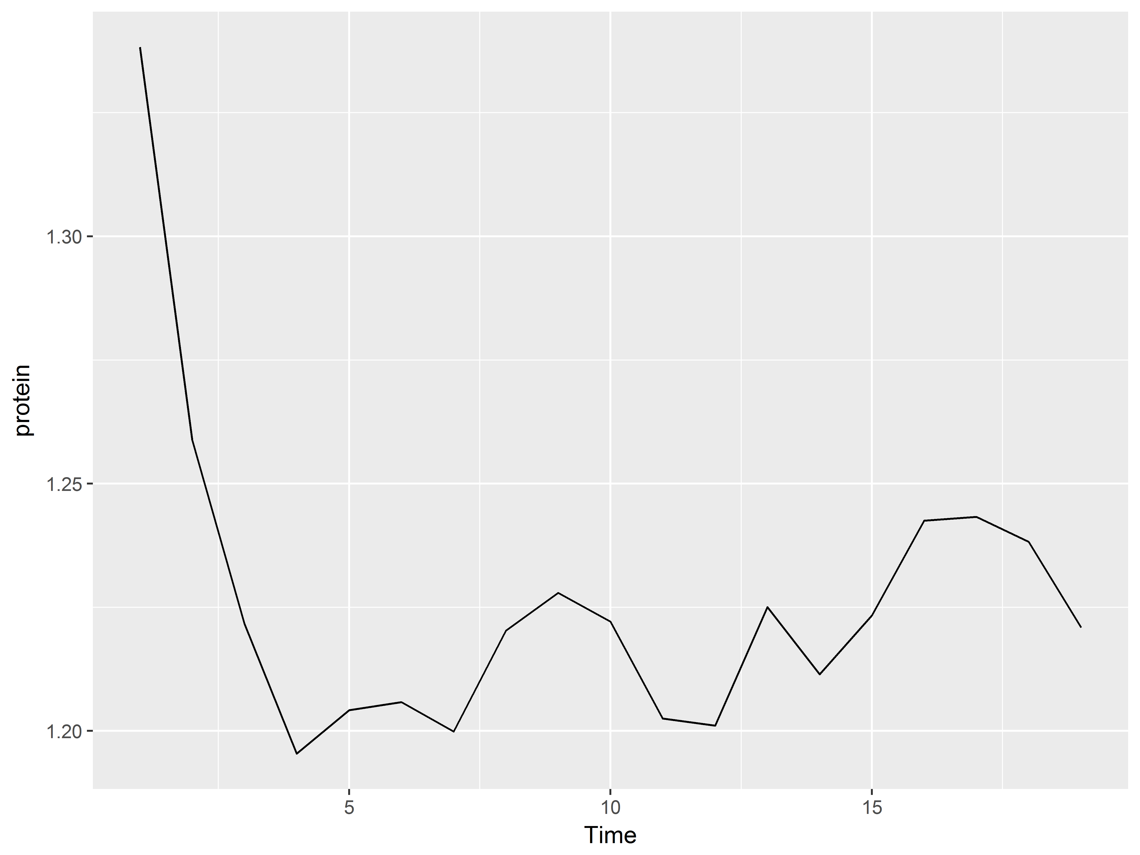
We can even specify a function we ourselves have defined.
#we define our own function mean of log
#and change geom to line
meanlog <- function(y) {mean(log(y))}
ggplot(Milk, aes(x=Time, y=protein)) +
  stat_summary(fun.y="meanlog", geom="line")
Scales
Scales define which aesthetic values are mapped to data values.
The ggplot2 package usually allows the user to control the scales for each aesthetic. Look for scale functions called something like scale_aesthetic_manual() to specify exactly which visual elements will appear on the graph.
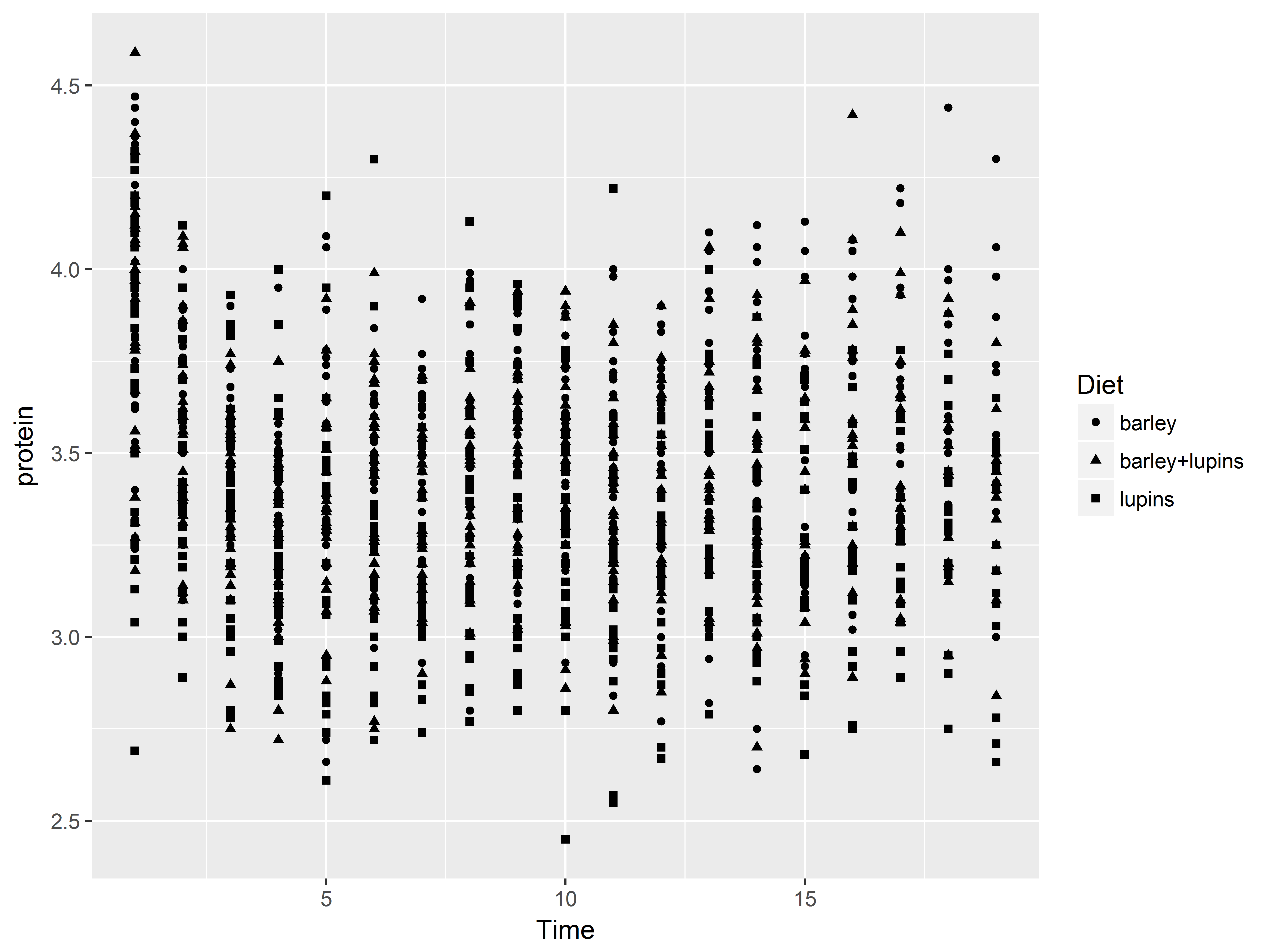
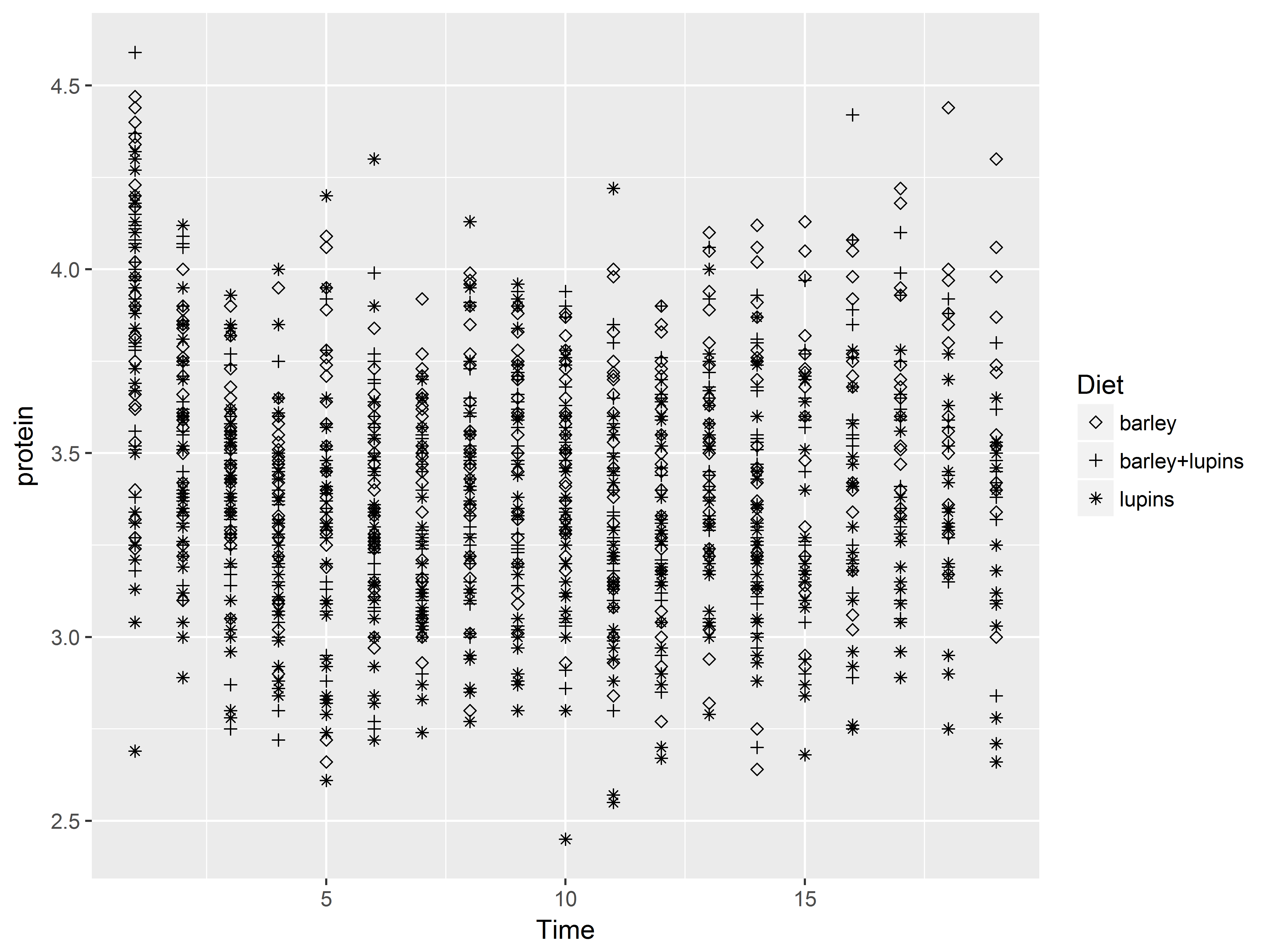
The default shape scale maps Diet values “barley” to circle, “barley+lupins” to triangle, and “lupins” to square symbols, like so:
#we define our own function mean of log
#and change geom to line
ggplot(Milk, aes(x=Time, y=protein, shape=Diet)) +
  geom_point()
Shape scales give us control over which symbols correspond to which values. A different shape scale could map the Diet values to diamond, plus, and asterisk symbols. Below we use shape_scale_manual() to specify the numeric codes corresponding to those shpaes. For a list of those codes, see the bottom of this page.
#we define our own function mean of log
#and change geom to line
ggplot(Milk, aes(x=Time, y=protein, shape=Diet)) +
  geom_point() +
  scale_shape_manual(values=c(5, 3, 8))
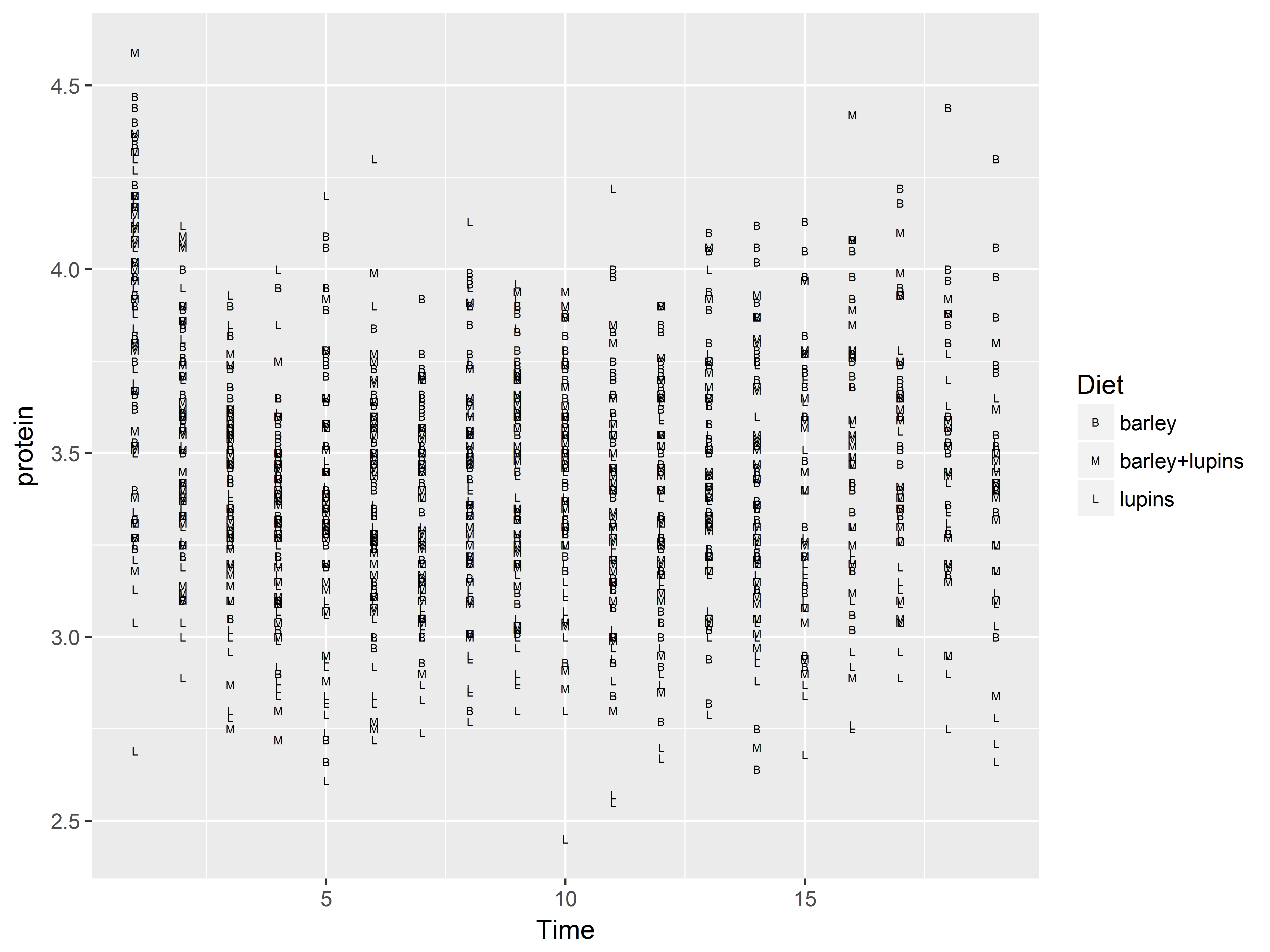
We can even supply our own shapes for plotting, here the characters “B”, “M”, and “L”:
#we define our own function mean of log
#and change geom to line
ggplot(Milk, aes(x=Time, y=protein, shape=Diet)) +
  geom_point() +
  scale_shape_manual(values=c("B","M","L"))
*Color scale functions*
As color is an important marker of variation in graphs, ggplot2 provides many scale functions designed to make controlling color scales simpler.
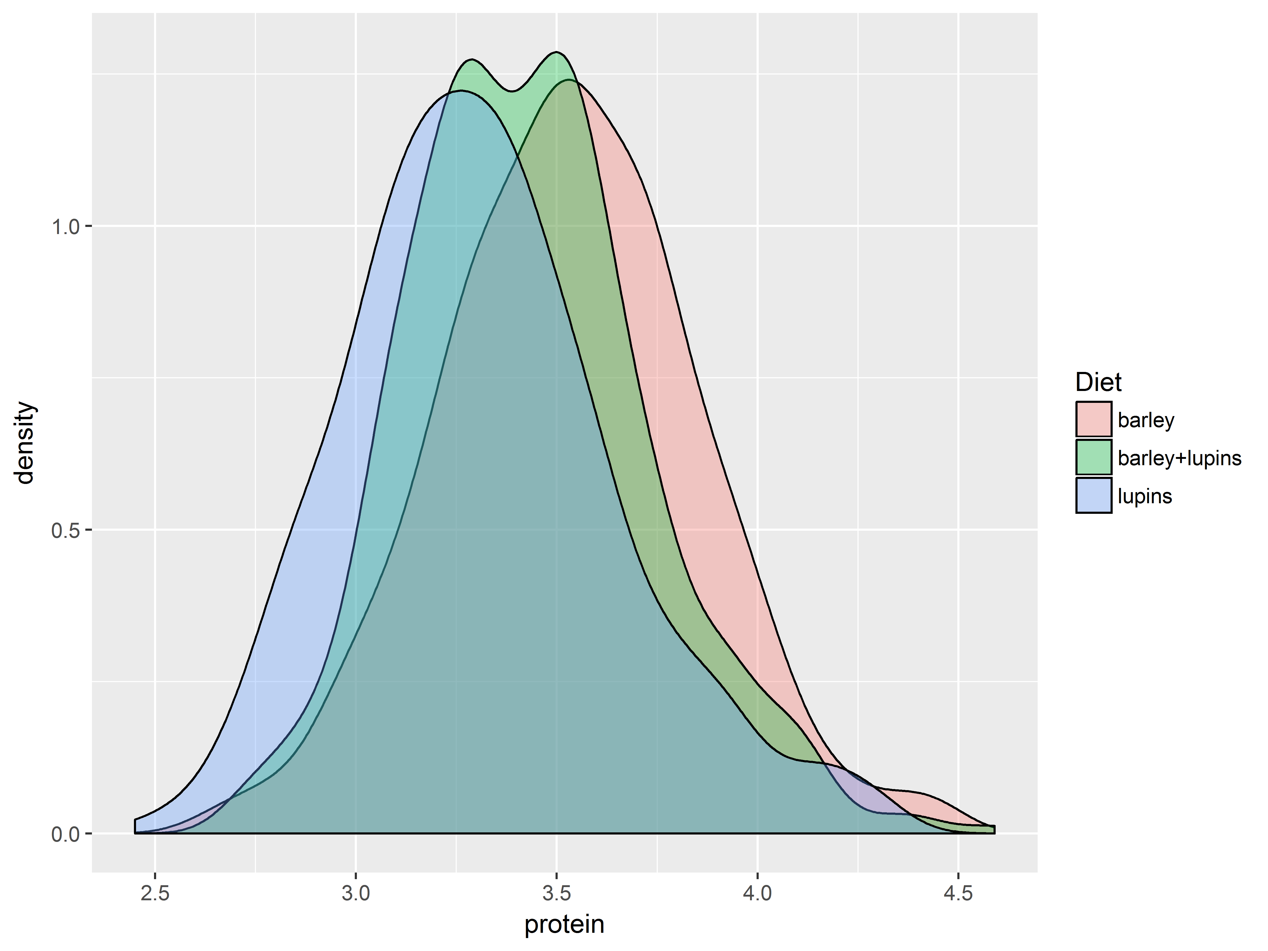
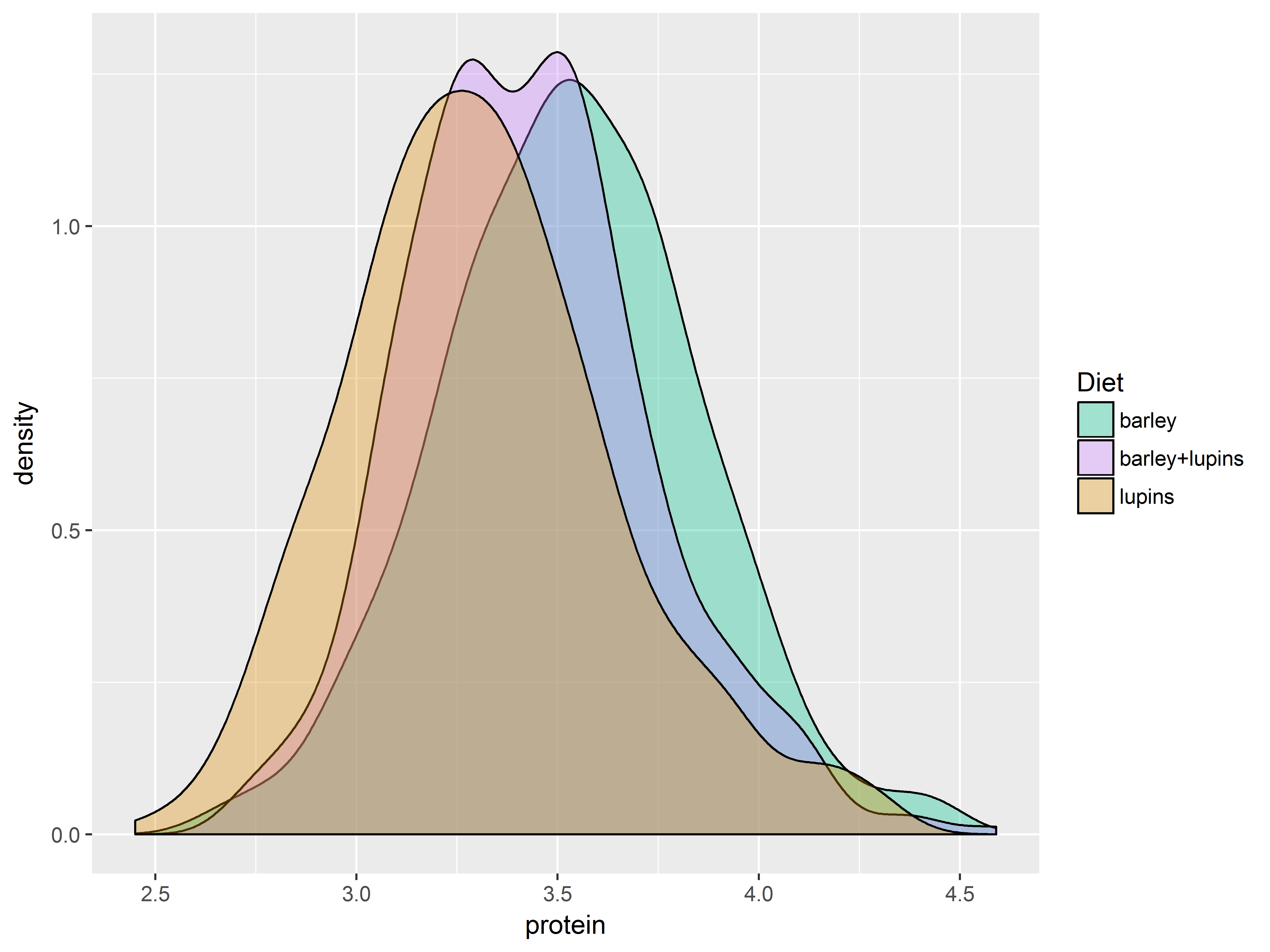
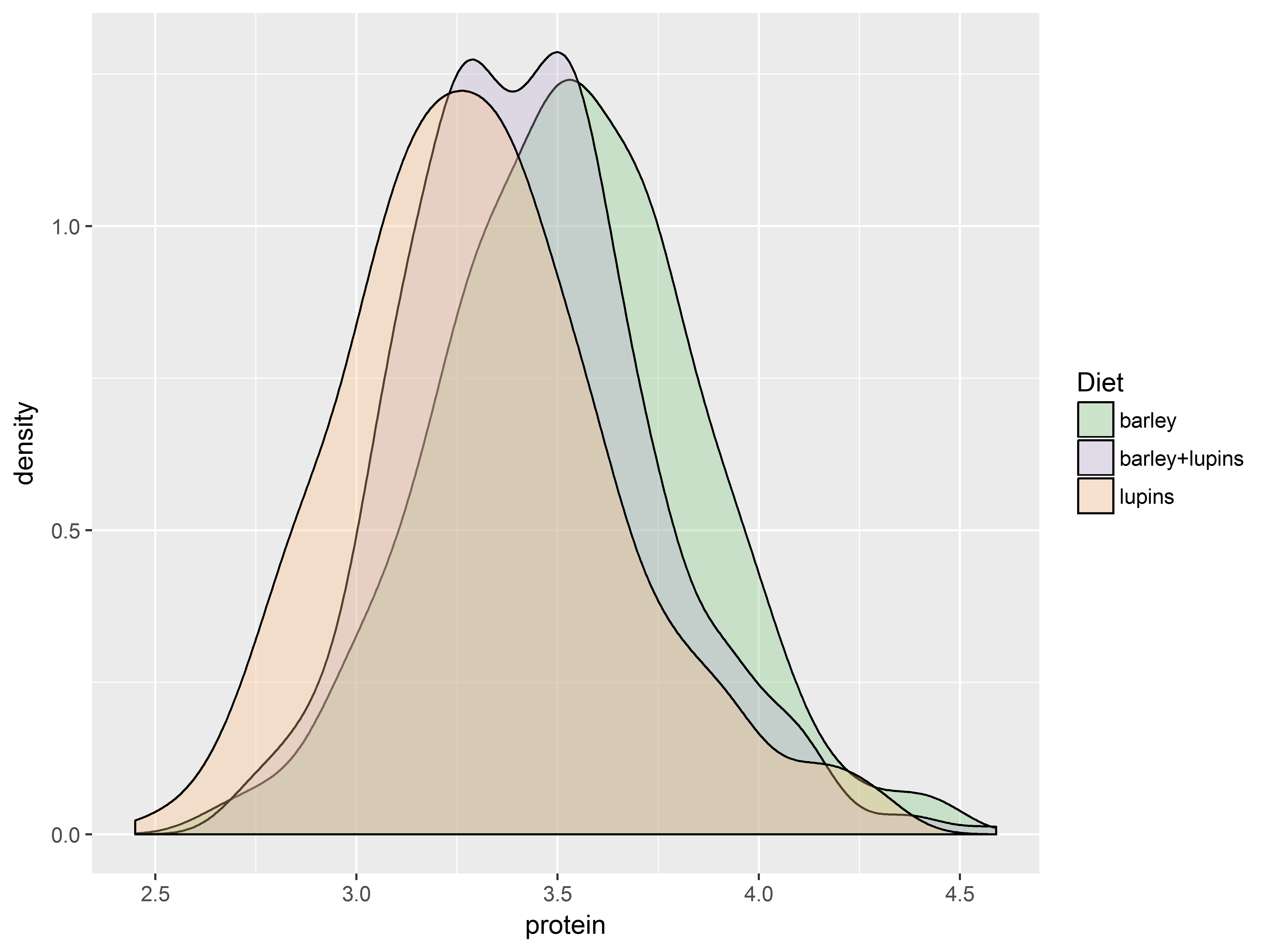
To demonstrate, we use scales for fill colors to adjust which 3 colors are mapped to the 3 values of Diet:
scale_fill_hue(): evenly spaced hues, default used for factor variablesscale_fill_brewer(): sequential, diverging or qualitative colour schemes, originally intended to display factor levels on a map.
The function scale_fill_brewer() pulls its color from the website ColorBrewer, which provides premade color palettes desinged to show contrast among discrete values.
The plots are densities of protein for each Diet group.
Here are 4 fill color scales produced by the above 2 functions.
First the default color scale.
#default is scale_fill_hue, would be the same if omitted
dDiet <- ggplot(Milk, aes(x=protein, fill=Diet)) +
  geom_density(alpha=1/3) # makes all colors transparent
dDiet + scale_fill_hue()
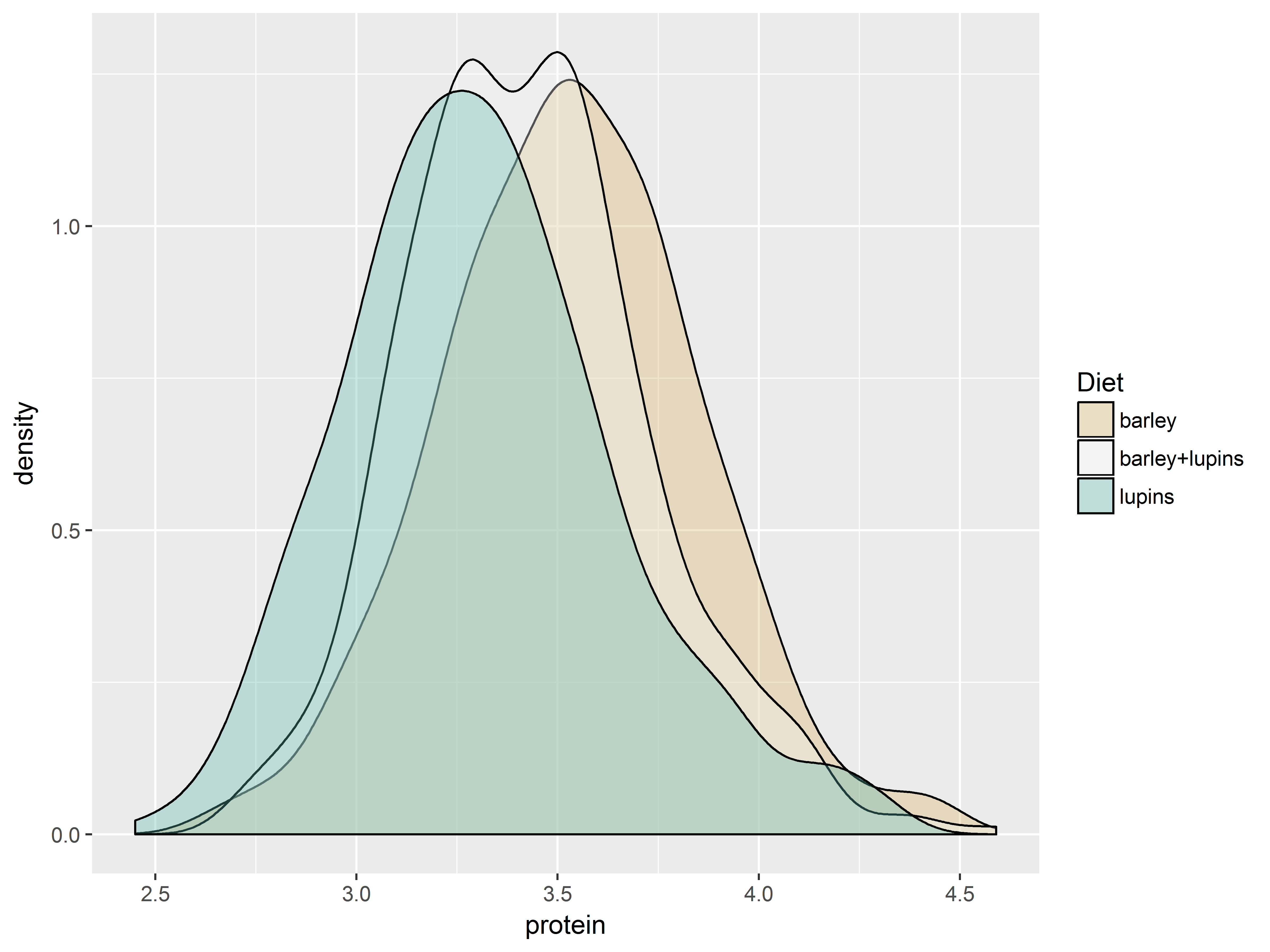
Then change the starting hue.
#a different starting hue [0,360] changes all 3 colors
#because of the even hue-spacing
dDiet + scale_fill_hue(h.start=150)
Now a “qualitative” scale.
#a qualitative scale for Diet in scale_fill_brewer
dDiet + scale_fill_brewer(type="qual")
And a “divergent” scale.
#a divergent scale in scale_fill_brewer
dDiet + scale_fill_brewer(type="div")
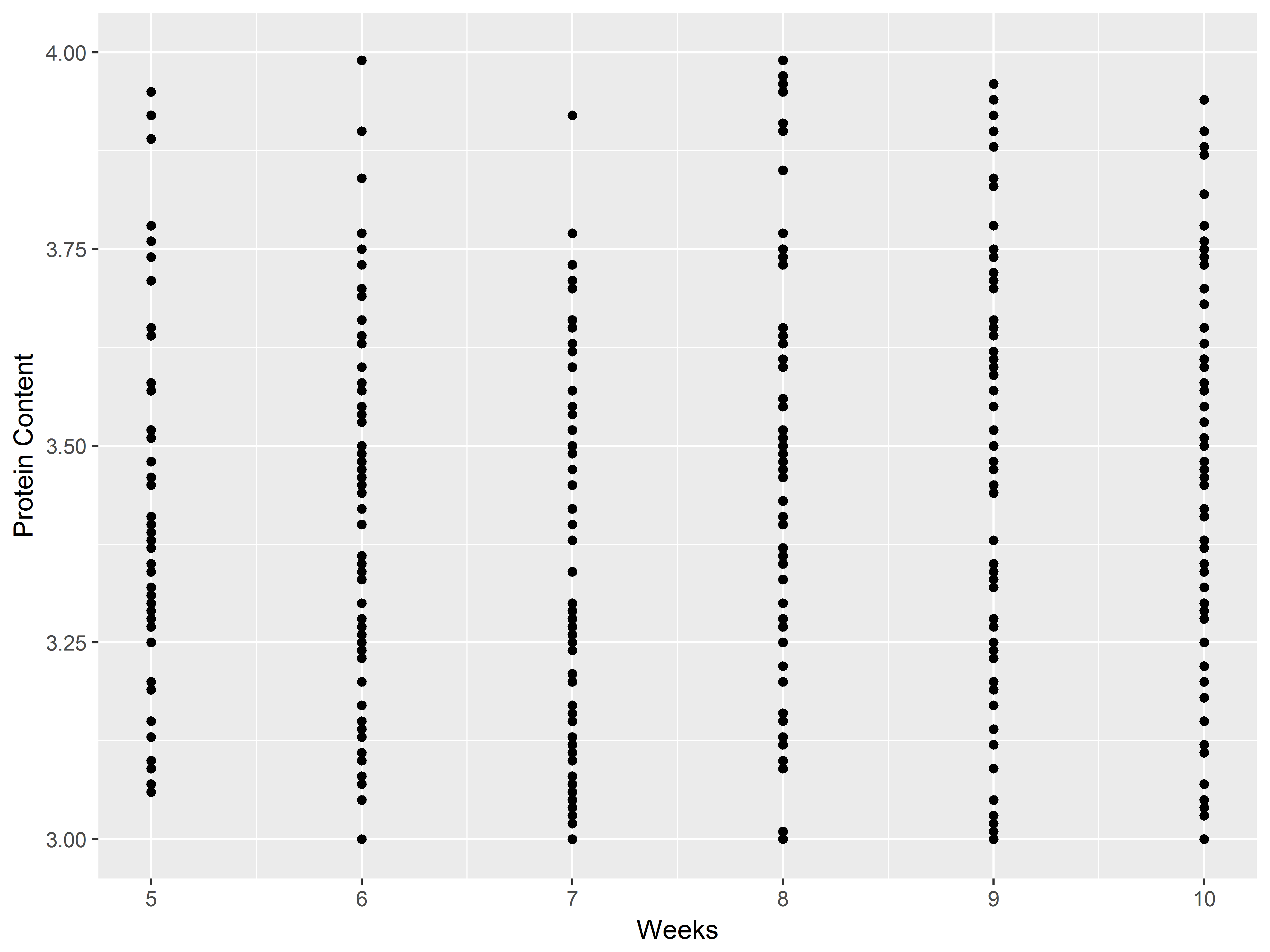
Setting axis limits and labeling scales
Axes visualize the scales for the aesthetics x and y. To adjust the axes use:
lims, xlim, ylim: set axis limitsexpand_limits: extend limits of scales for various aetheticsxlab, ylab, ggtitle, labs: give labels (titles) to x-axis, y-axis, or graph; labs can set labels for all aesthetics and title
Below we first let’s remake a plot without altering any axes:
# this old thing
ggplot(Milk, aes(x=Time, y=protein)) +
  geom_point()
Now, we’ll use lims() to restrict the range of the two axes, and use labs() to relabel them.
# notice restriced ranges of x-axis and y-axis
ggplot(Milk, aes(x=Time, y=protein)) +
  geom_point() +
  lims(x=c(5,10), y=c(3,4)) +
  labs(x="Weeks", y="Protein Content")
## Warning: Removed 918 rows containing missing values (geom_point).
Guides visualize scales
Guides (axes and legends) visualize a scale, displaying data values and their matching aesthetic values. The x-axis, a guide, visualizes the mapping of data values to position along the x-axis. A color scale guide (legend) displays which colors map to which data values.
Most guides are displayed by default. The guides function sets and removes guides for each scale.
Here we use guides to remove the shape scale legend.
# notice no legend on the right anymore
ggplot(Milk, aes(x=Time, y=protein, shape=Diet)) +
  geom_point() +
  guides(shape="none")
Coordinate systems
Coordinate systems define the planes on which objects are positioned in space on the plot. Most plots use Cartesian coordinate systems, as do all the plots in the seminar. Nevertheless, ggplot2 provides multiple coordinate systems, including polar, flipped Carteisan and map projections.
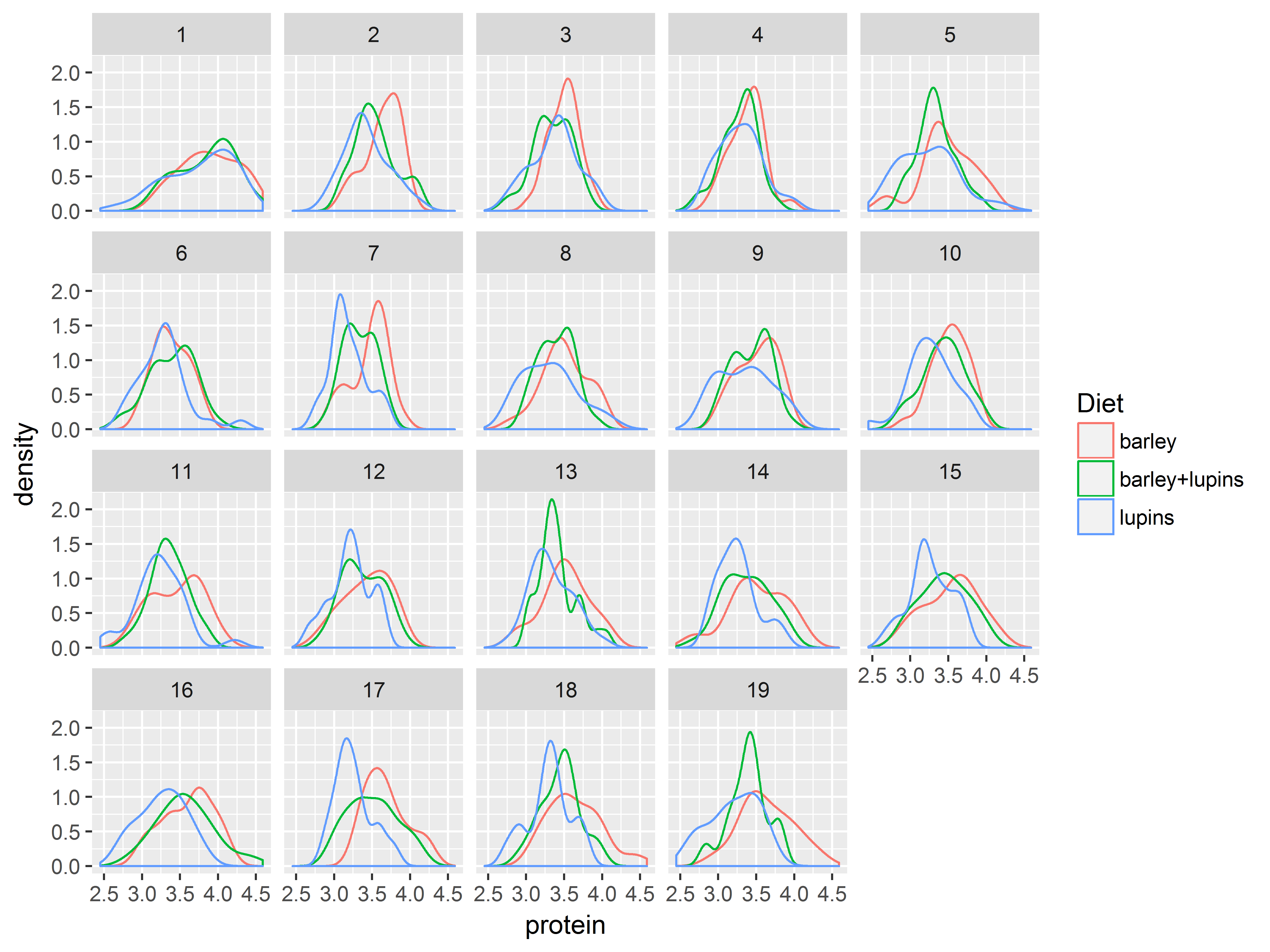
Faceting (paneling)
Split plots into small multiples (panels) with the faceting functions, facet_wrap() and facet_grid(). The resulting graph shows how each plot varies along the faceting variable(s).
facet_wrap wraps a ribbon of plots into a multirow panel of plots. The number of rows and columns can be specified. Multiple faceting variables can be separated by +.
#densities of protein, colored by Diet, faceted by Time
ggplot(Milk, aes(x=protein, color=Diet)) +
  geom_density() +
  facet_wrap(~Time)
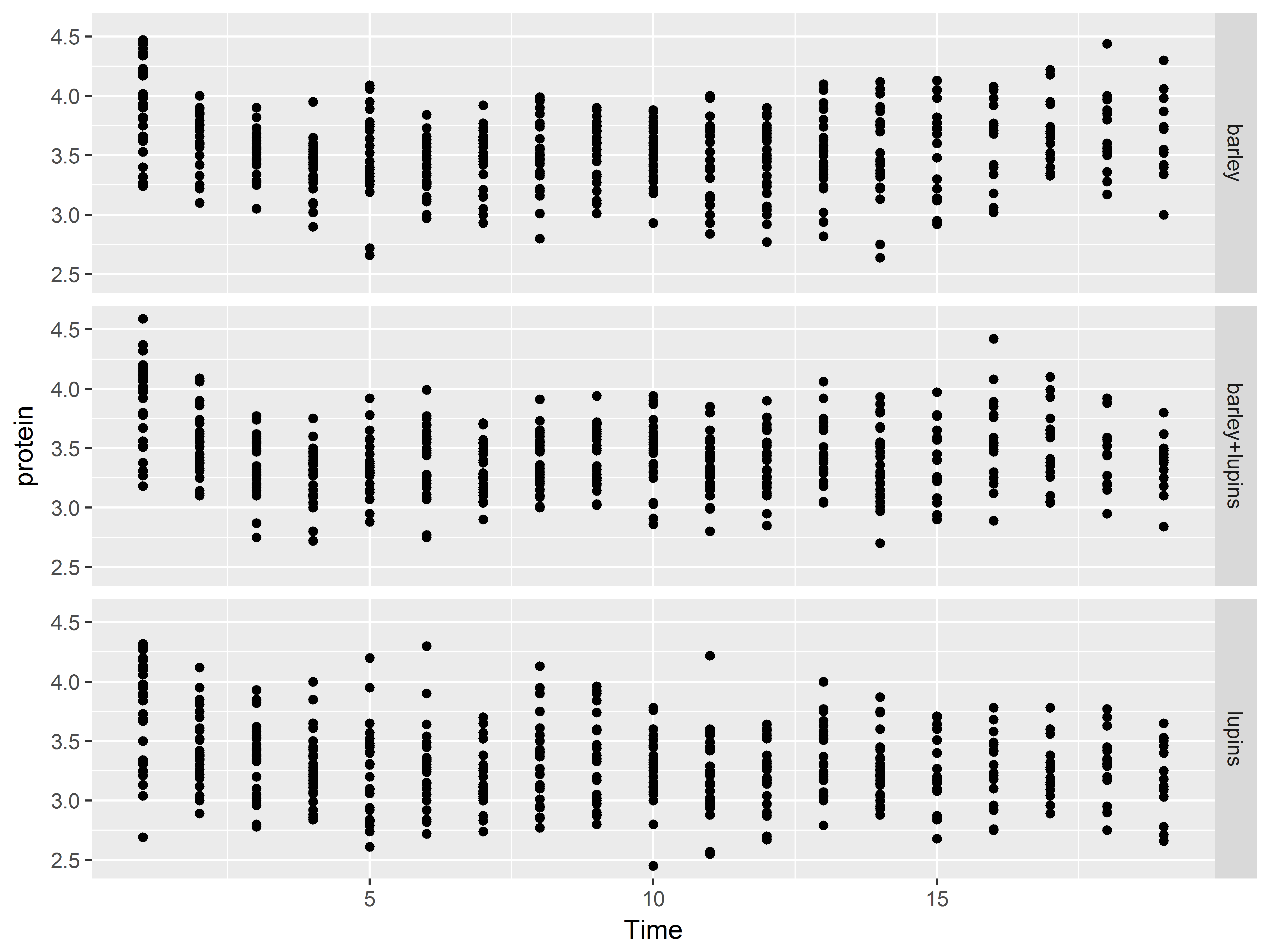
facet_grid() allows direct specification of which variables are used to split the data/plots along the rows and columns. Put the row-splitting variable before ~, and the column-splitting variable after. A . specifies no faceting along that dimension.
#split rows by Diet, no splitting along columns
ggplot(Milk, aes(x=Time, y=protein)) +
  geom_point() +
  facet_grid(Diet~.)
Themes
Themes control elements of the graph not related to the data. For example:
- background color
- size of fonts
- gridlines
- color of labels
These data-independent graph elements are known as theme elements.
A list of theme elements can be found here.
Each theme element can be classified as one of three basic elements: a line, a rectangle, or text. Each basic element has a corresponding element_ function, where graphical aspects of that element can be controlled:
element_line() - can specify color, size, linetype, etc.element_rect() - can specify fill, color, size, etc.element_text() - can specify family, size, color, etc.element_blank() - removes theme elements from graph
For example, the visual aspects of the x-axis can be controlled with element_line(), in which we can change the color, width, and linetype of the x-axis. On the other hand, the background of the graph can be controlled with element_rectangle(), in which we can specify the fill color, the border color, the size of the background.
Set a graphical element to element_blank() to remove it from the graph.
Adjust theme elements with theme() and element functions
Within the theme() function, adjust the properties of theme elements by specifying the arguments of the element_ functions.
For example, the theme element corresponding to the background of the graph is panel.background, and its properties are set using the basic element function element_rect(). We can adjust the background’s fill color, border color, and size in element_rect. All of this will be specified within theme.
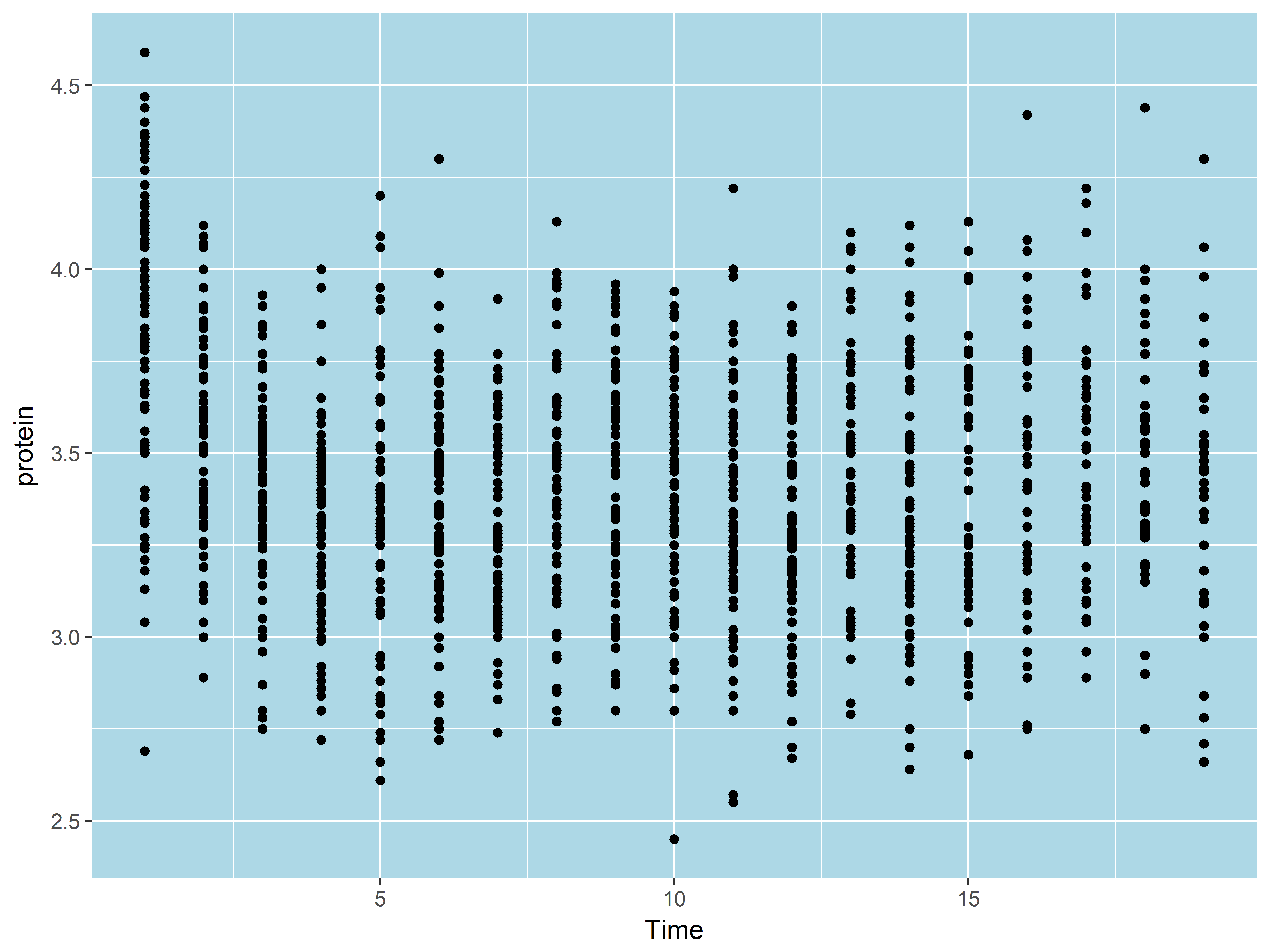
Below we change the fill color of the backround to “lightblue”.
#light blue background
pt <- ggplot(Milk, aes(x=Time, y=protein)) +
  geom_point()
pt + theme(panel.background=element_rect(fill="lightblue"))
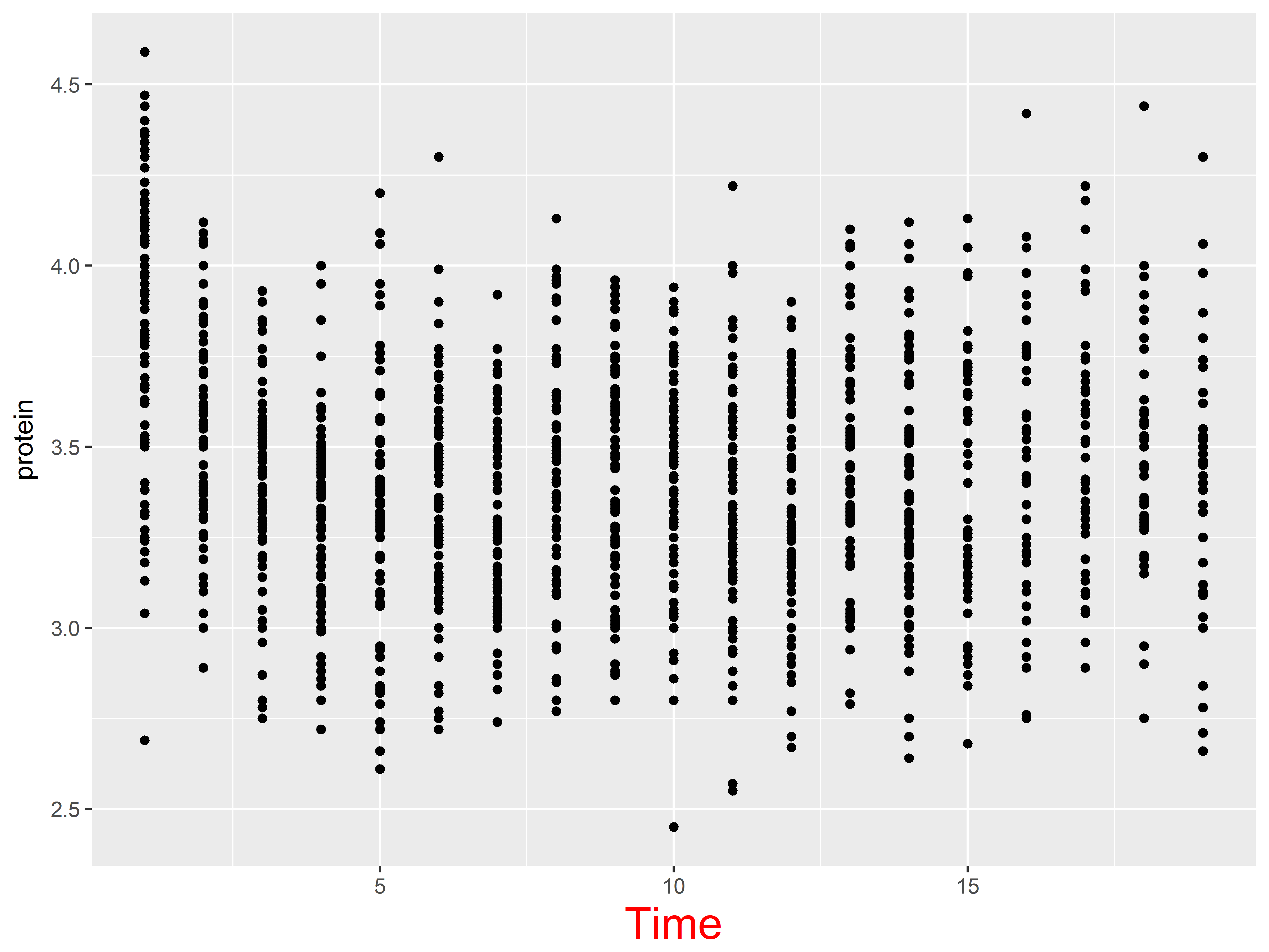
Now we specify the x-axis title, a text theme element, to be size=20pt and red.
#make x-axis title big and red
pt + theme(axis.title.x=element_text(size=20, color="red"))
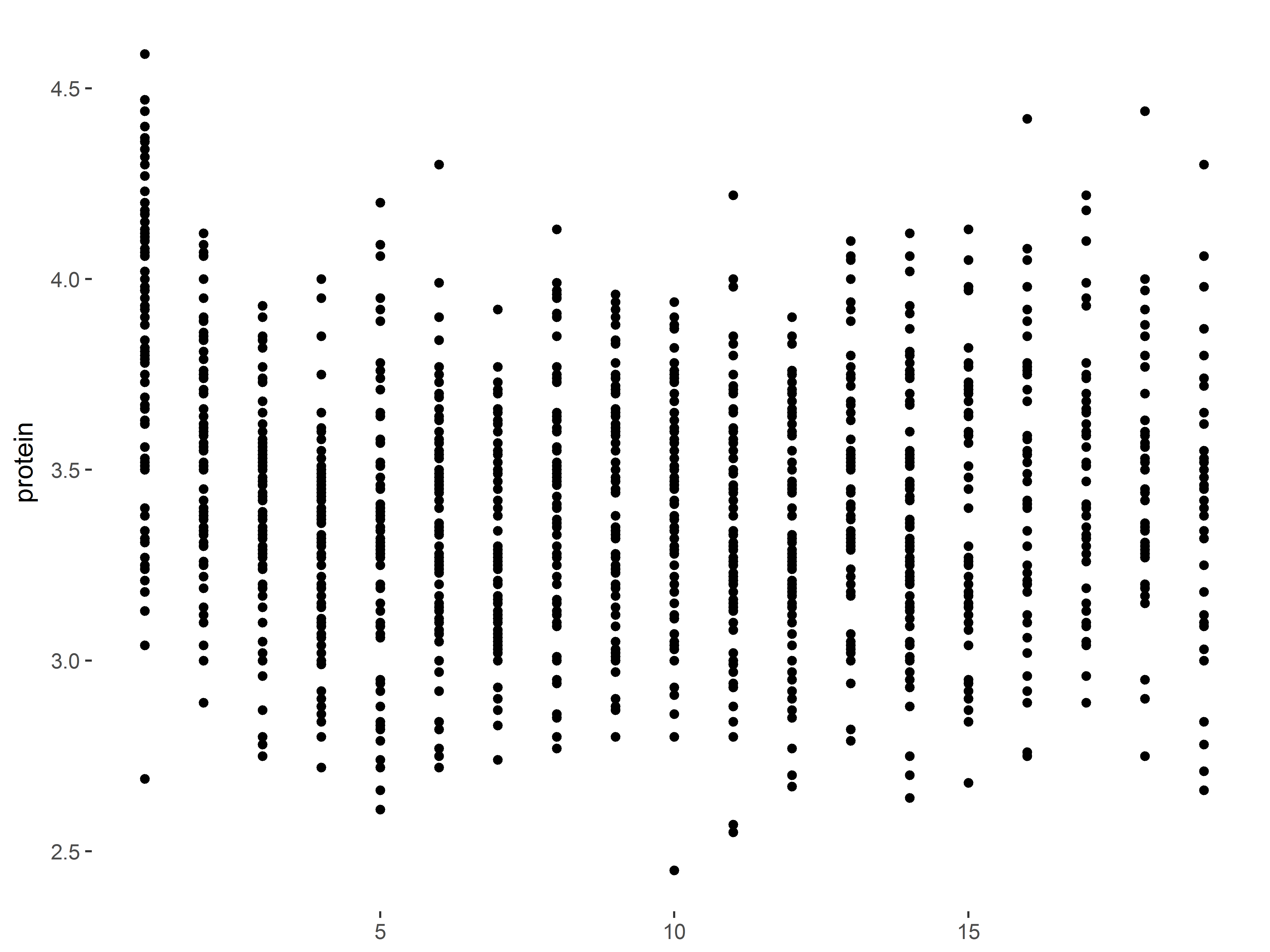
Theme elements can be removed by setting them to element_blank(). Let’s remove the background and x-axis title.
#remove plot background and x-axis title
pt + theme(panel.background=element_blank(),
           axis.title.x=element_blank())
Saving plots to files
ggsave() makes saving plots easy. The last plot displayed is saved by default, but we can also save a plot stored to an R object.
ggsave attempts to guess the device to use to save the image from the file extension, so use a meaningful extension. Available devices include eps/ps, tex (pictex), pdf, jpeg, tiff, png, bmp, svg and wmf. The size of the image can be specified as well.
#save last displayed plot as pdf
ggsave("plot.pdf")
#save plot stored in "p" as png and resize
ggsave("myplot.png", plot=p, width=7, height=5, units="in")
Upcoming examples
The next 3 sections of the seminar consist of examples designed to show create simple ggplot2 graphs at each stage of data analysis. Each section begins with exploratory graphs, then chooses a regression model informed by the exploratory graphs, checks the model assumptions with diagnostic graphs, and ends with the modifying a graph for presentation of model results.
Example 1
Purpose of example 1
This example illustrates how ggplot2 can be used at all stages of data analysis including data exploration, model diagnostics, and reporting of model results.
Description of ToothGrowth dataset
The ToothGrowth dataset loads with the datasets package.
The data are from an experiment examining how vitamin C dosage delivered in 2 different methods predicts tooth growth in guinea pigs. The data consist of 60 observations, representing 60 guinea pigs, and 3 variables:
- len: numeric, tooth length
- supp: factor, supplement type, 2 levels, “VC” is ascorbic acid, and “OJ” is orange juice
- dose: numeric, dose (mg/day)
For this study, we treat len as the outcome, and supp as dose as the predictors.
Below we examine the structure of the dataset, and then using unique(), we see that three doses were used, 0.5, 1.0, and 2.0.
#look at ToothGrowth data
str(ToothGrowth)
## 'data.frame':    60 obs. of  3 variables:
##  $ len : num  4.2 11.5 7.3 5.8 6.4 10 11.2 11.2 5.2 7 ...
##  $ supp: Factor w/ 2 levels "OJ","VC": 2 2 2 2 2 2 2 2 2 2 ...
##  $ dose: num  0.5 0.5 0.5 0.5 0.5 0.5 0.5 0.5 0.5 0.5 ...
unique(ToothGrowth$dose)
## [1] 0.5 1.0 2.0
Example 1: Exploratory analysis
We recommend graphically exploring a dataset before beginning statistical modeling. In particular, we recommend familiarizing yourself with distributions of individual variables as well as joint distibutions or relationships among groups of variables.
To be clear, we generally do not recommend forming a statistical model based on graphical exploration of the data, as it is generally unwise to generate a model for a population based upon the characteristics of a single sample of that population. However, knowing more about variation in your data will help you interpret and identify problems in your statistical models.
Exploring Toothgrowth
We being our exploration of Toothgrowth by examining the distributions of supp and dose, our predictors. Since both variables are discretely distributed, we want the frequencies (counts) of each value for both variables.
Frequencies are often plotted as bars, so we use geom_bar() to visualize.
We can of course produce bar graphs of supp and dose separately, like so:
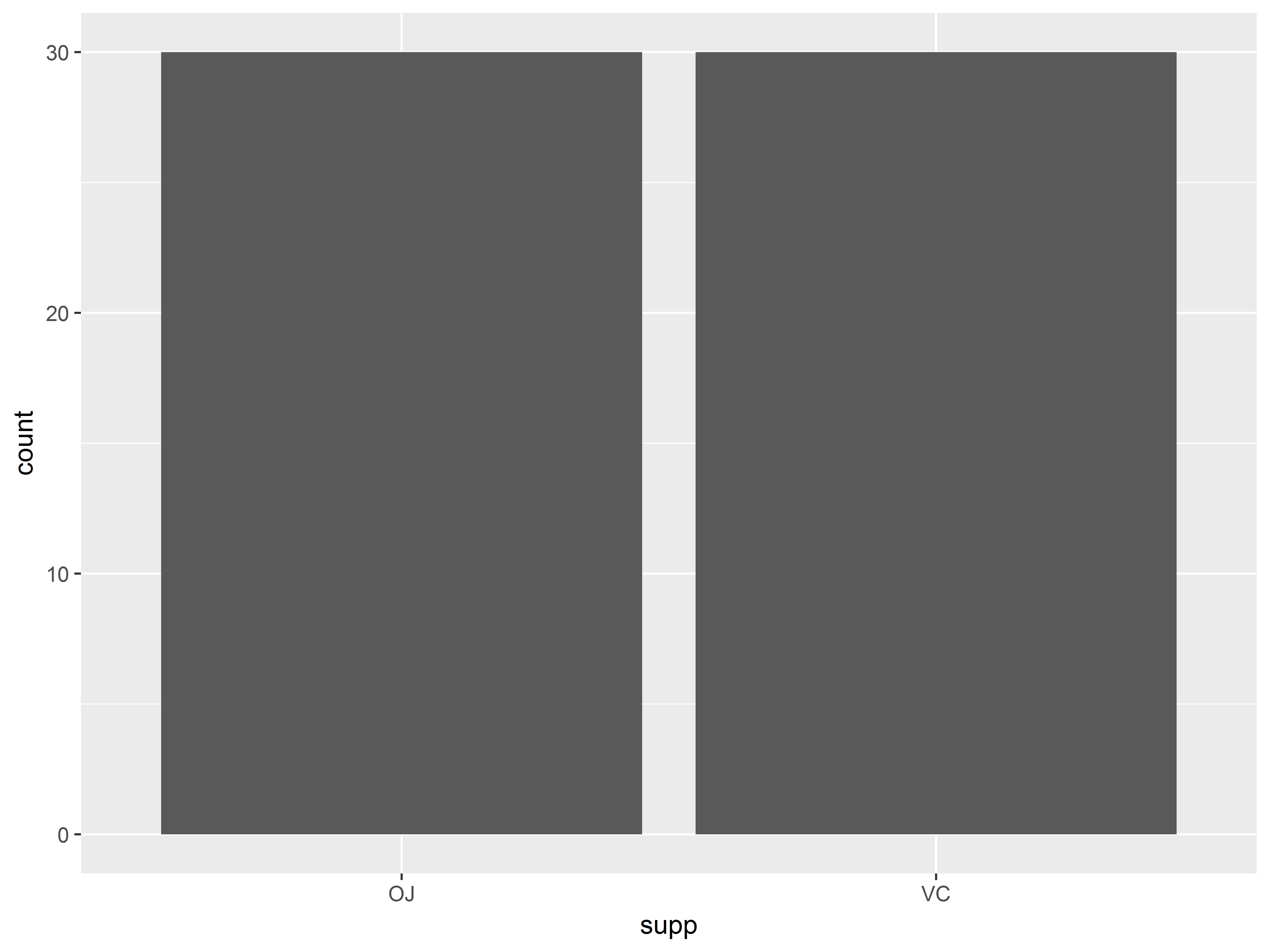
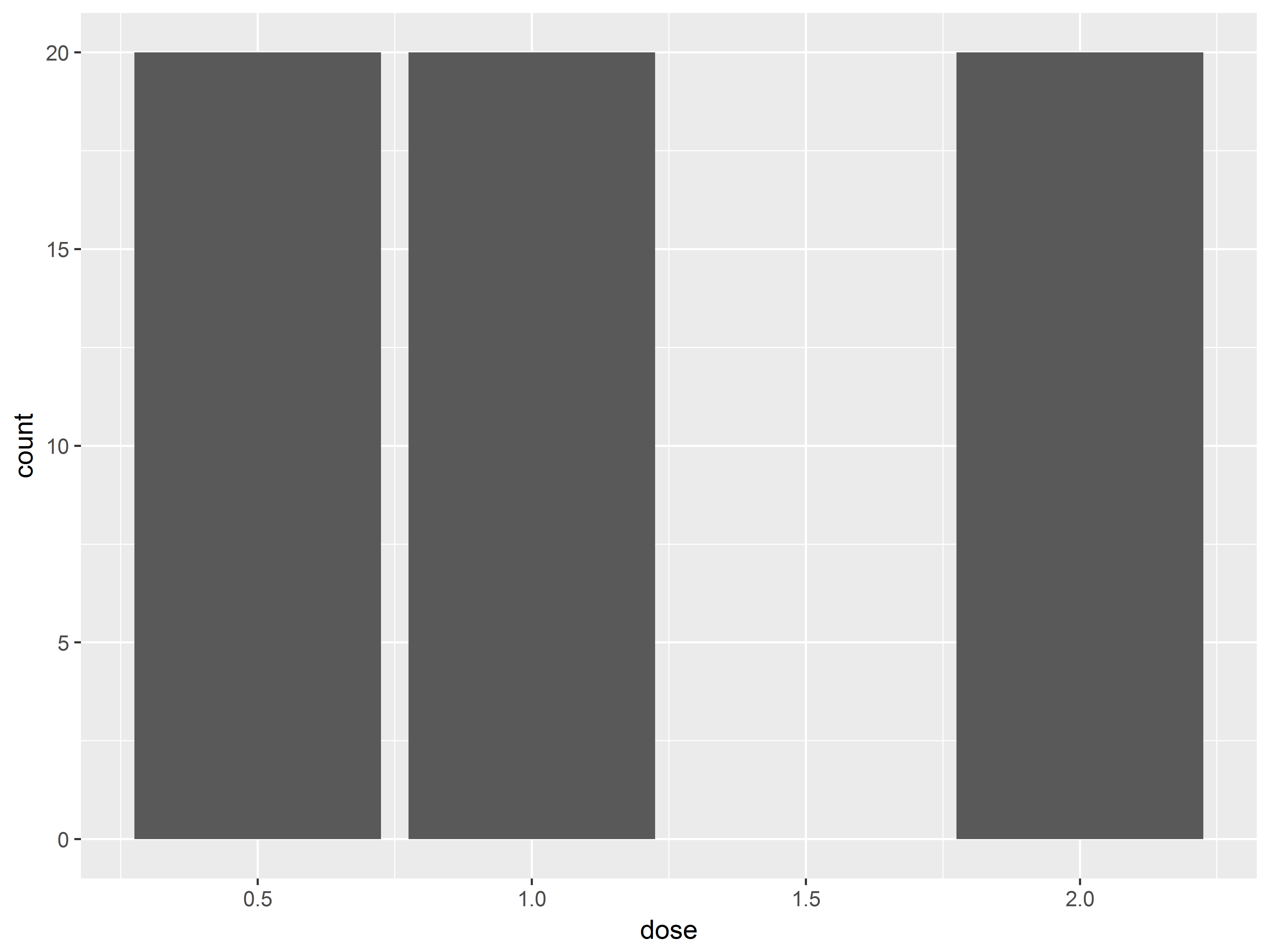
#bar plots of supp and dose
ggplot(ToothGrowth, aes(x=supp)) +
  geom_bar()

ggplot(ToothGrowth, aes(x=dose)) +
  geom_bar()
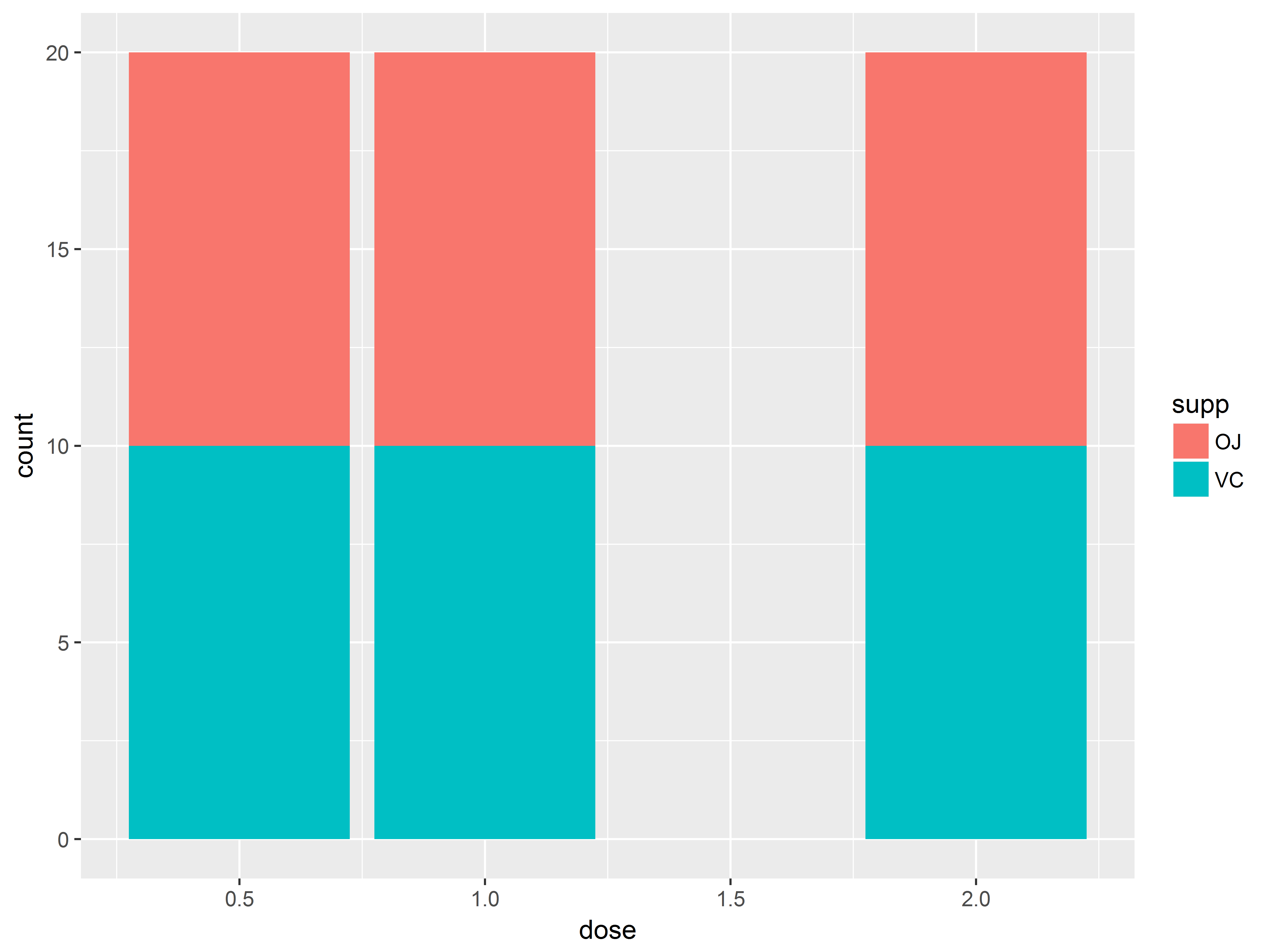
Even better would be to show the joint distribution of supp and dose – i.e. how dose is distributed at each supp (or vice versa). So we want distributions of dose, grouped by supp. We can group by supp on a graph by coloring by supp.
For bar geoms, the color aesthetic controls the border color of the bar, while the fill aesthetic controls the inner color.
#bar plot of counts of dose by supp
#data are balanced, so not so interesting
ggplot(ToothGrowth, aes(x=dose, fill=supp)) +
  geom_bar()
Now we can see that the distribution of dose is balanced across both supp types. Thus, supp and dose are uncorrelated, as will be their effects on len.
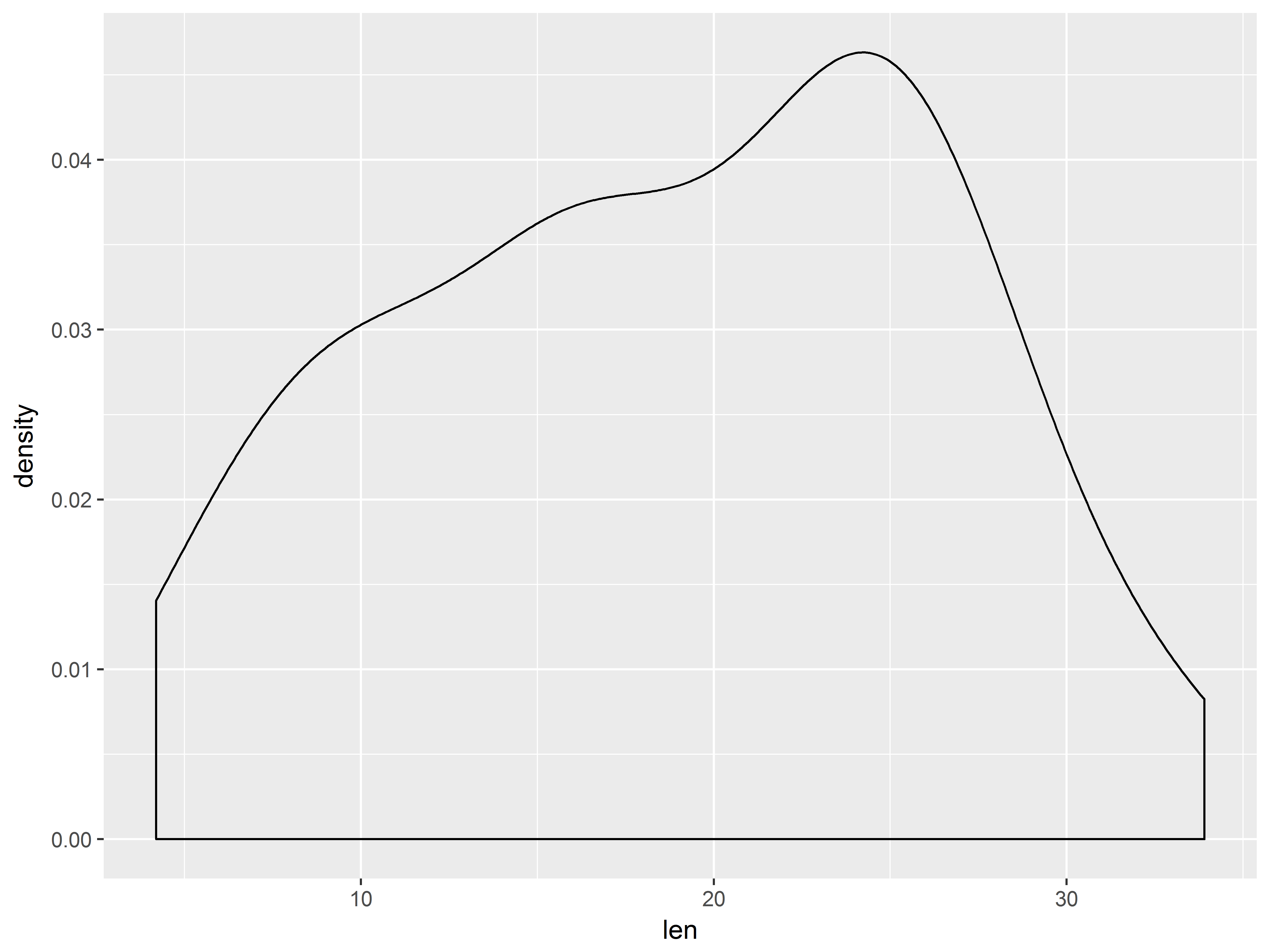
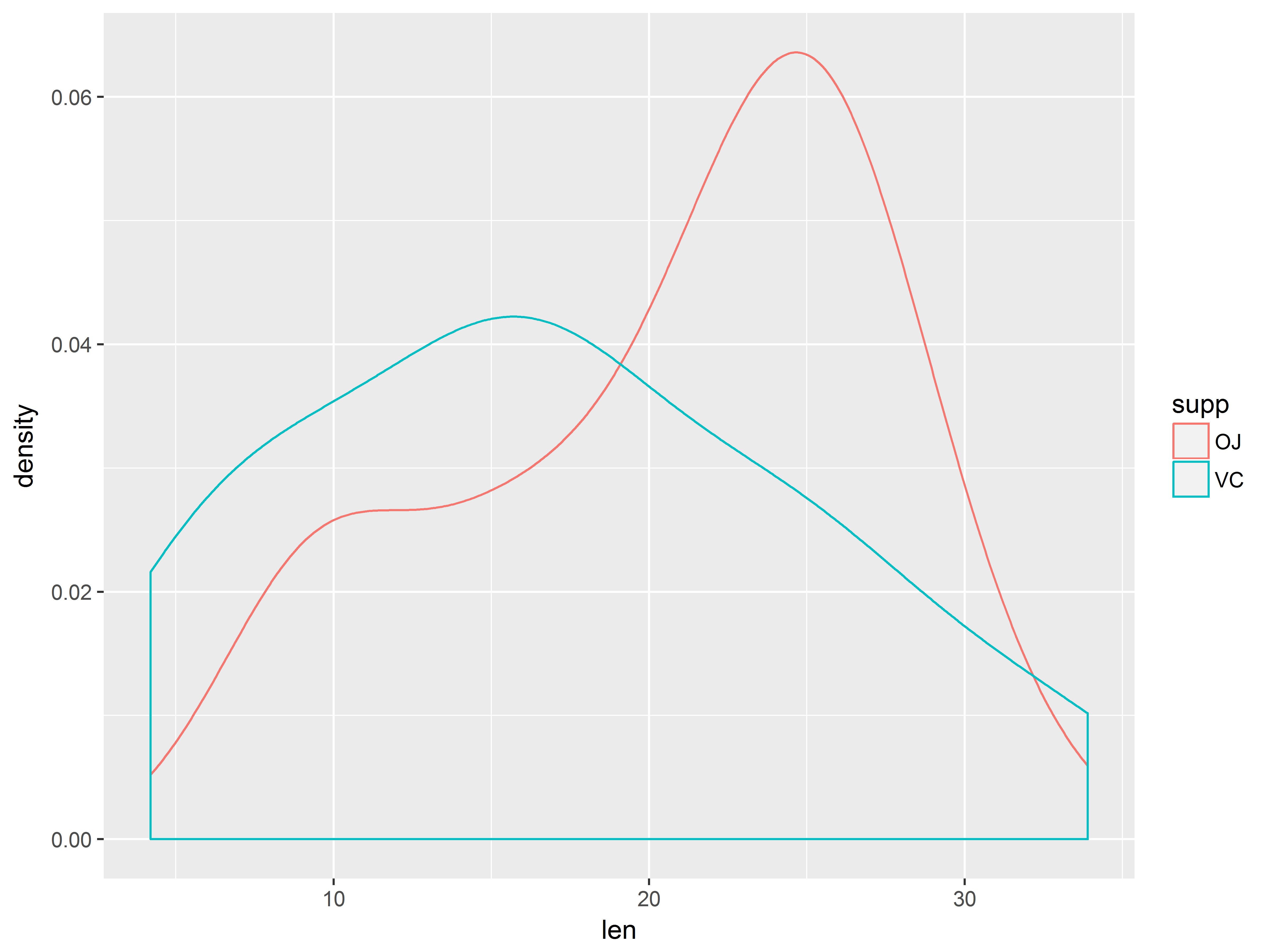
Statistical models often make assumptions about the distribution of the outcome (or its residuals), so an inspection might be wise. First let’s check the overall distribution of “len” with a density plot:
#density of len
ggplot(ToothGrowth, aes(x=len)) +
  geom_density()
We can get densities of len by supp by mapping supp to color:
#density of len by supp
ggplot(ToothGrowth, aes(x=len, color=supp)) +
  geom_density()
The outcome distributions appear a bit skewed, but the samples are small.
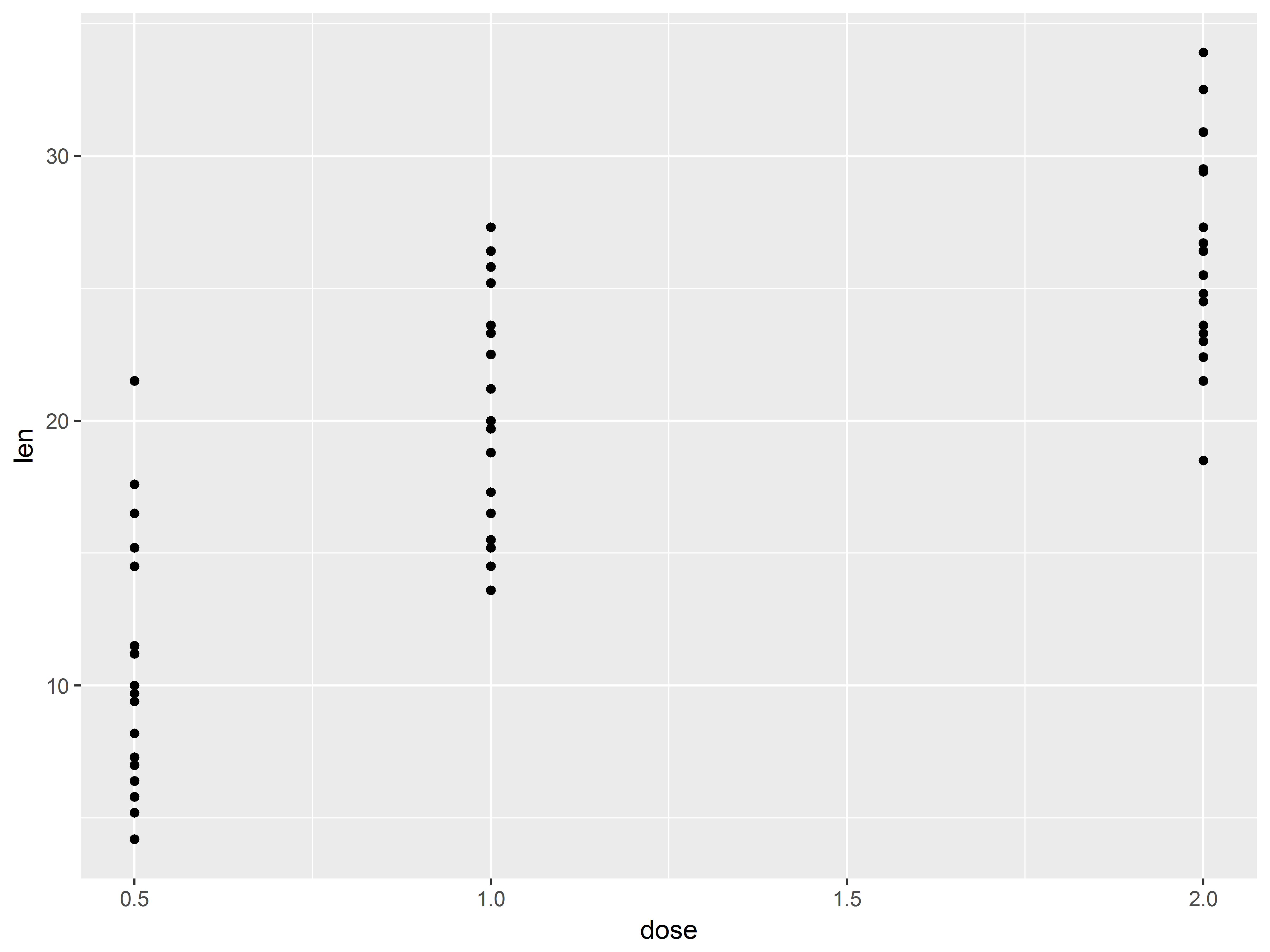
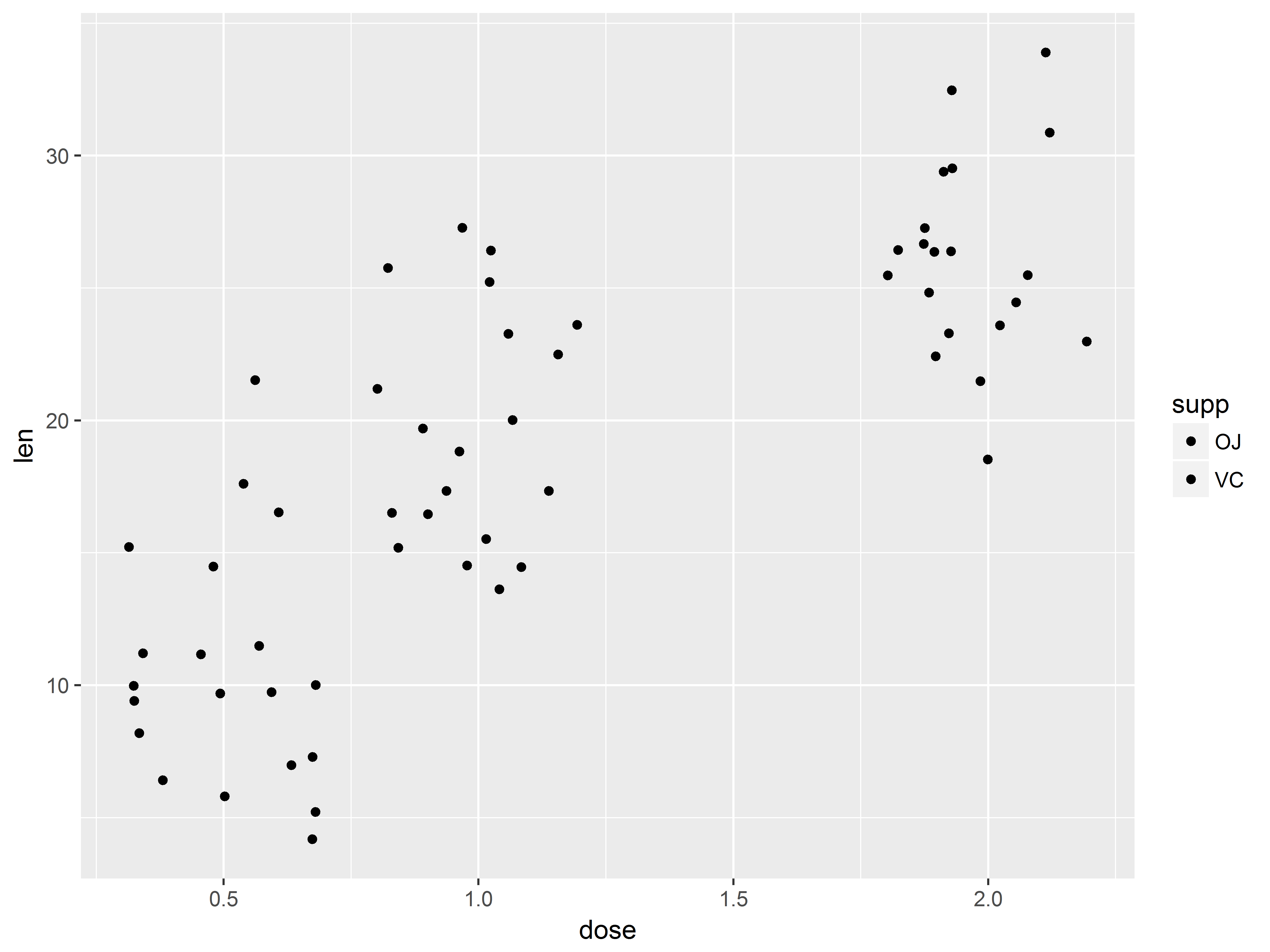
Quick scatterplot of outcome and predictor
Recall that the purpose of the study was to see how dose predicts length across two supplement types, orange juice and vitamin C. We plan to use linear regression to model this.
To preview, we can create a scatter plot of the dose-tooth length (len) relationship.
#not the best scatterplot
tp <- ggplot(ToothGrowth, aes(x=dose, y=len))
tp + geom_point()
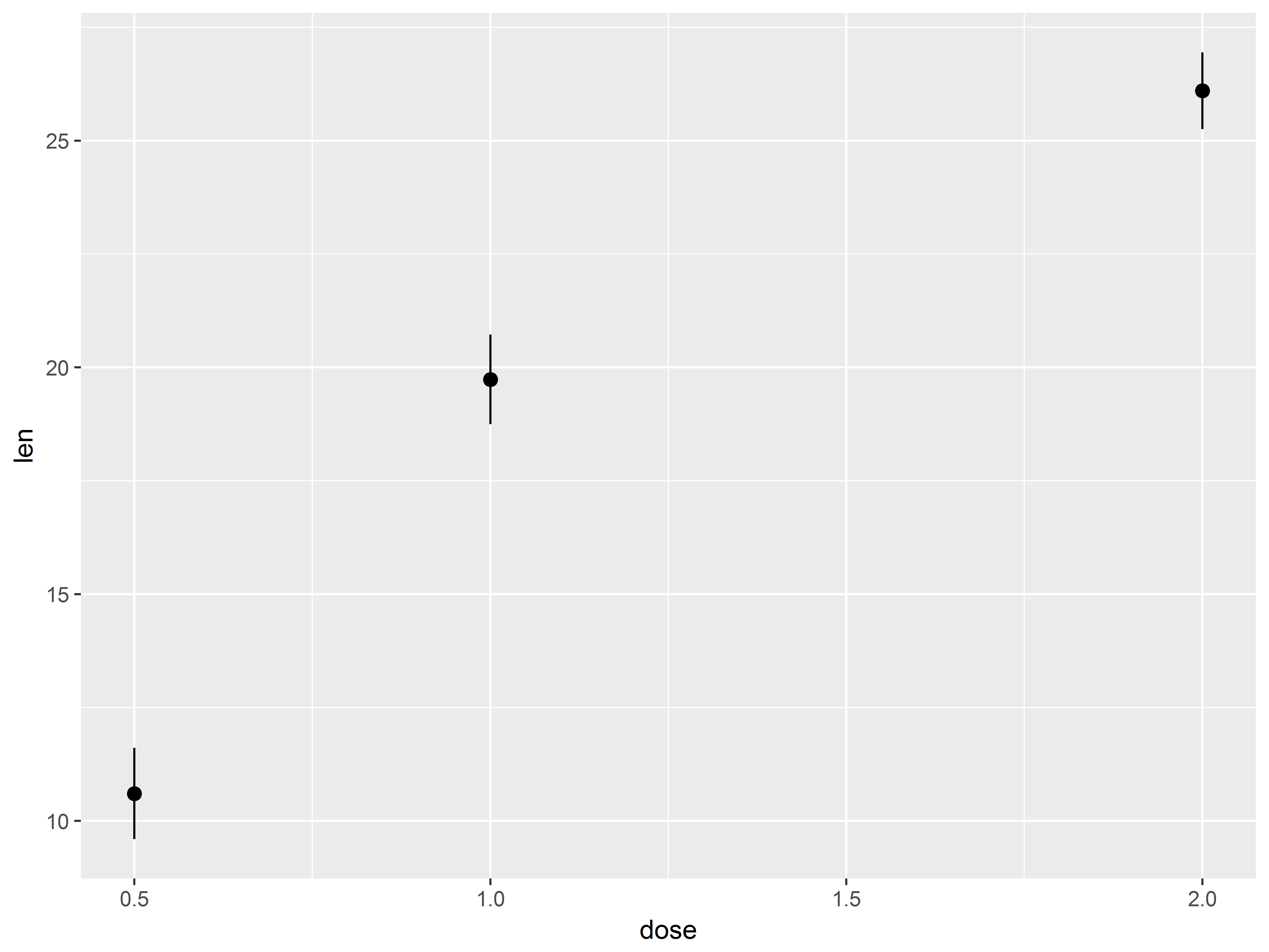
Because dose takes on only 3 values, many points are crowded in 3 columns, obscuring the shape of relationship between dose and len. We replace the column of points at each dose value with its mean and standard error bars using stat_summary() instead of geom_point().
#mean and cl of len at each dose
tp.1 <- tp + stat_summary()
tp.1
## No summary function supplied, defaulting to `mean_se()
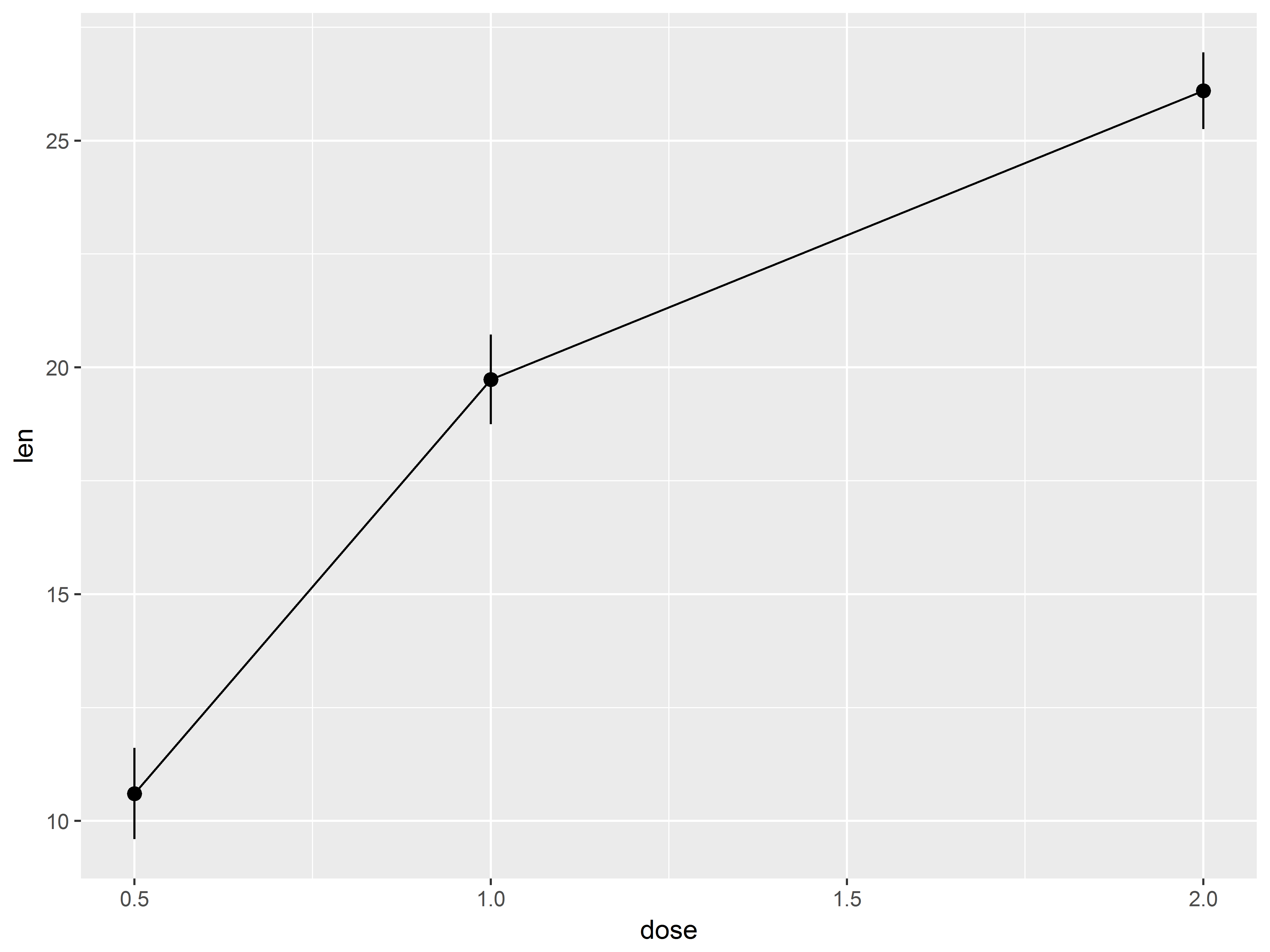
An additional call to stat_summary with fun.y=mean (use fun.y because mean returns one value) and changing the geom to “line” adds a line between means.
#add a line plot of means to see dose-len relationship
#maybe not linear
tp.2 <- tp.1 + stat_summary(fun.y="mean", geom="line")
tp.2
## No summary function supplied, defaulting to `mean_se()
That graph appears a bit non-linear.
Specifiying global aesthetics with aes()
Now let’s examine whether the dose-len relationship varies by supp. We can specify new global aesthetics with a new aes() layer, which will override the default aesthetics specified in the orginal ggplot() function.
Mapping supp to aesthetic color will vary the color of geom_point() symbols and geom_line() lines.
#all plots in tp.2 will now be colored by supp
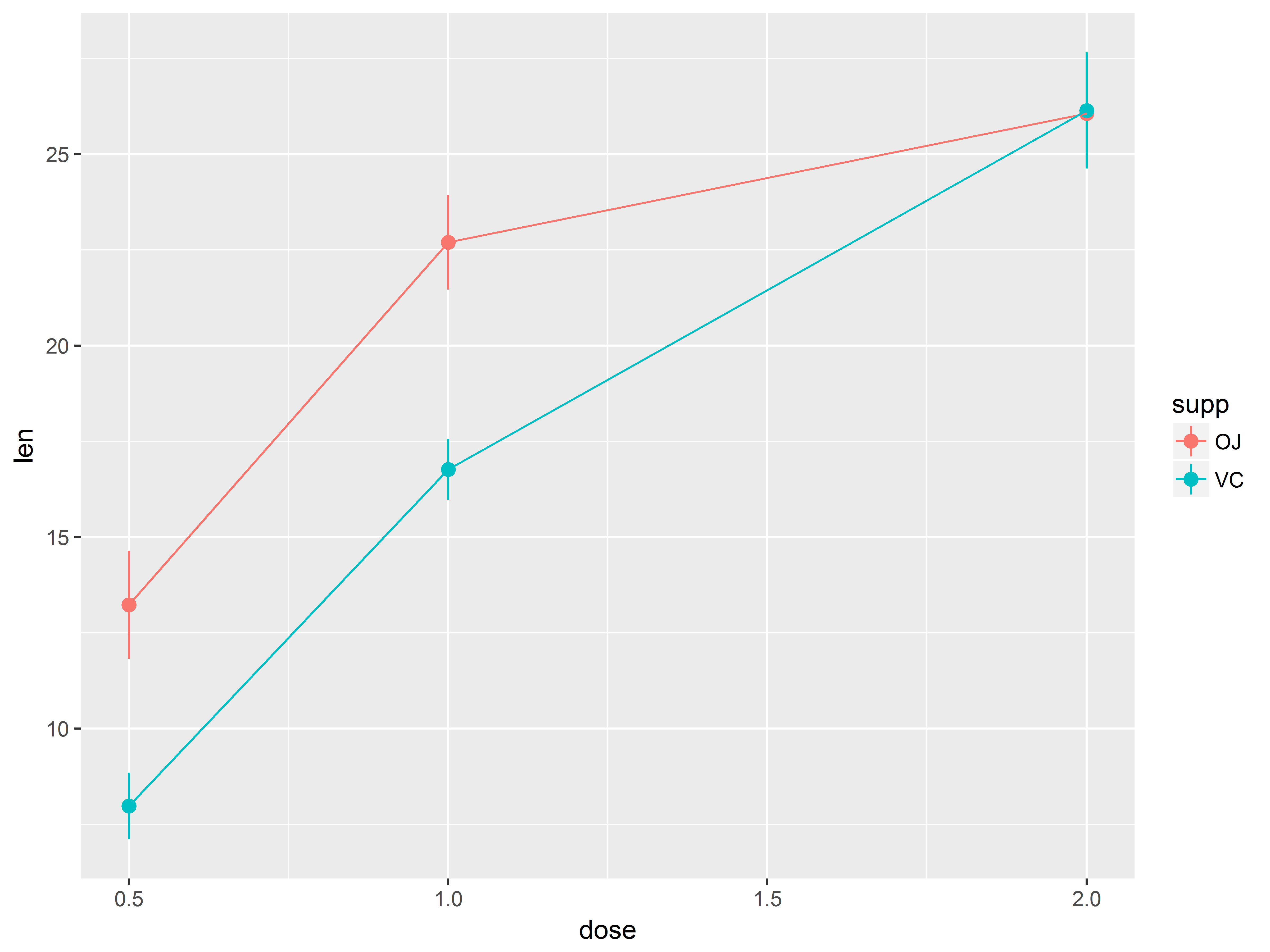
tp.2 + aes(color=supp)
## No summary function supplied, defaulting to `mean_se()
This graph suggests:
- The slope of the dose-response curve is not constant across dose for both supp types, suggesting a non-linear function.
- The shape of the curves looks somewhat different between supp
- At lower doses, OJ tends to be associated with longer lengths than VC, but this difference disappears at higher doses
ggplot2 makes graphs summarizing the outcome easy
We just plotted means and confidence limits of len, with lines connecting the means, separated by supp, all without any manipulation to the original data!
The stat_summary() function facilitates looking at patterns of means, just as regression models do.
Next we fit our linear regression model and check model assumptions with diagnostic graphs.
Linear regresssion model
Imagine that before looking at these exploratory graphs, we hypothesized that dose has a linear relationship with tooth length and that the linear function might be moderated by supplement type.
We will use lm() to run this regression model.
model_lin <- lm(len ~ dose*supp, data=ToothGrowth)
summary(model_lin)
##
## Call:
## lm(formula = len ~ dose * supp, data = ToothGrowth)
##
## Residuals:
##     Min      1Q  Median      3Q     Max
## -8.2264 -2.8462  0.0504  2.2893  7.9386
##
## Coefficients:
##             Estimate Std. Error t value Pr(>|t|)
## (Intercept)   11.550      1.581   7.304 1.09e-09 ***
## dose           7.811      1.195   6.534 2.03e-08 ***
## suppVC        -8.255      2.236  -3.691 0.000507 ***
## dose:suppVC    3.904      1.691   2.309 0.024631 *
## ---
## Signif. codes:  0 '***' 0.001 '**' 0.01 '*' 0.05 '.' 0.1 ' ' 1
##
## Residual standard error: 4.083 on 56 degrees of freedom
## Multiple R-squared:  0.7296, Adjusted R-squared:  0.7151
## F-statistic: 50.36 on 3 and 56 DF,  p-value: 6.521e-16
The model results suggest that tooth length increases with dose and that supplement moderates this relationship.
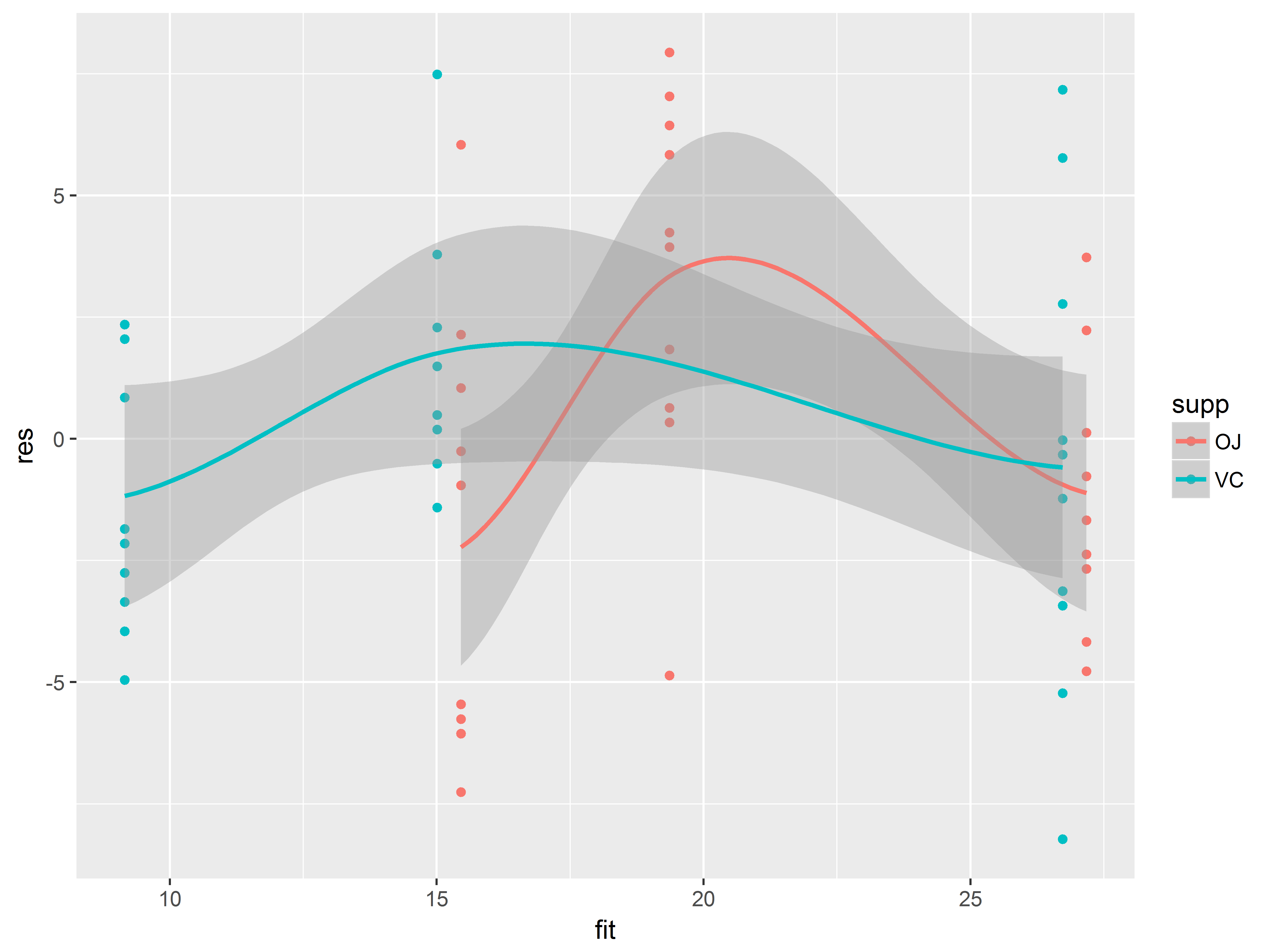
Diagnostic graph - Residuals vs Fitted
Validity of the inferences drawn from a statistical model depend on the plausibility of the model assumptions. Diagnostic graphs allow us to assess these assumptions, which are often untestable.
First we assess the assumptions of homoscedasticity, or constant error variance, and linear relationships between the outcome and predictors. A residuals vs fitted (predicted value) plot assesses both of these assmuptions. To make this plot, we’ll need fitted (predicted) values and residuals:
# add model fitted values and residuals to dataset
ToothGrowth$fit <- predict(model_lin)
ToothGrowth$res <- residuals(model_lin)
Now we are ready to make the graph, layer-by-layer
- First specify aesthetics in
ggplot(), where we map fit to x, res to y, and supp to color
- A
geom_point() scatter plot layer
- A
geom_smooth() layer to visualize the trend line with
An even spread of residuals around 0 suggests homoscedasticity, and a zero, flat trend line suggests linearity of predictor effects.
ggplot(ToothGrowth, aes(x=fit, y=res, color=supp)) +
  geom_point() +
  geom_smooth()
## `geom_smooth()` using method = 'loess'
We have suppressed several warnings regarding singularities, likely arising due to the sparsity of the data along the x-dimension.
Nevertheless, we see that the trend lines are clearly not flat, suggesting non-linear effects of dose, perhaps for both supplement types. Our exploratory graphs support this.
At this point, we have to decide whether we believe the non-linear relationship is true of the population or particular to this sample.
Regarding homoscedasticity, the data points do not look particularly more scattered at any fitted value or supplement type, so this assumption seems plausible.
Modeling a quadratic dose effect
Because it seems plausible that increasing dose would have diminishing returns, let’s try modeling a quadratic effect.
We create a dose-squared variable, for use in the quadratic model and prediction later.
#create dose-squared variable
ToothGrowth$dosesq <- ToothGrowth$dose^2
Now we run the new regression model, with linear and quadratic dose terms interacted with supp. We then show that the quadratic model has a signficantly lower AIC, indicating superior fit to the data, and then finally output the model coefficients:
# model with linear and quadratic effects interacted with supp
model_quad <- lm(len ~ (dose + dosesq)*supp, data=ToothGrowth)
# main effects model
AIC(model_lin, model_quad)
##            df      AIC
## model_lin   5 344.9571
## model_quad  7 332.7056
# interaction is significant, so we output model coefficients
summary(model_quad)
##
## Call:
## lm(formula = len ~ (dose + dosesq) * supp, data = ToothGrowth)
##
## Residuals:
##    Min     1Q Median     3Q    Max
##  -8.20  -2.72  -0.27   2.65   8.27
##
## Coefficients:
##               Estimate Std. Error t value Pr(>|t|)
## (Intercept)     -1.433      3.847  -0.373 0.710911
## dose            34.520      7.442   4.638 2.27e-05 ***
## dosesq         -10.387      2.864  -3.626 0.000638 ***
## suppVC          -2.113      5.440  -0.388 0.699208
## dose:suppVC     -8.730     10.525  -0.829 0.410492
## dosesq:suppVC    4.913      4.051   1.213 0.230460
## ---
## Signif. codes:  0 '***' 0.001 '**' 0.01 '*' 0.05 '.' 0.1 ' ' 1
##
## Residual standard error: 3.631 on 54 degrees of freedom
## Multiple R-squared:  0.7937, Adjusted R-squared:  0.7746
## F-statistic: 41.56 on 5 and 54 DF,  p-value: < 2.2e-16
Although the individual interaction coefficients are not signficiant, they are jointly significant (checked via likelihood ratio test, not shown).
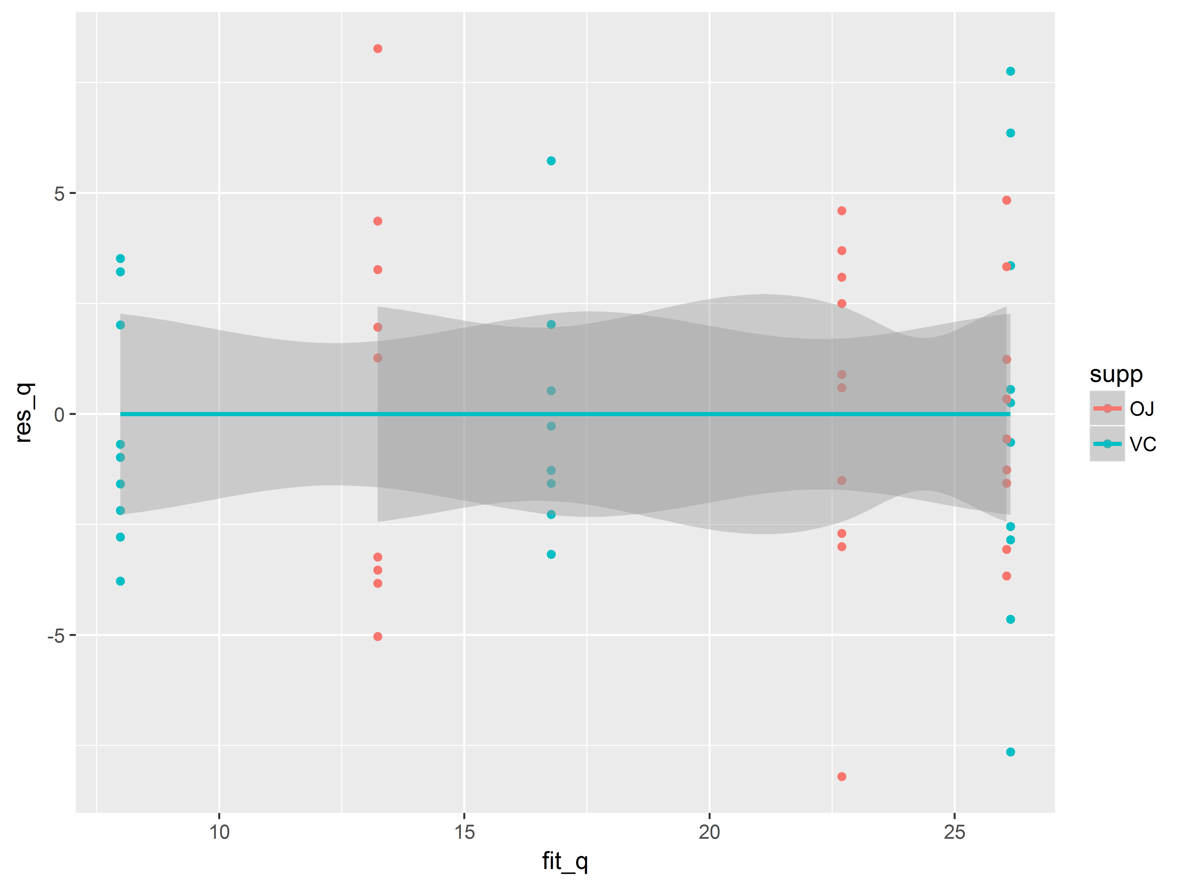
Let’s redo the residuals vs fitted plot for the quadratic model:
# get fitted values and residuals, quad model
ToothGrowth$fit_q <- predict(model_quad)
ToothGrowth$res_q <- residuals(model_quad)

# residuals vs fitted again
ggplot(ToothGrowth, aes(x=fit_q, y=res_q, color=supp)) +
  geom_point() +
  geom_smooth()
## `geom_smooth()` using method = 'loess'
To trend lines appear flat.
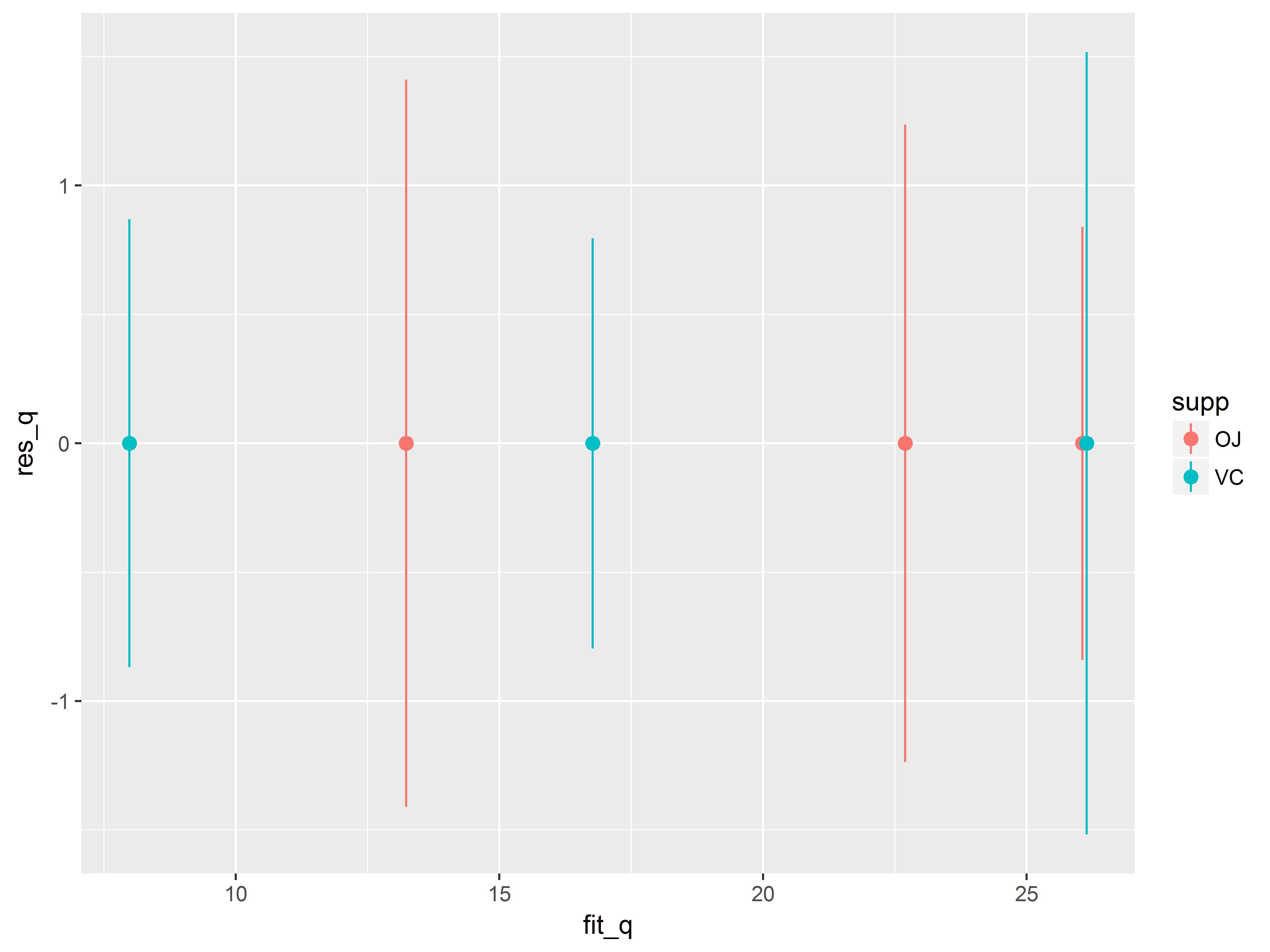
*Alternative residuals vs fitted plot*
If the warnings regarding the singularites are worrisome we can redo the residuals vs fitted plot without a loess smooth. We simply replace the geom_point() and geom_smooth() layers with a stat_summary() layer, which will plot the mean and standard errors of the residuals at each fitted value:
# means and standard errors of residuals at each fitted value
ggplot(ToothGrowth, aes(x=fit_q, y=res_q, color=supp)) +
  stat_summary()
## No summary function supplied, defaulting to `mean_se()
The means appear to lie along a flat line.
Diagnostic plot: q-q plot
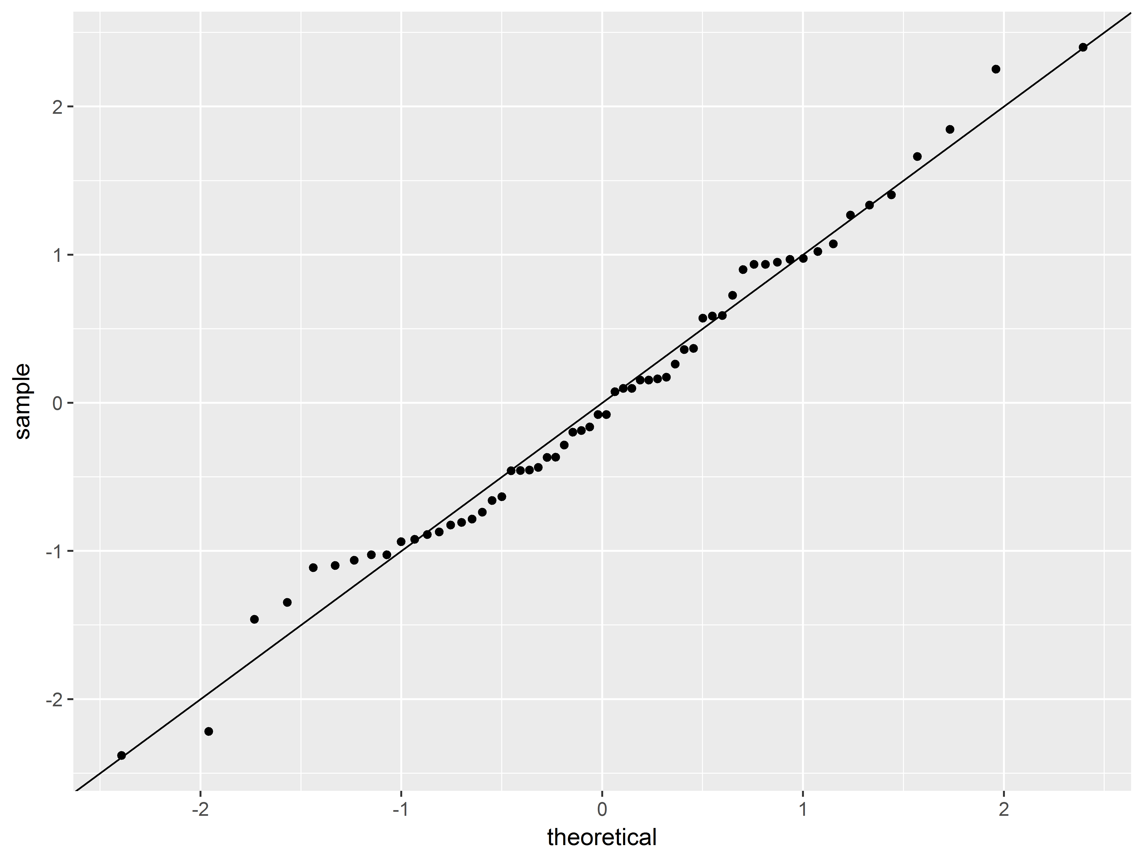
A q-q plot can assess the assumption that the residuals are normally distributed by plotting the standardized residuals (observed z-score) against theoretical quantiles of the normal distribution (expected z-score if normally distributed).
We will need standardized residuals for this plot, which we obtain with the function rstandard().
stat_qq() creates a q-q plot. The only required aesthetic is sample, which we map to the standardized residual variable.
A diagonal reference line (intercept=0, slope=1) is added to the plot with geom_abline(), representing perfect fit to a normal distribution.
# add standardizes residuals to data set
ToothGrowth$res_stand <- rstandard(model_quad)
#q-q plot of residuals and diagonal reference line
#geom_abline default aesthetics are yintercept=0 and slope=1
ggplot(ToothGrowth, aes(sample=res_stand)) +
  stat_qq() +
  geom_abline()
The normal distribution appears to be a reasonable fit.
Although we could more thoroughly assess model assumptions, we move on to presenting the model results for this seminar.
Example 1: Customizing a plot for presentation
We have decided to present our model dose-response curves with confidence intervals for an audience. Because we are presenting it to an audience, we are more concerned about its visual qualities.
Our model implies smooth, quadratic dose functions so we predict fitted values at more finely spaced doses than in the original data (0.5,1,2).
First we create the new dataset of doses between 0.5 and 2, separated by 0.01 and a corresponding dose-squared variable. Then, we use predict() to add fitted values and confidence bands estimates to the new dataset.
#create new data set of values from 0.5 to 2 for each supp
newdata <- data.frame(dose=rep(seq(0.5, 2, .01),each=2),
                      supp=factor(c("OJ", "VC")))
#dose squared variable
newdata$dosesq <- newdata$dose^2

#snapshot of the data we will use to get predicted values
head(newdata)
##   dose supp dosesq
## 1 0.50   OJ 0.2500
## 2 0.50   VC 0.2500
## 3 0.51   OJ 0.2601
## 4 0.51   VC 0.2601
## 5 0.52   OJ 0.2704
## 6 0.52   VC 0.2704
Now we add predicted values from the model:
#add predicted values and confidence limits to newdata
newdata <- data.frame(newdata, predict(model_quad, newdata,
                      interval="confidence"))
#take a look
head(newdata)
##   dose supp dosesq       fit       lwr      upr
## 1 0.50   OJ 0.2500 13.230000 10.927691 15.53231
## 2 0.50   VC 0.2500  7.980000  5.677691 10.28231
## 3 0.51   OJ 0.2601 13.470295 11.228011 15.71258
## 4 0.51   VC 0.2601  8.182619  5.940335 10.42490
## 5 0.52   OJ 0.2704 13.708512 11.523460 15.89356
## 6 0.52   VC 0.2704  8.384144  6.199092 10.56920
Initial plot: fitted vs dose by supp
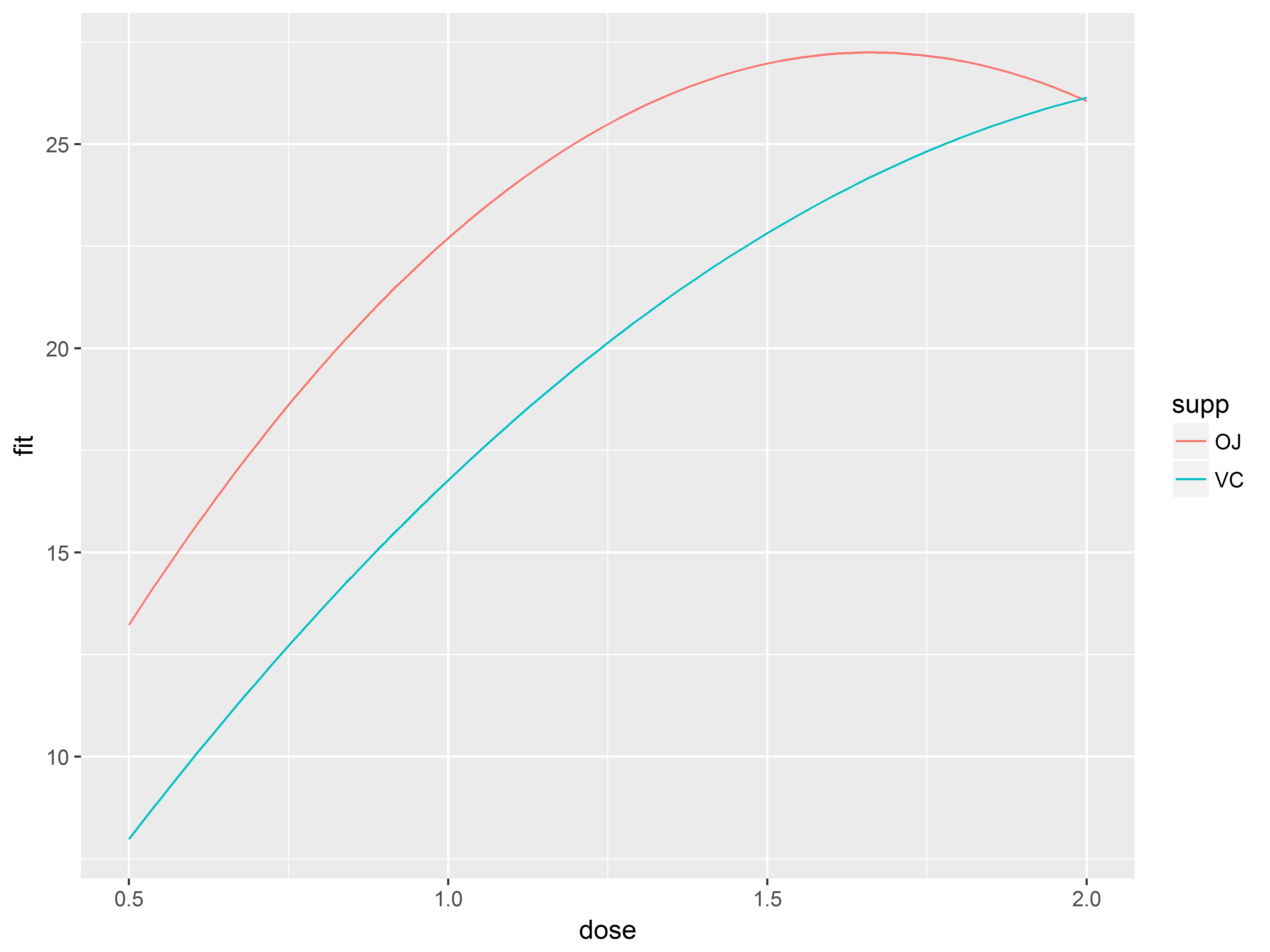
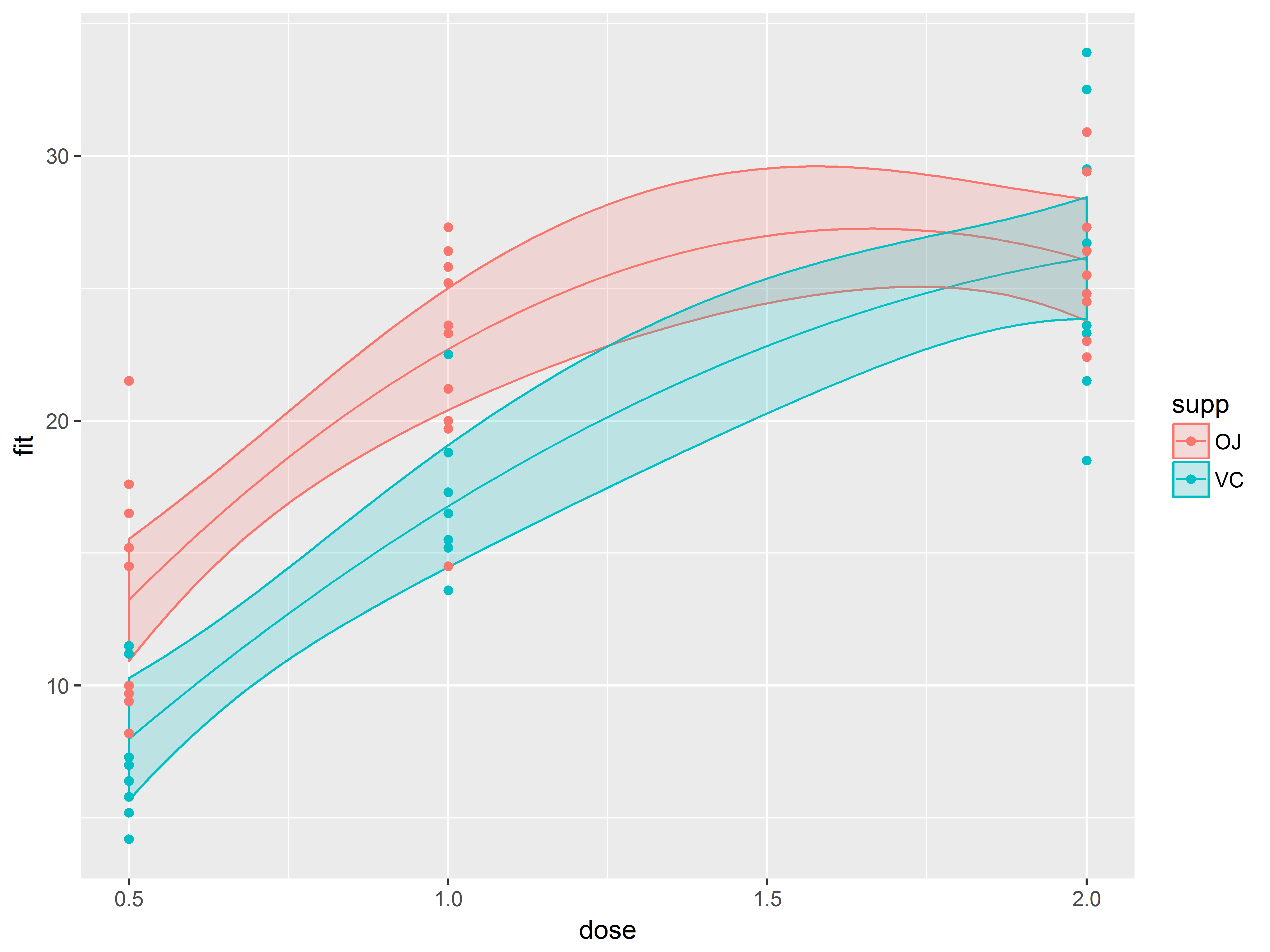
Our planned plot will show the model predicted values of tooth length across a range of doses from 0.5 to 2 for both supplement types.
Again, we build the plot layer by layer:
- In
ggpplot() we map dose to x, fit to y and supp to color.
- A
geom_line() layer to visualize the predicted curves.
#fit curves by supp
p1.0 <- ggplot(newdata, aes(x=dose, y=fit, color=supp)) +
  geom_line()
p1.0
Add confidence bands with geom_ribbon()
Next we add layer for the confidence bands.
geom_ribbon() requires the aesthetics ymax and ymin, which we map to upr and lwr, respectively. We specify that fill colors of the ribbons are mapped to supp as well (otherwise they will be filled black).
#add confidence bands
p1.1 <- p1.0 + geom_ribbon(aes(ymax=upr, ymin=lwr, fill=supp))
p1.1
Oops! The fill color has obscured everything. We set (outside of aes()) the alpha (transparency) level of geom_ribbon() to a constant of 1/5.
#make confidence bands transparent
#alpha=1/5 means that 5 objects overlaid will be opaque
p1.2 <- p1.0 + geom_ribbon(aes(ymax=upr, ymin=lwr, fill=supp),
                           alpha=1/5)
p1.2
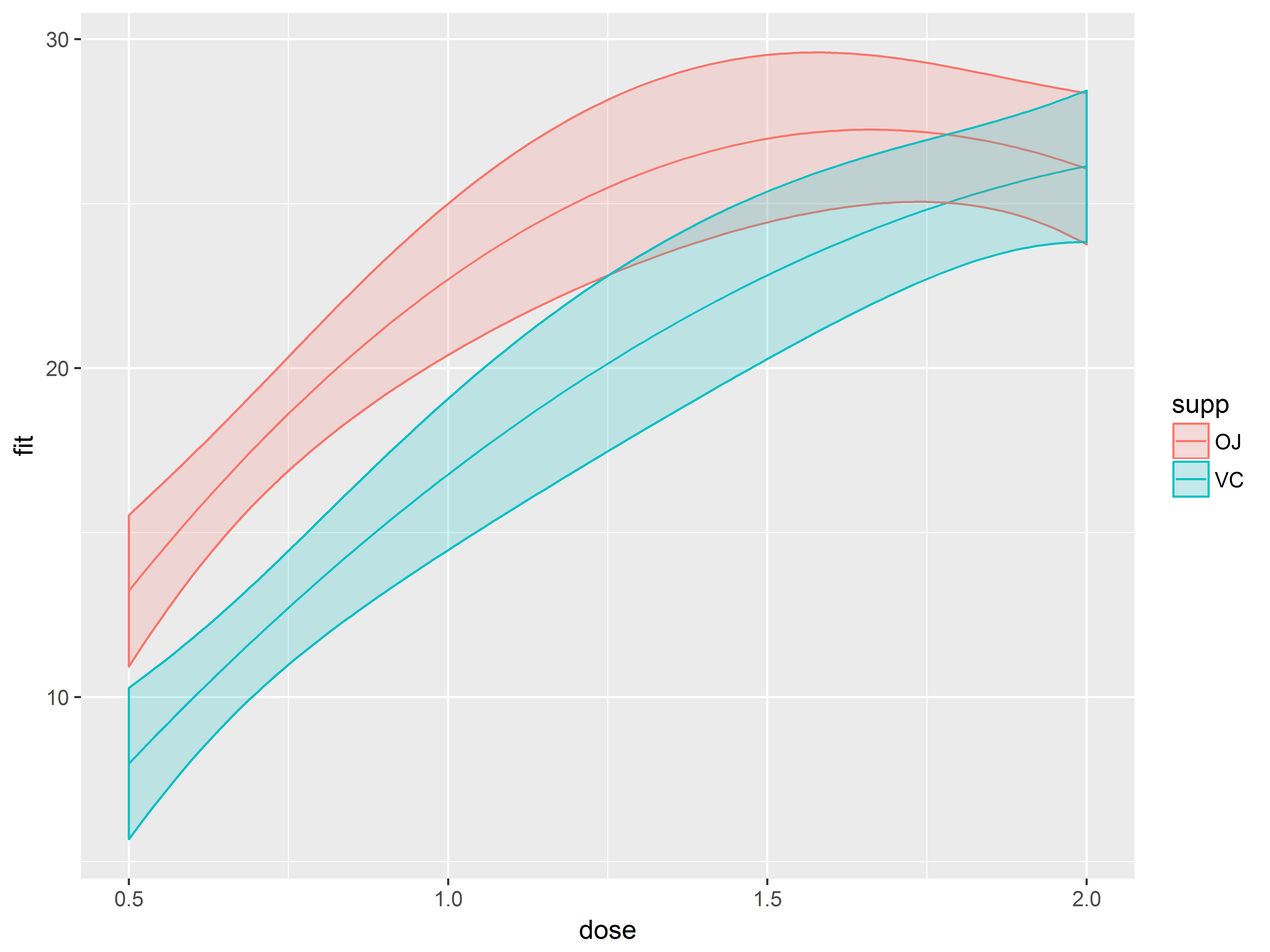
Adding original data (in a different dataset) to the graph
As a final layer to the graph, we decide to overlay a scatter plot of the original data, which is located in our original dataset, ToothGrowth. Fortunately, you can change the dataset in a ggplot2 plot.
In geom_point() we respecify the data to be ToothGrowth to override newdata, and respecify the y aesthetic to len to override fit.
#overlay observed data, changing dataset and y aesthetic to observed outcome
p1.3 <- p1.2 +  geom_point(data=ToothGrowth, aes(y=len))
p1.3
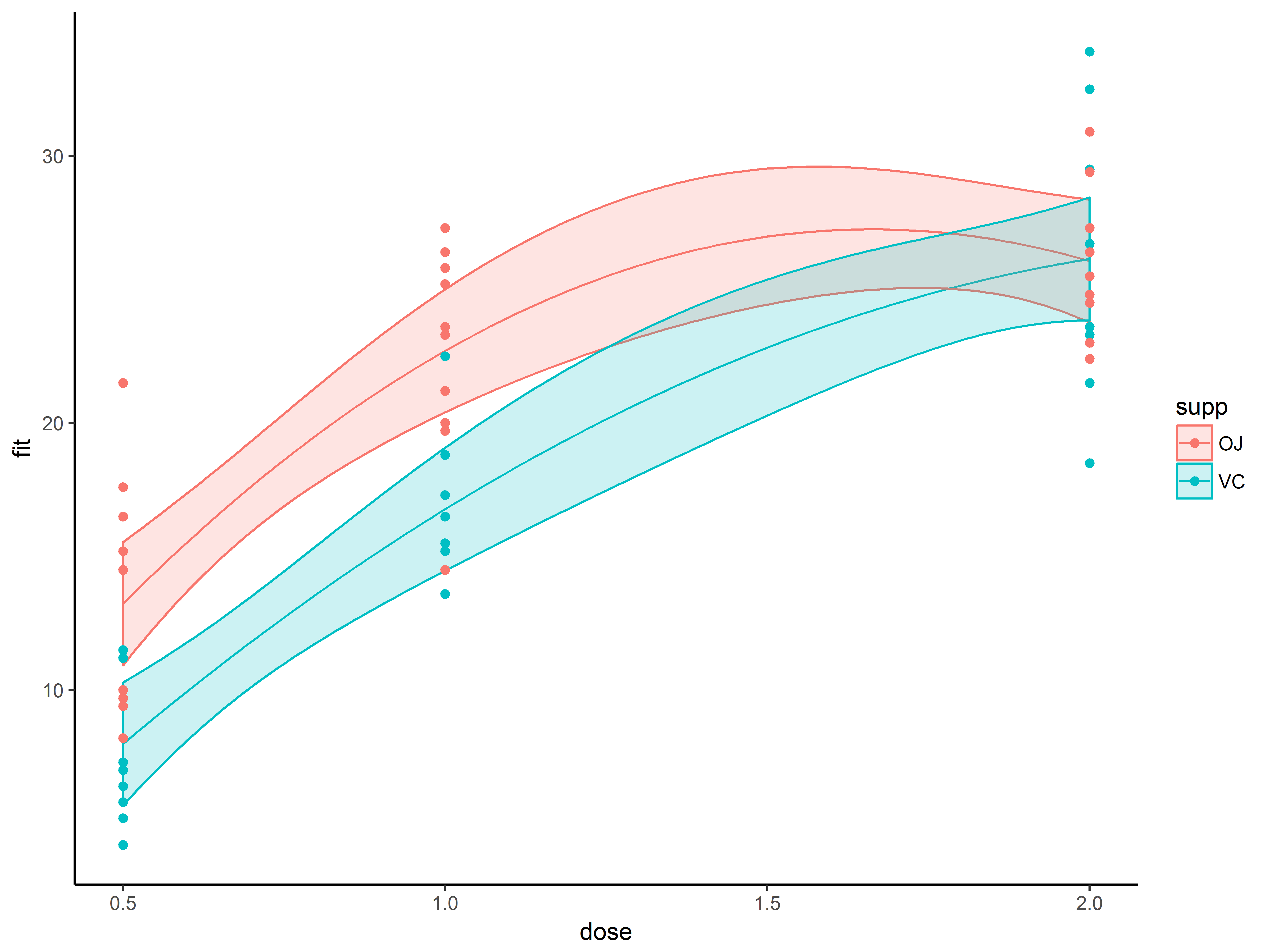
Finishing the graph: adjusting theme and theme elements
Finally, we make a few non-data related changes to the graph.
The ggplot2 package provides a few built-in themes (see here for a full list), which make several changes to the overall background look of the graphic.
First we change the overall look of a graph with such a built-in theme, theme_classic(), which replaces the gray background and white gridlines with a white background, no grid lines, no border on the top or right. This theme mimics the look of base R graphics.
#overlay observed data
p1.4 <- p1.3 + theme_classic()
p1.4
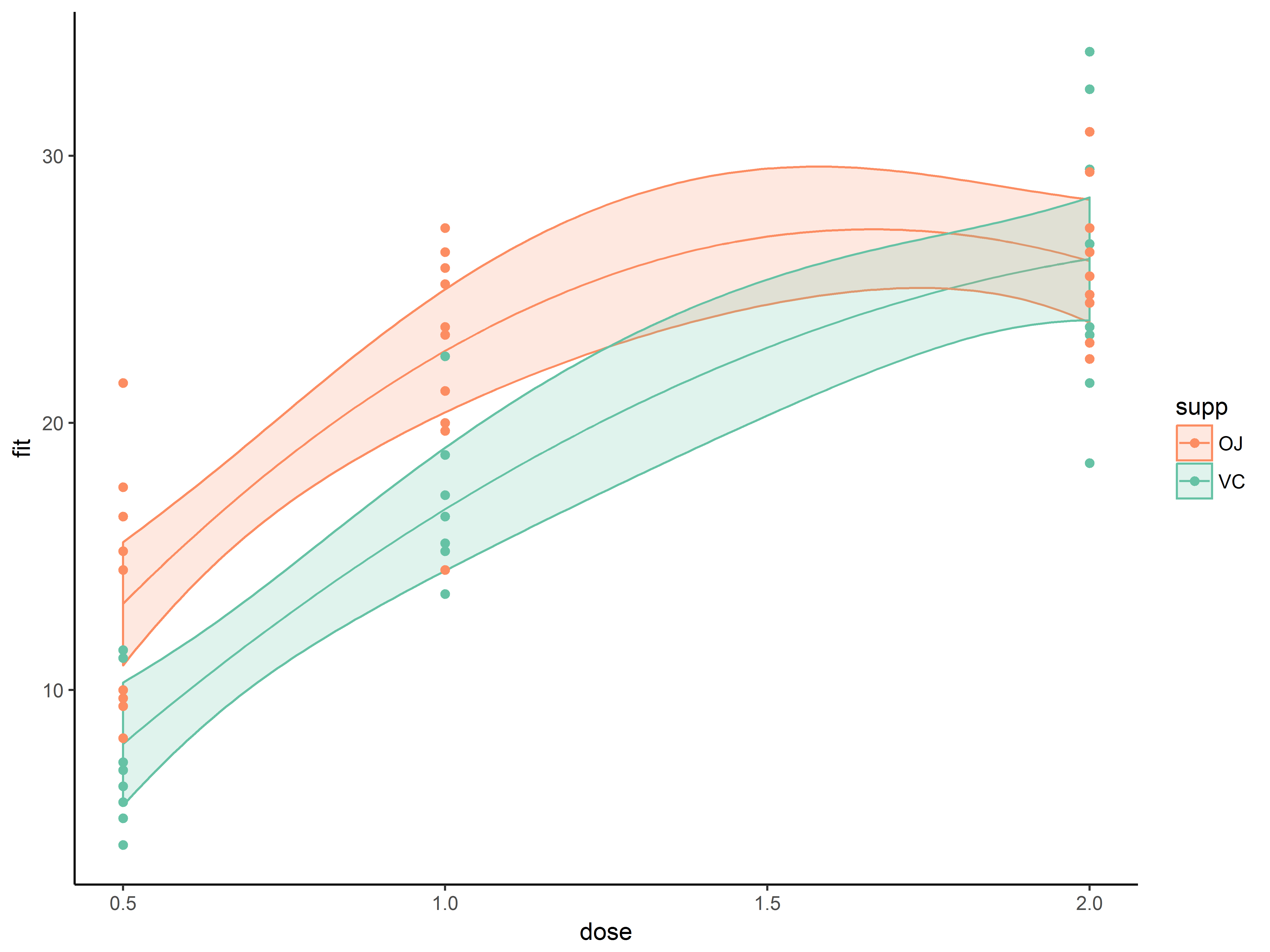
Next we change the color of the “OJ” group to a more obvious orange.
scale_fill_manual() and scale_color_manual() allow color specification through hexadecimal notation (often called color hex codes, # follwed by 6 alphanumeric characters).
On the Color Brewer website, are many ready-to-use color scales with corresponding color hex codes. We find a qualitative scale we like(“Set2”) with an orange, hex code “#fd8d62”, and a complementary green, hex code “#66c2a5”.
We apply these orange-green colors scales to both the color aesthetic (color of points, fit line and the borders of ribbon), and to the fill aesthetic (fill color of the confidence bands)
#specify hex codes for orange, #fc8d62, and green #66c2a5
p1.5 <- p1.4 +
  scale_color_manual(values=c("#fc8d62", "#66c2a5")) +
  scale_fill_manual(values=c("#fc8d62", "#66c2a5"))
p1.5
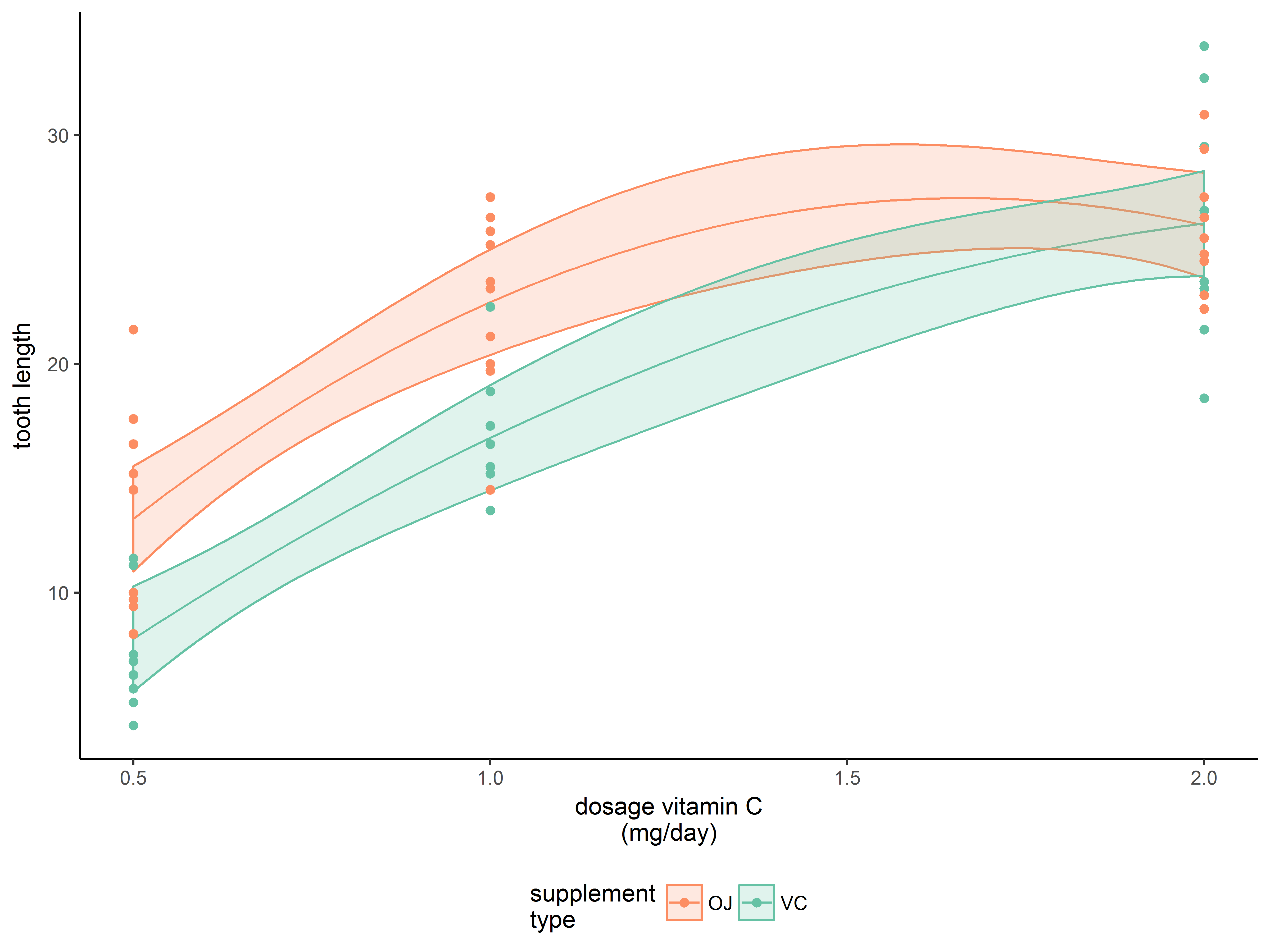
Finally, we use labs() to make the axes and guide titles more descriptive. The “\n” is a newline. We also move the guide (legend) to the bottom with theme.
#note the default text justifications for the x-axis vs guide
p1.6 <- p1.5 + labs(x="dosage vitamin C\n(mg/day)",
                    y="tooth length", fill="supplement\ntype",
                    color ="supplement\ntype") +
  theme(legend.position="bottom")
p1.6
Here is the full code for the above graph:
#FULL CODE FOR THE ABOVE GRAPH
ggplot(newdata, aes(x=dose, y=fit, color=supp)) +
  geom_line() +
  geom_ribbon(aes(ymax=upr, ymin=lwr, fill=supp), alpha=1/5) +
  geom_point(data=ToothGrowth, aes(x=dose, y=len)) +
  theme_minimal() +
  scale_color_manual(values=c("#fc8d62", "#66c2a5")) +
  scale_fill_manual(values=c("#fc8d62", "#66c2a5")) +
  labs(x="dosage vitamin C\n(mg/day)", y="tooth length",
       fill="supplement\ntype",
       color ="supplement\ntype") +
  theme(legend.position="bottom")
Recap of Example 1
- Build graphs layer-by-layer
- Use exploratory graphs to characterize the sample and to inspect relationships between model variables.
- The
stat_summary() function greatly simplifies plotting means and other summaries.
- You can change global aesthetics using
aes() outside of any layer
- Assess model assumptions with diagnostic plots.
- You can plot from multiple datasets on the same graph!
- Use built-in themes to change the overall look of a graph
Example 2
Purpose of example 2
This example shows how a little data management may help you get the graph you want, and demonstrates splitting a plot along faceting variables. Bar graphs are heavily covered in this section.
The esoph dataset
The esoph dataset:
- loaded with the
datasets package
- comes from a case-control study of the risk of alcohol and tobacco use in predicting esophageal cancer.
- consists of 88 “grouped” observations, which record the number of cases (with cancer) and controls (without cancer) who fall in the same classes of age, alcohol use, and tobacco use.
Variables in the dataset:
- agegp: ordered factor, age group, 6 levels (25-34, 35-44, etc.)
- alcgp: ordered factor, alcohol consumption gm/day, 4 levels (0-39, 40-79, etc.)
- tobgp: ordered factor, tobacco consumption gm/day, 4 levels (0-9, 10-19, etc.)
- ncases: numeric, number of cases
- ncontrols: numeric, number of controls
Here is a look at the dataset:
#structure of esoph
str(esoph)
## 'data.frame':    88 obs. of  5 variables:
##  $ agegp    : Ord.factor w/ 6 levels "25-34"<"35-44"<..: 1 1 1 1 1 1 1 1 1 1 ...
##  $ alcgp    : Ord.factor w/ 4 levels "0-39g/day"<"40-79"<..: 1 1 1 1 2 2 2 2 3 3 ...
##  $ tobgp    : Ord.factor w/ 4 levels "0-9g/day"<"10-19"<..: 1 2 3 4 1 2 3 4 1 2 ...
##  $ ncases   : num  0 0 0 0 0 0 0 0 0 0 ...
##  $ ncontrols: num  40 10 6 5 27 7 4 7 2 1 ...
#head of esoph
head(esoph)
##   agegp     alcgp    tobgp ncases ncontrols
## 1 25-34 0-39g/day 0-9g/day      0        40
## 2 25-34 0-39g/day    10-19      0        10
## 3 25-34 0-39g/day    20-29      0         6
## 4 25-34 0-39g/day      30+      0         5
## 5 25-34     40-79 0-9g/day      0        27
## 6 25-34     40-79    10-19      0         7
In the first row we see that there were 0 cases and 40 controls in the group consisting of subjects of age 25-34, alcohol consumption 0-39g/day, and tobacco consumption 0-9g/day.
The grouped data structure here is common for case-control designs.
Example 2 Exploratory analysis
In this study the outcome, case vs. control, is binary. Typically, we use statistical models to estimate the probability of a binary outcome.
To visualize the probability of being a case (having cancer), we can proceed in a couple of ways:
- We can calculate the probability of being a case as prob=ncases/(ncases+ncontrols) and plot the probability directly
- We can plot both ncases and ncontrols on the same graph to compare them
Although using the first method is certainly simple and effective, we proceed with the second method to illustrate more ggplot2 methods.
Use stat= to change what geom_bar() is plotting
We have previously used geom_bar() to plot frequencies of a discrete variable mapped to the aesthetic y.
We can use geom_bar() here to plot the frequencies of cases across alcohol groups, but there is a complication.
In geom_bar(), the default is stat=bin, which counts the number of observations that fall into each value of the variable mapped to x (alcgp). However, here ncases represents the number of observed cases. In other words, the data are already binned.
By respecifying stat="identity", geom_bar() will plot the values stored in the variable mapped to y (ncases).
geom_bar() is smart enough to sum ncases across groups with the same value of alcgp.
#"stat=identity" plots the value of the variable mapped to "y" (ncases) as is
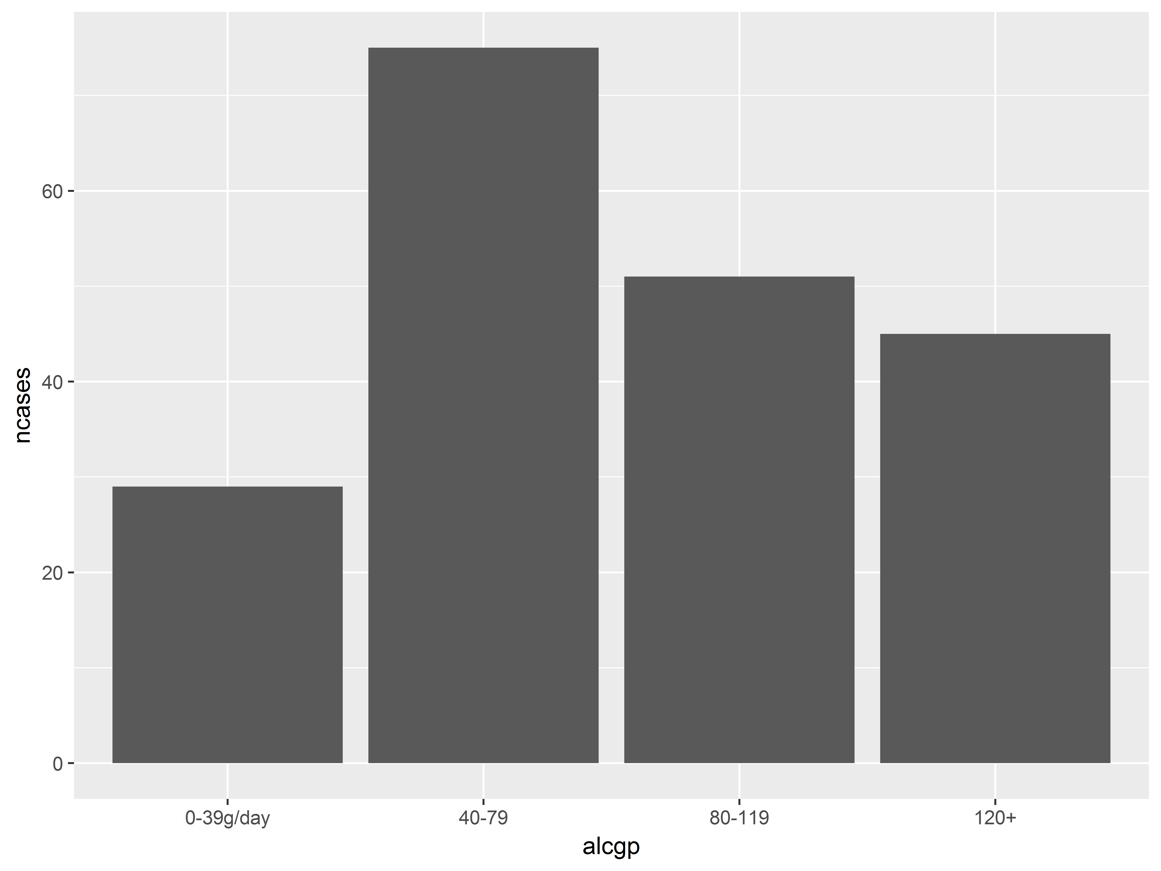
ggplot(esoph, aes(x=alcgp, y=ncases)) +
geom_bar(stat="identity")
While the above graph is fine, we can’t glean the probability of being a case without seeing the number of controls for each group. We would like to map both ncases and ncontrols to y, but we cannot. How do we add ncontrols to the bar plot above?
Using gather() to stack ncases and ncontrols into one column
Our goal, then, is to get ncases and ncontrols into a single “n” variable that we can map to y. If we label each “n” value as “case” or “control”, we can then map the labelling variable to color to distinguish cases from controls on the graph. The gather() function, loaded with tidyverse (package tidyr), reshapes a set of column headings into a “key” variable and then stacks the values in those columns into a “value” variable.
Arguments to gather():
- the dataset
key=: name of the new column that will hold the values of the selected column headingsvalue=: the name of the new column that will hold the stacked values of the selected columns- the names of the columns to be reshaped
Here, we want to stack the values in the ncontrols and ncases columns. We will call the new key variable that codes case/control “status”, while the new variable that holds the stacked values will be called “n”.
#gather ncontrols and ncases into a single column, "n"
#labels will be in column "status"
esoph_long <- gather(esoph, key="status", value="n", c(ncases, ncontrols))
#sort data before viewing (arrange from package dplyr)
esoph_long <- arrange(esoph_long, agegp, alcgp, tobgp)
#we can see the stacking of ncases and ncontrols
head(esoph_long)
##   agegp     alcgp    tobgp    status  n
## 1 25-34 0-39g/day 0-9g/day    ncases  0
## 2 25-34 0-39g/day 0-9g/day ncontrols 40
## 3 25-34 0-39g/day    10-19    ncases  0
## 4 25-34 0-39g/day    10-19 ncontrols 10
## 5 25-34 0-39g/day    20-29    ncases  0
## 6 25-34 0-39g/day    20-29 ncontrols  6
Now we have one column, n, which we can map to y, and we can use status as a fill color for the plot.
Don’t be afraid to do a little data management to get the graph you want.
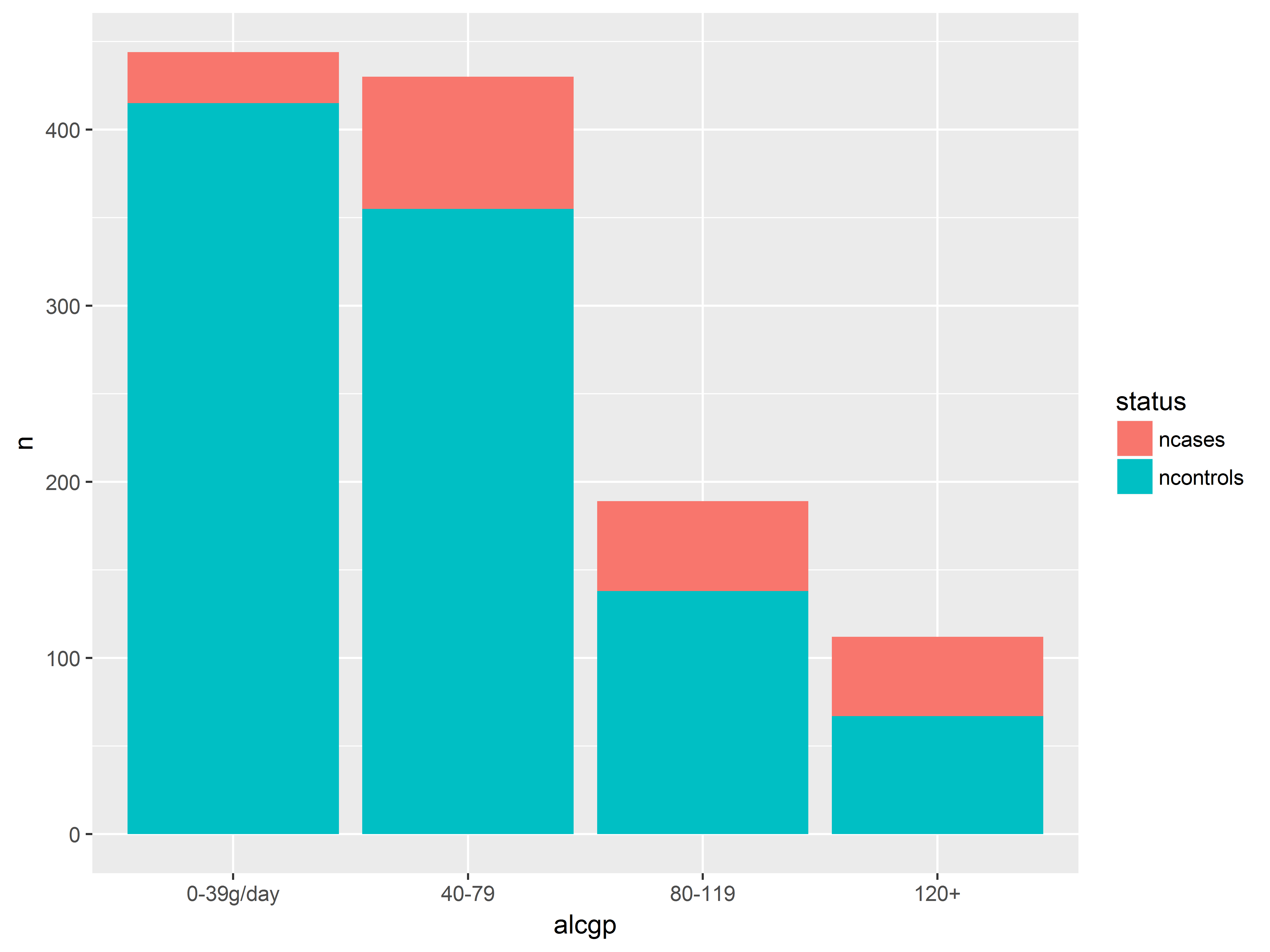
Putting ncases and ncontrols on the same graph
We now plot counts of cases and controls across alcohol groups on the same graph.
We again use geom_bar() and stat=identity to plot the values stored in y=n. However, now status will also be mapped to fill color of the bars.
Notice that the resulting bars are stacked.
#put n for cases and controls on the same bar graph
ggplot(esoph_long, aes(x=alcgp, y=n, fill=status)) +
  geom_bar(stat="identity")
Counts of both cases and controls on the same graph help us to visualize probabilities.
We have more light drinkers than heavy drinkers in the dataset (overall height of bars). Probability of being a case seems to increase with alcohol consumption (red takes up proportionally more as we move right).
Position adjustments
When 2 graphical objects are to be placed in the same or overlapping positions on the graph, we have several options, called “position adjustments”, for placement of the objects:
dodge: move elements side-by-side,fill: stack elements vertically, standardize heights to 1identity: no adjustment, objects will overlapjitter: add a little random noise to positionstack: stack elements vertically
These options are specified in a “position” argument (in a geom or stat). For geom_bar(), by default “position=stack”, producing stacked bars. For geom_point(), by default “position=identity” for overlapping points.
The next few graphs demonstrate the utility of position adjustments for bar graphs.
position=stack, the default, stacks the graphics and visualizes both proportions and counts.
#by default, geom_bar uses position="stack"
#looks same as above
ggplot(esoph_long, aes(x=alcgp, y=n, fill=status)) +
  geom_bar(stat="identity", position="stack")
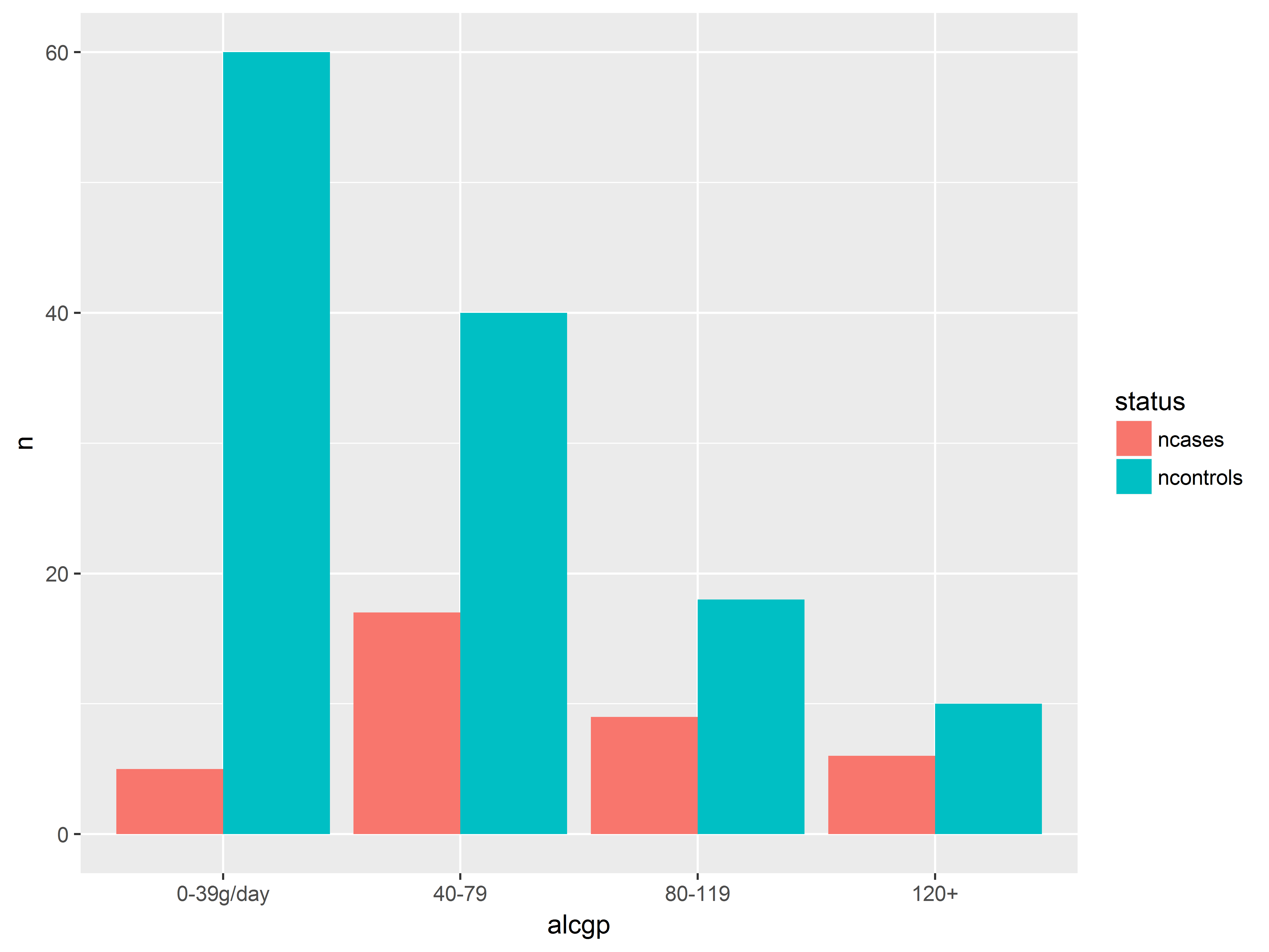
position=dodge dodges the graphics side-by-side, allowing us to compare counts better.
#position = dodge move bars to the side
ggplot(esoph_long, aes(x=alcgp, y=n, fill=status)) +
  geom_bar(stat="identity", position="dodge")
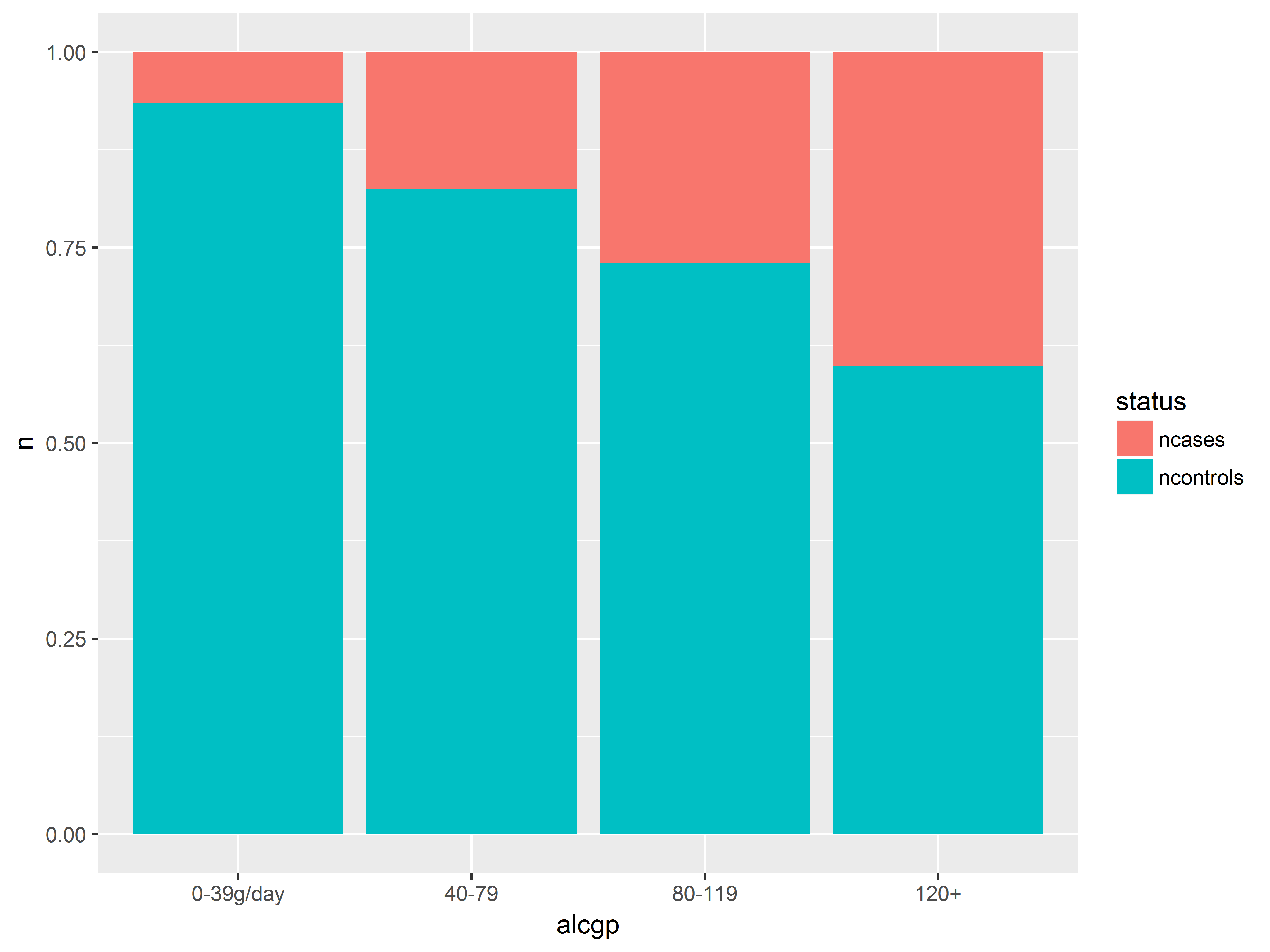
position=fill standardizes the height of all bars and allows us to compare proportions (probabilities) better.
#position = fill stacks and standardizes height to 1
ggplot(esoph_long, aes(x=alcgp, y=n, fill=status)) +
  geom_bar(stat="identity", position="fill")
position=identity puts the grapics in the same position and will obscure one of the groups.
#position = identity overlays, obscruing "ncases"
ggplot(esoph_long, aes(x=alcgp, y=n, fill=status)) +
  geom_bar(stat="identity", position="identity")
position=jitter for scatter plots
Jittering is typically used to separate overlaid continuous values by adding a tiny bit of noise to each value. We revisit the ToothGrowth example from Example 1 to show jittering.
#jittering moves points a little away from x=0.5, x=1 and x=2
ggplot(ToothGrowth, aes(x=dose, y=len, fill=supp)) +
  geom_point(position="jitter")
Graphing observed probabilities
We are interested in visualizing the probability of being a case (having esophogeal cancer), for different classes of age, alcohol use and tobacco use.
As we just saw above, using position="fill" in geom_bar() stacks overlapping groups and standardizes the height of all bars to 1, creating a visual representation of a proportion or probability.
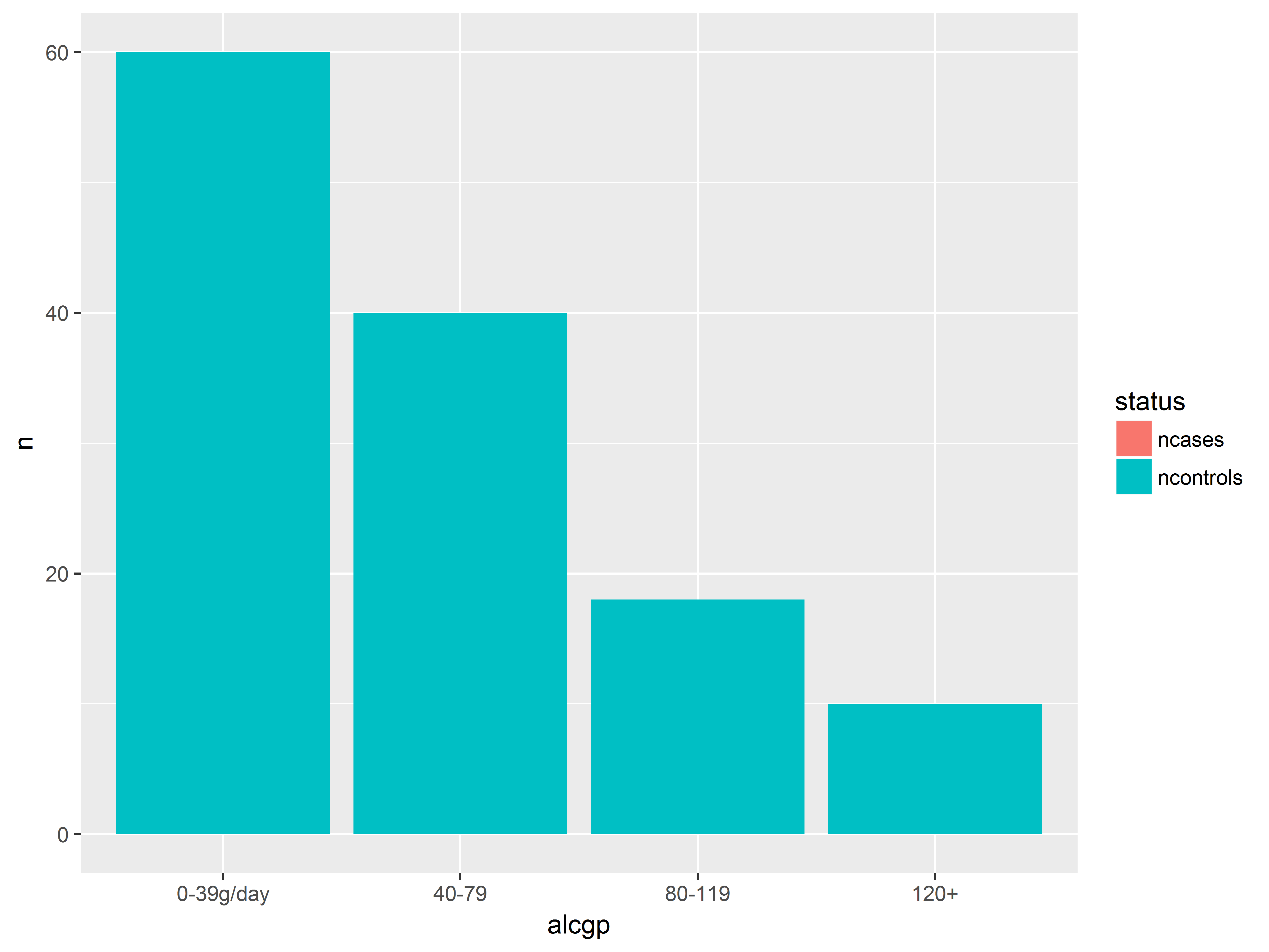
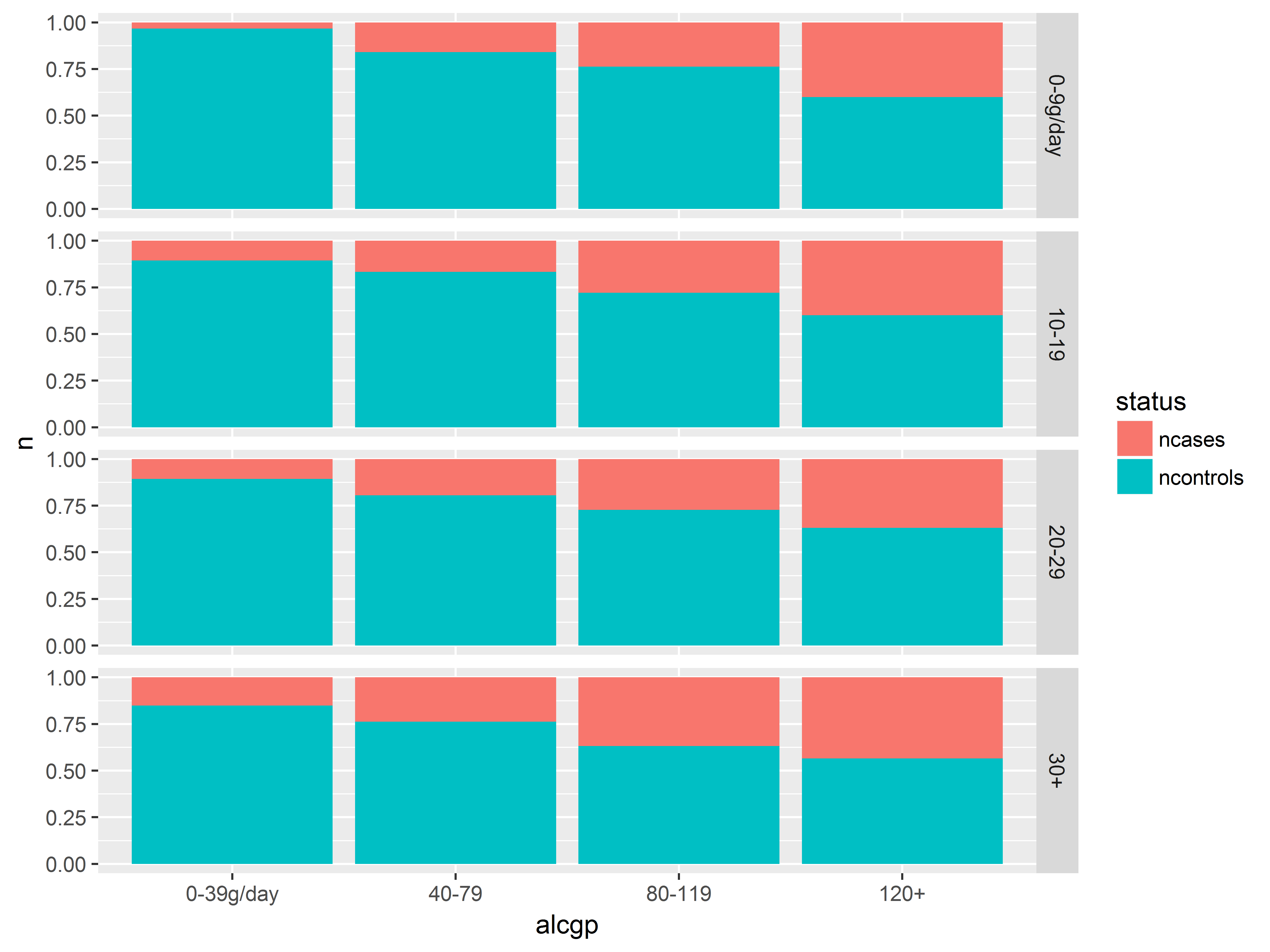
Here we visualize the probabilities of being a case across alcohol groups. Remember that proportions and not counts are plotted in this bar graph.
#alcohol group
#plot saved to object an
an <- ggplot(esoph_long, aes(x=alcgp, y=n, fill=status)) +
  geom_bar(stat="identity", position="fill")
an
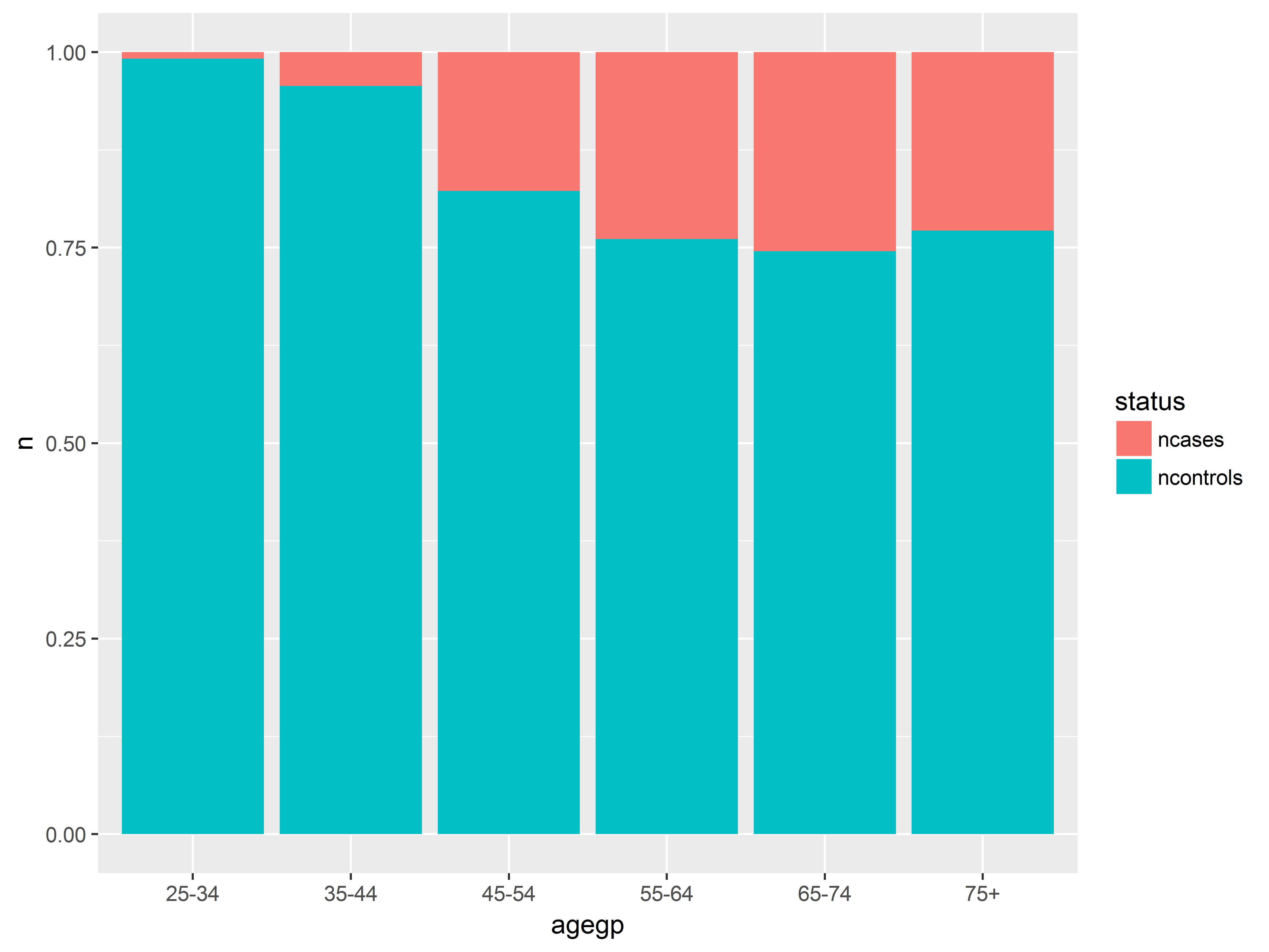
Now that we have our graphed stored in object an, we can easily create a new graph with a different x-axis variable by simply respecifying the x aesthetic in aes(). Here we look at probabilities across age groups.
#age group instead of alcohol consumption
an + aes(x=agegp)
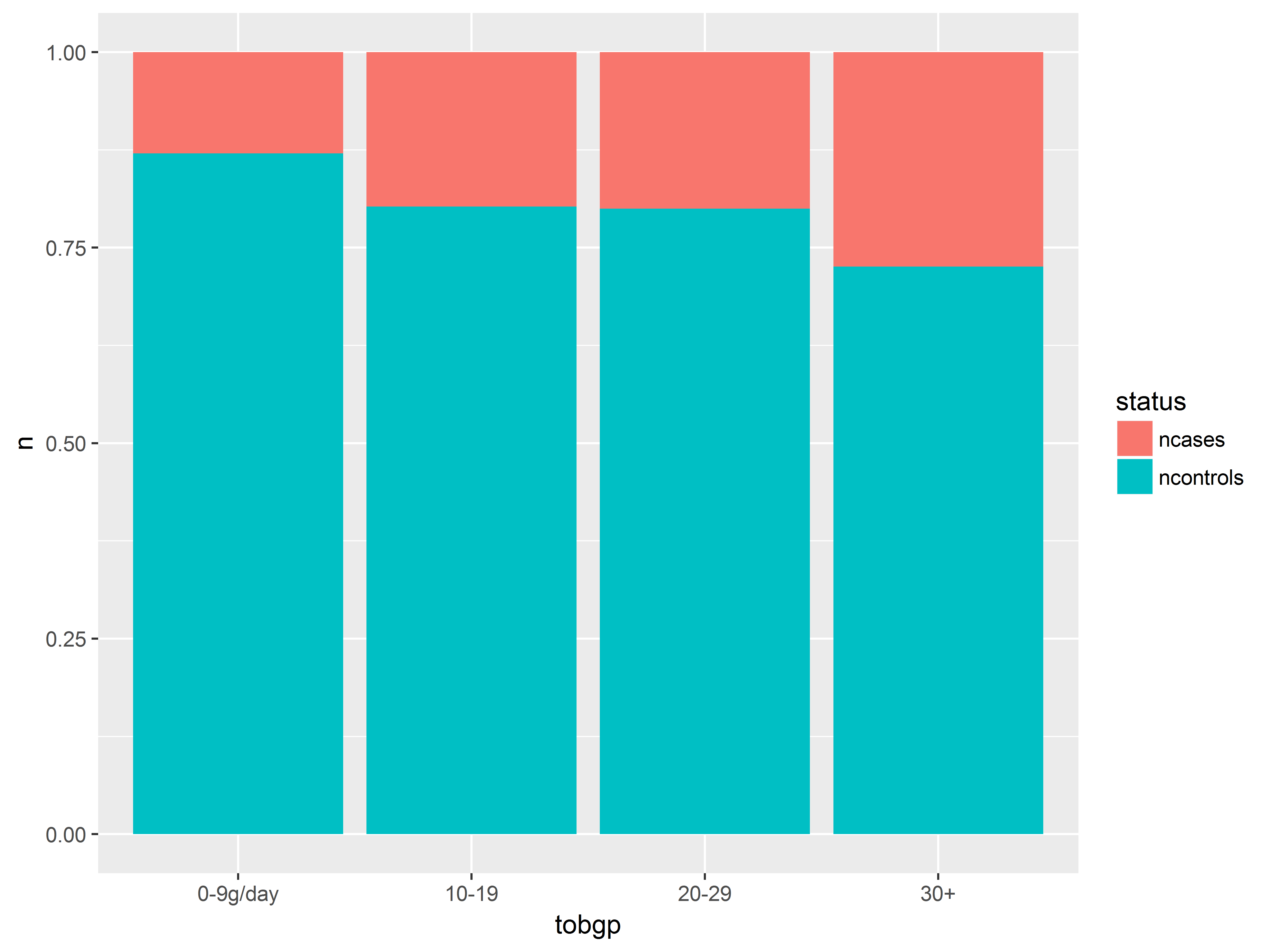
And here we look at tobacco consumption.
#tobacco consumption instead of agegp
an + aes(x=tobgp)
The probability of having esophogeal cancer seems to increase with all 3 predictors, most clearly with alcgp. The agegp relationship appears possibly non-linear.
Visualizing interactions by faceting
Is the effect of alcohol consumption the same for each age group? Does the effect of tobacco consumption become more severe if alcohol consumption is high?
These questions address interaction or nested effects (aka moderation) – the dependence of one variable’s effect on the level of another variable.
To visualize an interaction, then, we want to show the effect of one variable stratified across levels of another variable.
ggplot2 makes stratifying a graph easy through its faceting functions, facet_wrap() and facet_grid().
Before, we created a bar graph of probabilities of being a case by alcohol consumption. Let’s facet (stratify) that graph by tobacco consumption.
Remember that in facet_grid(), variables specified before ~ are used to split the rows, while variables specified after are used to split the columns.
#tobgp to split rows, no splitting along columns
an + facet_grid(tobgp~.)
The panels look rather similar - the alcohol consumption effect does not seem to change much across tobacco groups.
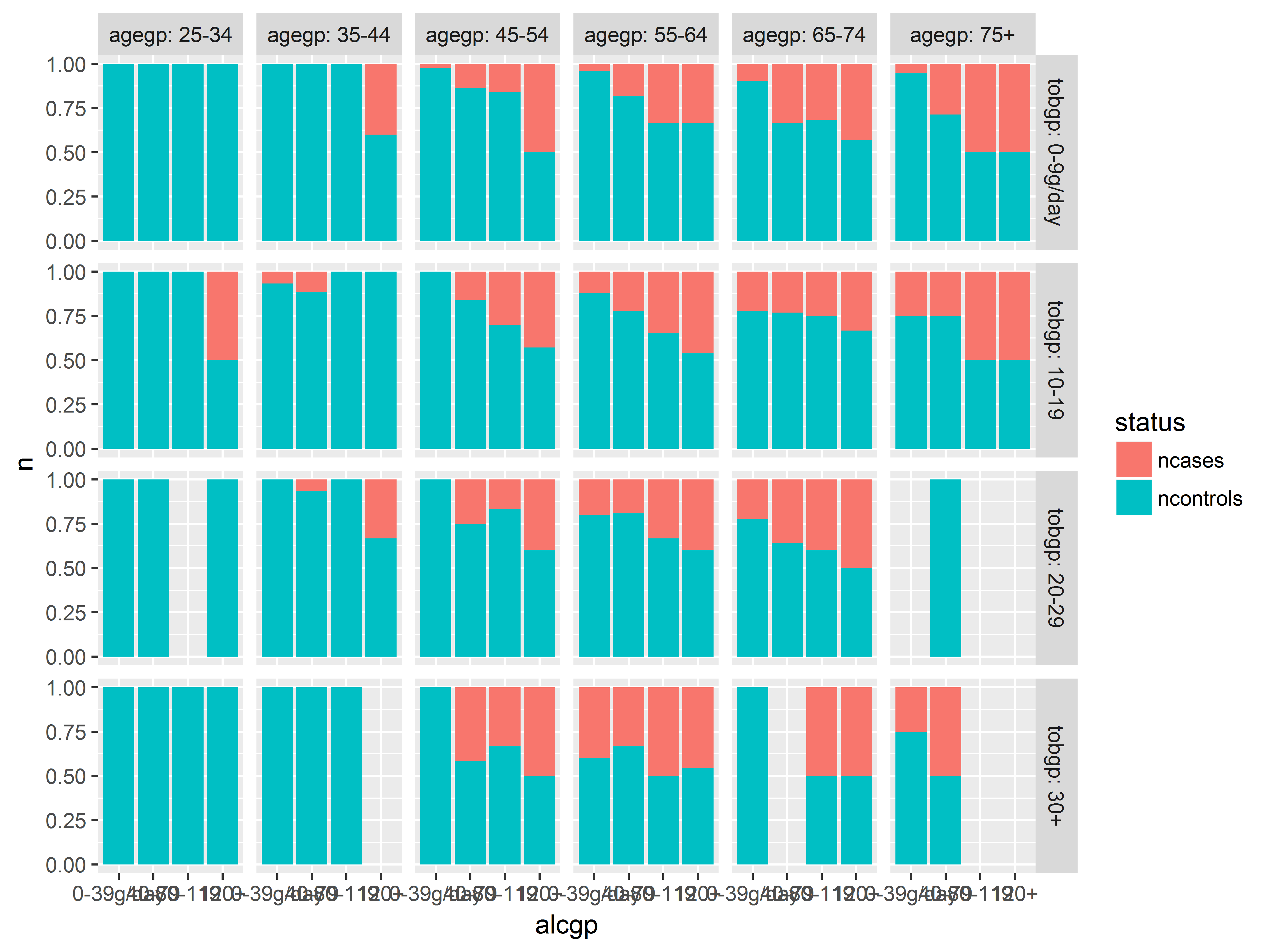
Faceting by 2 variables
Faceting on two variables can visualize a three-way interaction.
We split the previous graph along the columns by adding agegp after the ~. The code labeller="label_both" adds both the factor name and the value for each facet label.
#3-way interaction visualization
an + facet_grid(tobgp~agegp, labeller="label_both")
More alcohol, old age, and more tobacco usage all seems to predict being a case – we see more red on the right bars in each plot, as we move down rows and we move right across columns. No clear indication of interactions (but see next slide).
In the highest smoking groups, 30+/day (bottom row), the 2 youngest age groups, 25-34 and 35-44 (2 left columns) had no cases at all, regardless of drinking. Does young age offer some protection against (moderate) the effects of alcohol and tobacco?
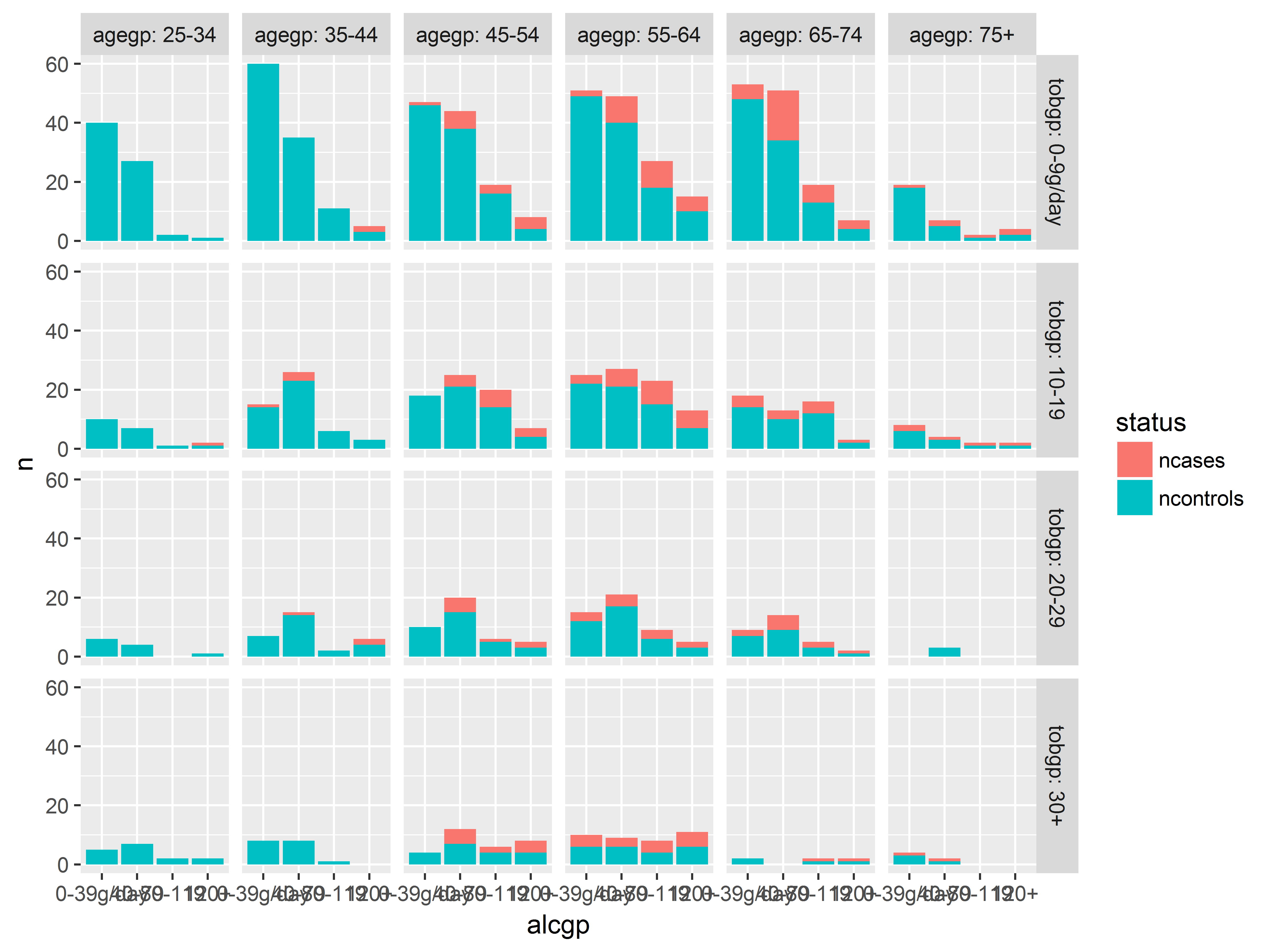
Before we break out the cigarettes and whiskey, let’s check our sample sizes in each of these groups.
We change to position=stack to get stacked counts.
#stacked counts
ggplot(esoph_long, aes(x=alcgp, y=n, fill=status)) +
  geom_bar(stat="identity", position="stack") +
  facet_grid(tobgp~agegp, labeller="label_both")
Very few heavy smokers or heavy drinkers were studied in the youngest 2 age groups.
Logistic regression model
For simplicity, imagine our plan is to use logistic regression to model only linear effects of age, alcohol consumption and tobacco consumption on the probability of having esophogeal cancer.
In glm(), we use as.numeric() to treat the predictors as continuous, which will model just linear effects. If left as unordered factors, R will model orthogonal polynomial effects.
#change to numeric to model just linear effects of each
logit2 <- glm(cbind(ncases, ncontrols) ~ as.numeric(agegp) +
              as.numeric(alcgp) + as.numeric(tobgp),
              data=esoph, family=binomial)
summary(logit2)
##
## Call:
## glm(formula = cbind(ncases, ncontrols) ~ as.numeric(agegp) +
##     as.numeric(alcgp) + as.numeric(tobgp), family = binomial,
##     data = esoph)
##
## Deviance Residuals:
##     Min       1Q   Median       3Q      Max
## -1.9586  -0.8555  -0.4358   0.3075   1.9349
##
## Coefficients:
##                   Estimate Std. Error z value Pr(>|z|)
## (Intercept)       -5.59594    0.41540 -13.471  < 2e-16 ***
## as.numeric(agegp)  0.52867    0.07188   7.355 1.91e-13 ***
## as.numeric(alcgp)  0.69382    0.08342   8.317  < 2e-16 ***
## as.numeric(tobgp)  0.27446    0.08074   3.399 0.000676 ***
## ---
## Signif. codes:  0 '***' 0.001 '**' 0.01 '*' 0.05 '.' 0.1 ' ' 1
##
## (Dispersion parameter for binomial family taken to be 1)
##
##     Null deviance: 227.241  on 87  degrees of freedom
## Residual deviance:  73.959  on 84  degrees of freedom
## AIC: 229.44
##
## Number of Fisher Scoring iterations: 4
We are happy with this model and can proceed to model diagnostics.
Influence diagnsotic plot
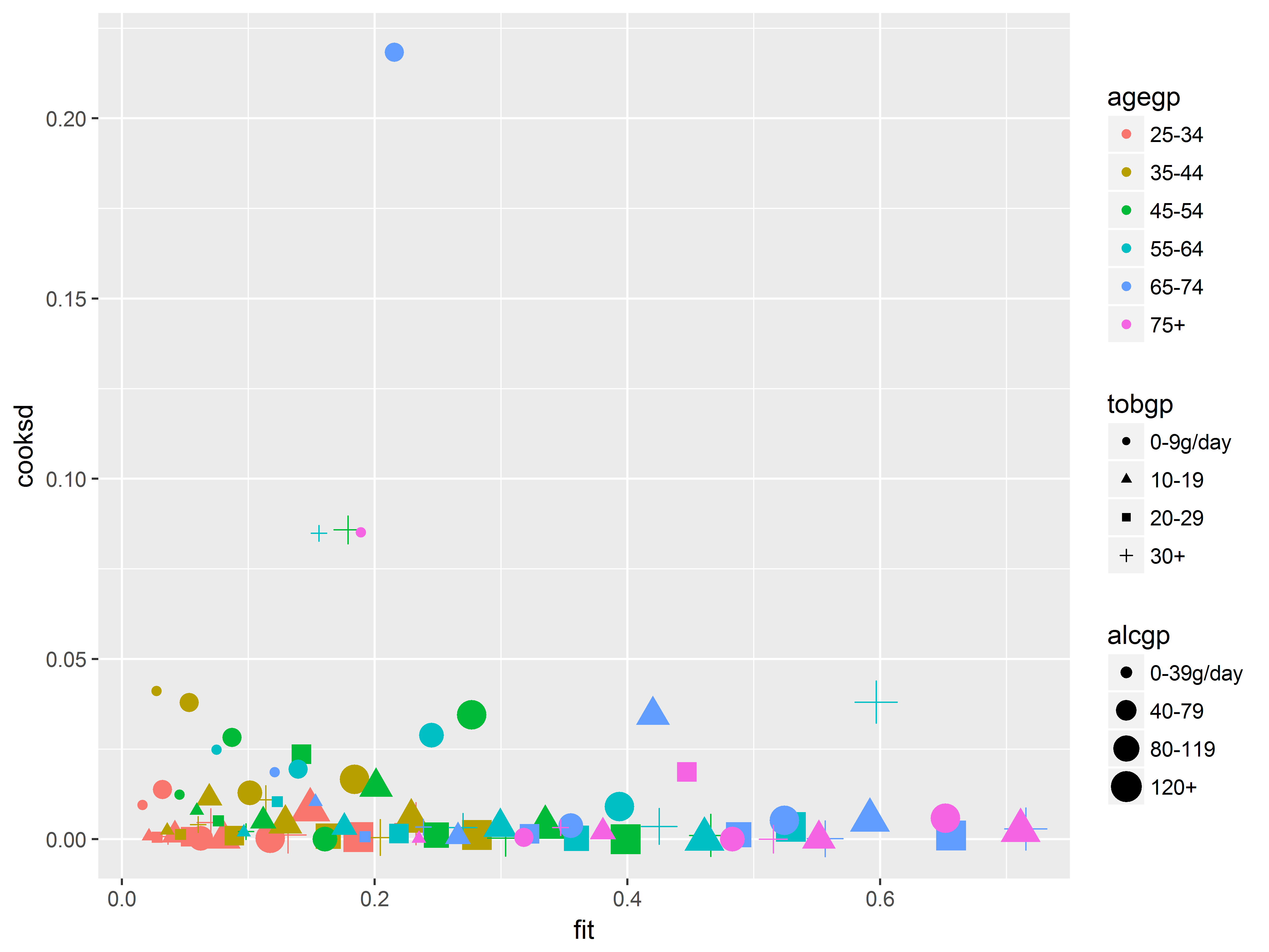
Now we will create an influence diagnostic plot, to illustrate putting many variables on the same plot.
Cook’s D assesses the overall influence of an observation by measuring the change on the overall fit of the model if that observation were deleted. We should be wary of interpreting model results if they are driven by one or a handful of observations. One recommended influence diagnostic plot is predicted probabilities (fitted values) vs Cook’s D.
Here we show that we can easily identify which predictor groups are heavily influential by mapping those predictors to graphical aesthetics. From this graph, we can easily discern which age, alcohol consumption, and tobacco consumption groups are most influential.
#get predicted probabilities and Cook's D
esoph$fit <- predict(logit2, type="response")
esoph$cooksd <- cooks.distance(logit2)

#fitted vs Cooks D, colored by age, sized by alcohol, shaped by tobacco
ggplot(esoph, aes(x=fit, y=cooksd,
                  color=agegp, size=alcgp, shape=tobgp)) +
  geom_point()
We should inspect the observation with the outlying Cook’s D value above 0.2, which we can easily identify as age 65-74, 0-9g/day tobacco, and 40-79g/day alcohol based on its color, shape, and size.
Example 2: Customizing a black-and-white plot for presentation
Our planned graph for presentation will show how the model predicted probabilities of esophogeal cancer varies with all 3 risk factors, age, alcohol and tobacco.
Imagine we are constrained to colorless images, so we cannot use color or fill.
Predicted probabilities will be mapped to y, and we map tobgp to x (this produces the best-looking graph). Faceting by the other 2 risk factors would produce too many plots to fit in a journal article figure, so we will facet only by one variable, agegp. We map alcgp to alpha transparency, to create a grayscale in place of a color scale.
We previously obtained the predicted probabilities with predict() for the Cook’s D vs fitted values graph, so we have all the variables we need.
Here is are first few layers of this graph. Inside geom_point() we set the size of all markers to be larger than the default.
Starting graph
#starting graph
p2.0 <- ggplot(esoph, aes(x=tobgp, y=fit,
                          alpha=alcgp, group=alcgp)) +
  geom_point(size=3) +
  facet_grid(~agegp)
p2.0
Using element_blank() to remove graphics from a plot color
Recall that we can remove theme elements from a graph by setting them to element_blank().
Let’s remove the background color in the plotting area to make the lighter points easier to see using theme element panel.background.
We also remove the gray in the facet headings, strip.background, and the axis ticks, axis.ticks, to clean up the graph.
However, the predicted probabilities need some guide, so we will also add back some panel grid lines on the y-axis. These grid lines are specified by theme element panel.grid.major.y, which we control with element_line(). Here we specify that they be a light gray color.
All of these changes are made within theme().
#in theme
# remove things with element_blank()
# gray0 is black and gray100 is white
p2.1 <- p2.0 +
  theme(panel.background=element_blank(),
        strip.background=element_blank(),
        axis.ticks=element_blank(),
        panel.grid.major.y=element_line(color="gray90"))
p2.1
Changing guide titles and fonts
Next we fix the guide (legends and axes) titles with labs(). Notice how we give a title to the guide by specifying the aesthetic (x, alpha, etc.).
We also standardize all the font sizes and families in theme() by setting various theme elements to element_text.
The x-axis tick labels (axis.text.x) are rotated for clarity using angle=90.
#Set titles with labs
#set fonts and sizes with theme
p2.2 <- p2.1 +
  labs(title="age group",
       x="tobacco use(g/day)",
       y = "predicted probability of esophogeal cancer",
       alpha="alcohol\nuse(g/day)") +
  theme(plot.title=element_text(family="serif", size=14),
        axis.title=element_text(family="serif", size=14),
        legend.title=element_text(family="serif", size=14),
        strip.text=element_text(family="serif", size=10),
        legend.text=element_text(family="serif", size=10),
        axis.text.x=element_text(family="serif", size=8, angle=90))
p2.2
Changing guide labels using scale functions
Finally, we use scale_x_discrete() to fix the x-axis labels, and scale_alpha_discrete() to fix the legend labels.
We also use theme() again to move the legend to the bottom.
#Set titles with labs
#set fonts and sizes with theme
p2.3 <- p2.2 +
  scale_x_discrete(labels=c("0-9", "10-19", "20-29", "30+")) +
  scale_alpha_discrete(labels=c("0-39", "40-79", "80-119", "120+")) +
  theme(legend.position="bottom")
p2.3
And the full code for this plot:
#FULL CODE FOR ABOVE PLOT
ggplot(esoph, aes(x=tobgp, y=.pred, alpha=alcgp, group=alcgp)) +
  geom_point(size=3) +
  facet_grid(~agegp) +
  labs(title="age group",
       x="tobacco use(g/day)",
       y = "predicted probability of esophogeal cancer",
       alpha="alcohol\nuse(g/day)") +
  theme(panel.background = element_blank(),
        strip.background=element_blank(),
        panel.grid.major.y = element_line(color="gray90"),
        plot.title=element_text(family="serif", size=14),
        axis.title=element_text(family="serif", size=14),
        legend.title=element_text(family="serif", size=14),
        strip.text=element_text(family="serif", size=10),
        legend.text=element_text(family="serif", size=10),
        axis.text.x=element_text(family="serif", size=8, angle=90),
        legend.position="bottom",
        axis.ticks=element_blank()) +
  scale_x_discrete(labels=c("0-9", "10-19", "20-29", "30+")) +
  scale_alpha_discrete(labels=c("0-39", "40-79", "80-119", "120+"))
Example 3
Purpose of example 3
This section of the seminar is interactive.
We will use what we have learned in the seminar up to this point to create graphs together that will support our data analysis.
The sleepstudy dataset
The sleepstudy dataset:
- loaded with the
lme4 package
- comes from a study looking at the effects of successive nights of sleep deprivation on reaction times
- constists of 180 observations of 18 Subjects (repeated measures)
Three variables in sleepstudy:
Reaction: numeric, reaction time (ms)Days: numeric, number of days of sleep deprivation, 0 to 9Subject: factor, Subject id
#quick look at data structure
str(sleepstudy)
## 'data.frame':    180 obs. of  3 variables:
##  $ Reaction: num  250 259 251 321 357 ...
##  $ Days    : num  0 1 2 3 4 5 6 7 8 9 ...
##  $ Subject : Factor w/ 18 levels "308","309","310",..: 1 1 1 1 1 1 1 1 1 1 ...
Example 3: Analysis assuming independence of observations (simple linear regression)
Although we know that the data are repeated measures, we begin by analyzing the data as if the observations were independent, to illustrate how graphs can help us to determine whether ignoring the non-independence of observations might be problematic.
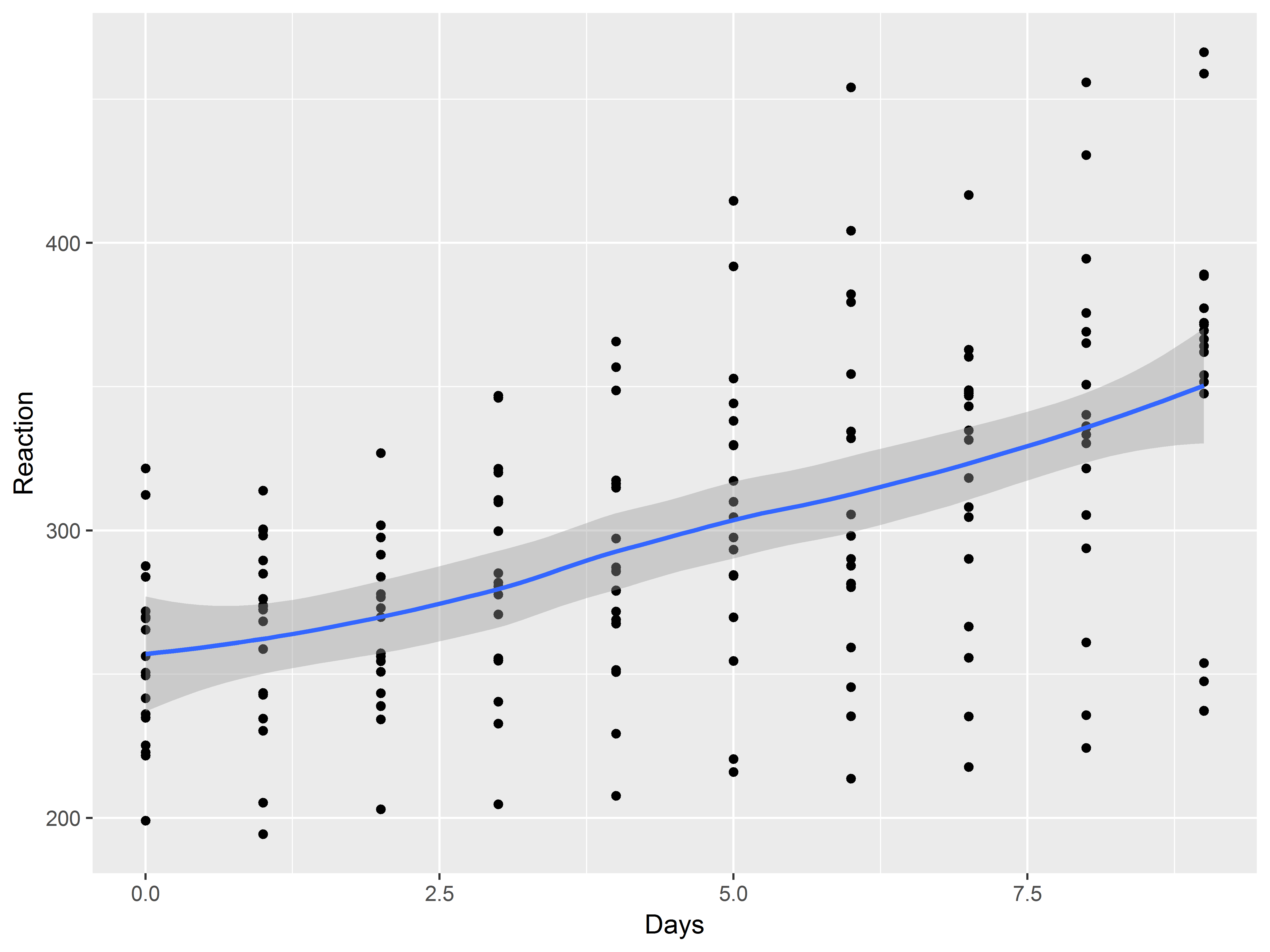
First, let’s plot the relationship between Days and Reaction with a scatter plot and a loess smooth.
What is the first thing we specify for each ggplot2 graph and how should we specify this one?
Always specify default aesthetics first in ggplot().
We map Days to x and Reaction to y.
#mean relationship
ggplot(sleepstudy, aes(x=Days, y=Reaction))
Now how do we add the scatter plot layer and the loess smooth layer?
Use geom_point() and geom_smooth().
#mean relationship
ggplot(sleepstudy, aes(x=Days, y=Reaction)) +
  geom_point() +
  geom_smooth()
## `geom_smooth()` using method = 'loess'
The mean relationship appears linear.
Simple linear regression model
We next regress Reaction on Days and output the model in a simple linear regression model.
#linear model
lm1 <- lm(Reaction ~ Days, sleepstudy)
summary(lm1)
##
## Call:
## lm(formula = Reaction ~ Days, data = sleepstudy)
##
## Residuals:
##      Min       1Q   Median       3Q      Max
## -110.848  -27.483    1.546   26.142  139.953
##
## Coefficients:
##             Estimate Std. Error t value Pr(>|t|)
## (Intercept)  251.405      6.610  38.033  < 2e-16 ***
## Days          10.467      1.238   8.454 9.89e-15 ***
## ---
## Signif. codes:  0 '***' 0.001 '**' 0.01 '*' 0.05 '.' 0.1 ' ' 1
##
## Residual standard error: 47.71 on 178 degrees of freedom
## Multiple R-squared:  0.2865, Adjusted R-squared:  0.2825
## F-statistic: 71.46 on 1 and 178 DF,  p-value: 9.894e-15
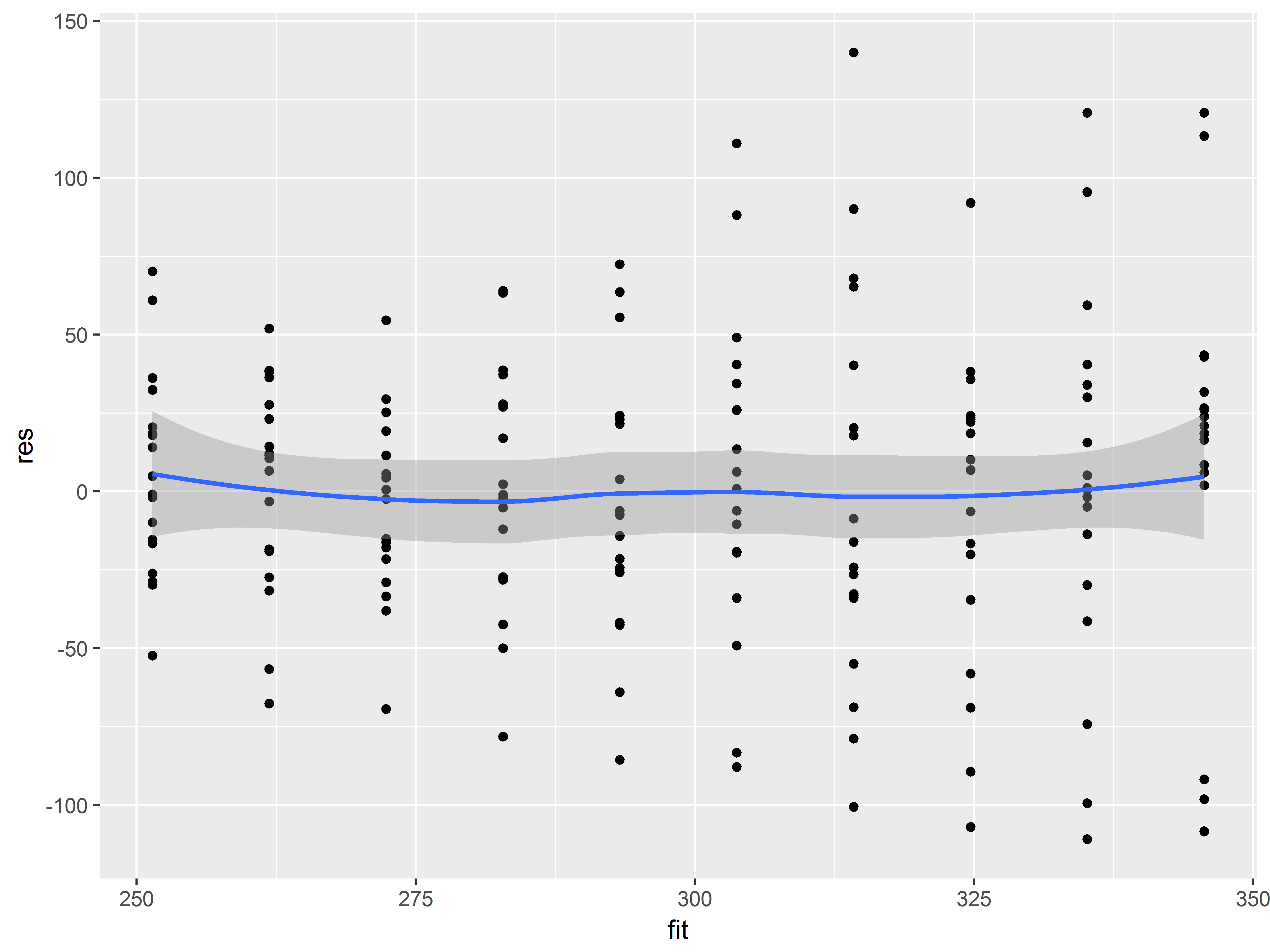
Here, a residuals vs fitted value plot shows that the assumptions of linearity of predictor effects seems plausible, though there may be some evidence of heteroscedasticity.
#linear model
sleepstudy$res <- residuals(lm1)
sleepstudy$fit <- predict(lm1)

ggplot(sleepstudy, aes(x=fit, y=res)) +
  geom_point() +
  geom_smooth()
## `geom_smooth()` using method = 'loess'
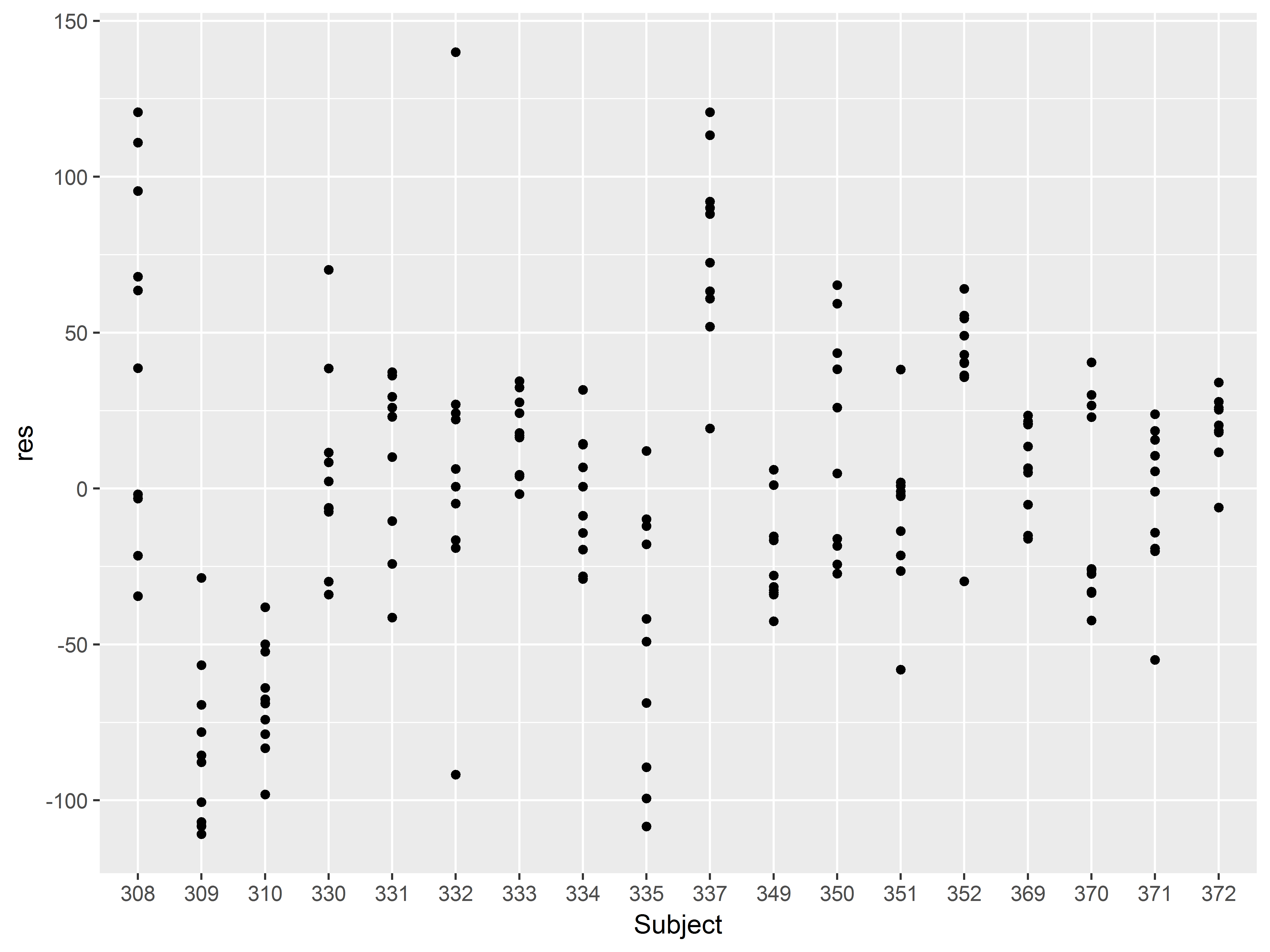
Independence of observations - residuals by subject
In addition to linearity and homoscedasticity, linear regression models also assume independence of the observations.
Data collected from a repeated measurements design almost certainly violate this assumption.
A plot of residuals by Subject, with means and standard errors, will assess this assumption.
If the plot is residuals (variable res) by subject (variable Subject) how should we specify the intial ggplot() function and how do we begin with a scatter plot?
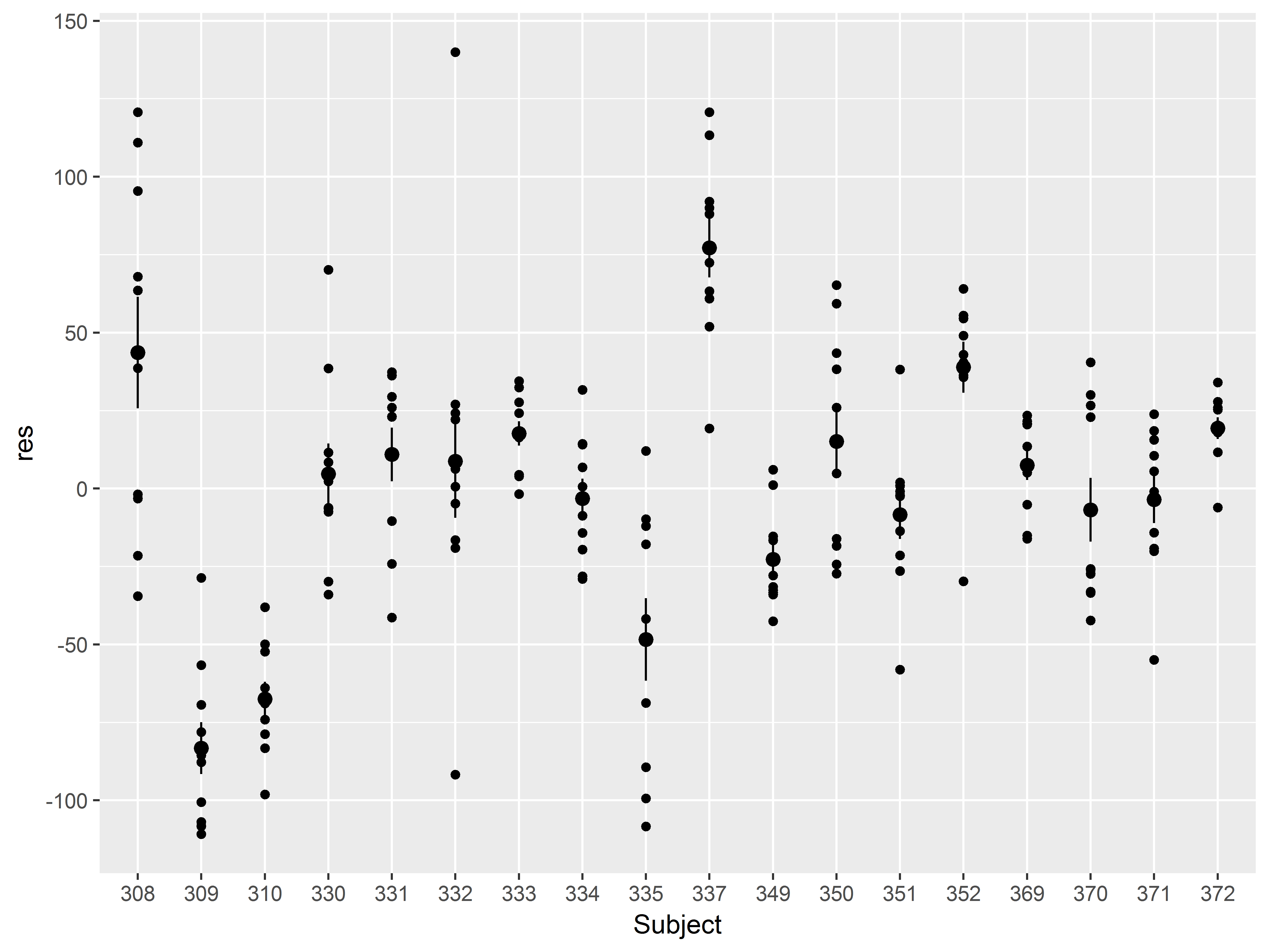
#scatter of residuals by subject
ggplot(sleepstudy, aes(x=Subject, y=res)) +
  geom_point()
Some clustering of residuals by Subject is already apparent. Visualizing the means would help evaluate the clustering.
How do we add a layer of means and standard errors to this plot?
Remember that if the data you want to plot do not exist in the dataset at hand, you probably need a stat to plot such a transformation (e.g. mean, counts, variance).
stat_summary() by default plots means and standard errors.
#stat_summary() transforms the data to means and standard errors
ggplot(sleepstudy, aes(x=Subject, y=res)) +
  geom_point() +
  stat_summary()
## No summary function supplied, defaulting to `mean_se()
Ok, that worked, but the means are bit hard to see.
Let’s change the color of all of the means and standard error bars to red and the size to 1 mm. How do we do that?
Remember, when setting an aesthetic to a constant, specify it outside of aes().
#SET color and size to make dots stand out more
ggplot(sleepstudy, aes(x=Subject, y=res)) +
  geom_point() +
   stat_summary(color="red", size=1)
## No summary function supplied, defaulting to `mean_se()
Those means really stand out now. The heterogeneity among the means is evidence of clustering by Subject, suggesting that the assumption of independence has been violated.
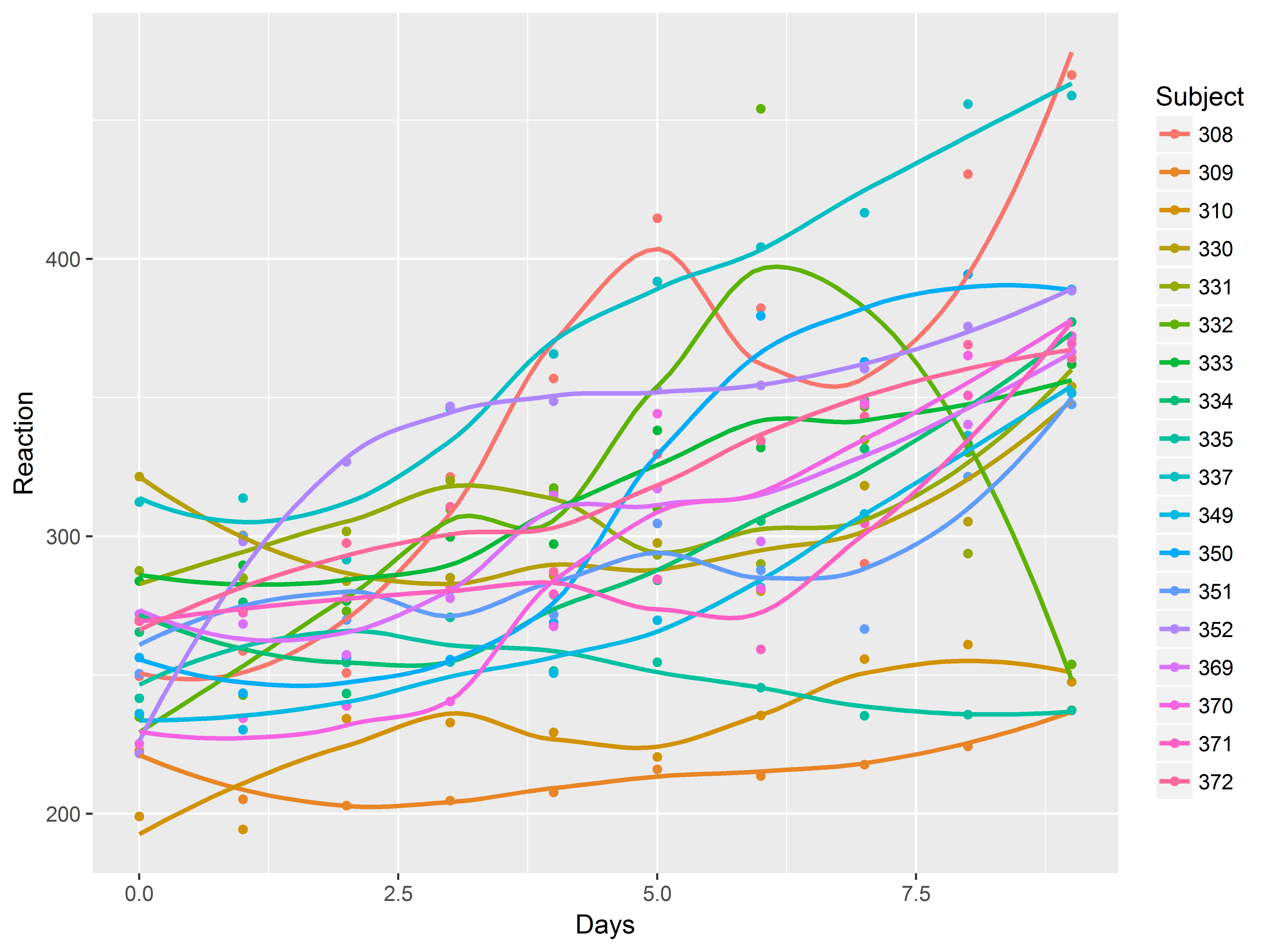
Slopes by subject
Faced with evidence that Subjects have different baseline levels of Reaction time, we further suspect that not all subjects react to sleep deprivation in the same way. In other words, we believe there is heterogeneity in the relationship between Days of deprivation and Reaction time (i.e. the slope) among subjects.
Previously we used the graph specifcation below to visualize the mean “slope” across subject:
#not run
ggplot(sleepstudy, aes(x=Days, y=Reaction)) +
  geom_point() +
  geom_smooth()
How can we adapt that code so that it the graph is plotted by subject?
There are several ways to do repeat a graphic across levels of a variable. To overlay all graphics on the same plot, simply map the variable to an aesthetic like color.
We suppress the standard error bands of the loess smooth with se=F.
ggplot(sleepstudy, aes(x=Days, y=Reaction, color=Subject)) +
  geom_point() +
  geom_smooth(se=F)
## `geom_smooth()` using method = 'loess'
If instead we wanted to repeat the whole plot across subjects, how would we specify that?
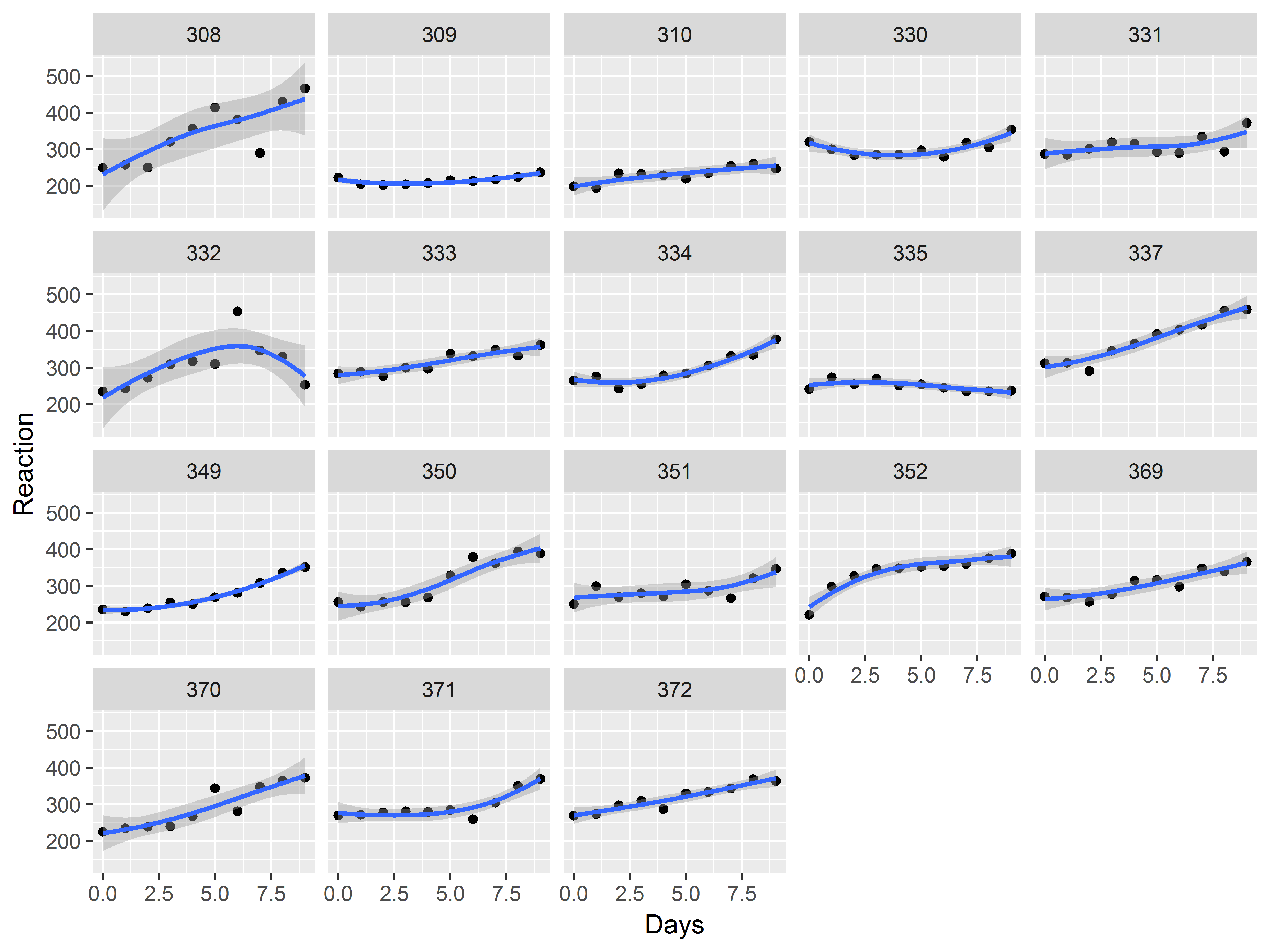
Use faceting to repeat a whole plot across levels of a factor. Here we use facet_wrap().
When estimating the loess curve by subject, the data are sparser, so we increase the “span”, or the number of observations used in each local regression (increasing the smoothness).
ggplot(sleepstudy, aes(x=Days, y=Reaction)) +
  geom_point() +
  geom_smooth(span=1.5) +
  facet_wrap(~Subject)
## `geom_smooth()` using method = 'loess'
We see evidence of heterogeneity in the effect of days of deprivation across subjects.
Heterogeneity among subjects can be addressed in mixed models.
Example 3: Mixed effects models
Our graphs suggest a linear effect of Days, with Subject-level heterogeneity of mean reaction time and effect of Days.
These two sources of heterogeneity can be addressed in mixed models with random intercepts and random coefficients (slopes).
We estimate a mixed model using lmer() from the lme4 package, with a fixed effect of Days, and random intercepts and coefficients for Days by Subject.
#random intercepts and coefficients for Days
mixed <- lmer(Reaction ~ Days + (1+Days|Subject),
              data=sleepstudy)
summary(mixed)
## Linear mixed model fit by REML ['lmerMod']
## Formula: Reaction ~ Days + (1 + Days | Subject)
##    Data: sleepstudy
##
## REML criterion at convergence: 1743.6
##
## Scaled residuals:
##     Min      1Q  Median      3Q     Max
## -3.9536 -0.4634  0.0231  0.4634  5.1793
##
## Random effects:
##  Groups   Name        Variance Std.Dev. Corr
##  Subject  (Intercept) 612.09   24.740
##           Days         35.07    5.922   0.07
##  Residual             654.94   25.592
## Number of obs: 180, groups:  Subject, 18
##
## Fixed effects:
##             Estimate Std. Error t value
## (Intercept)  251.405      6.825  36.838
## Days          10.467      1.546   6.771
##
## Correlation of Fixed Effects:
##      (Intr)
## Days -0.138
Revisiting residuals by subject
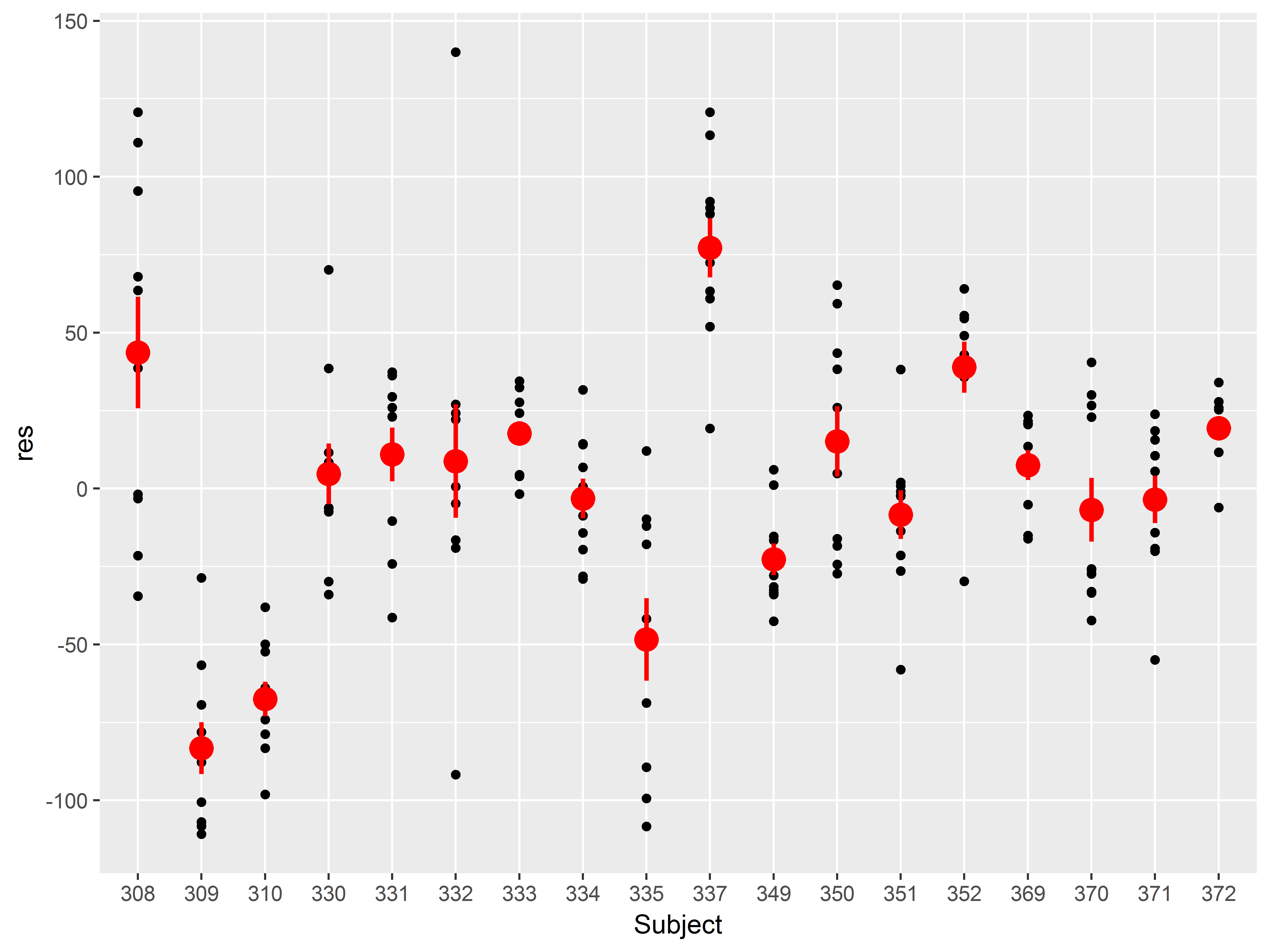
Let’s redo our residual by subject plot for the mixed model to see if we have adequately addressed the clustering by subject.
Remember for this plot, we want Subject mapped to x, the residuals mapped to y, and then we add scatter plot layer, and finally a layer of means and standard errors.
Since we’ve made that plot before, here is the code:
#residuals mixed model
sleepstudy$res_mix <- residuals(mixed)
#residuals by subject, mixed model
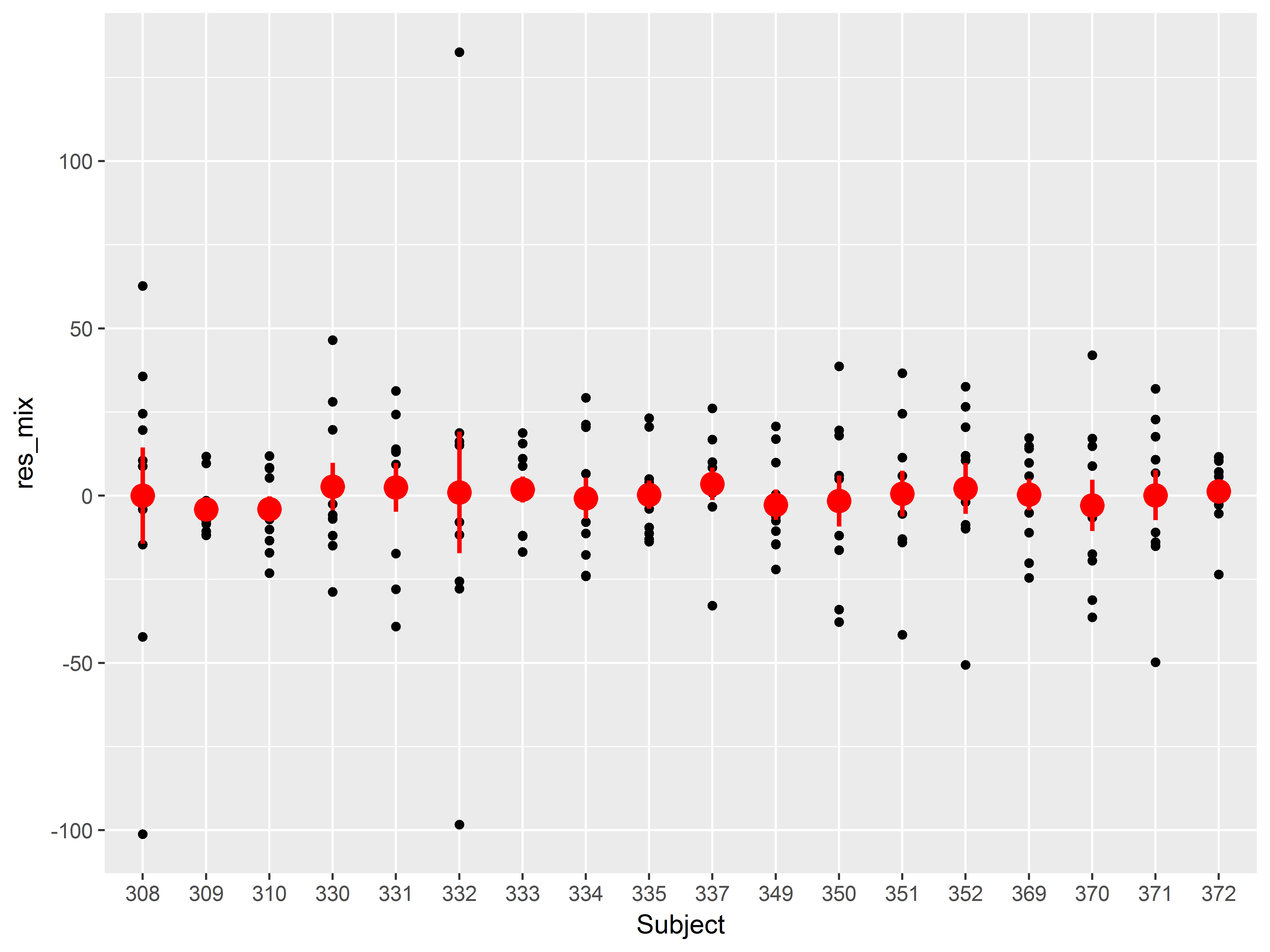
ggplot(sleepstudy, aes(x=Subject, y=res_mix)) +
geom_point() +
stat_summary(color="red", size=1)
## No summary function supplied, defaulting to `mean_se()
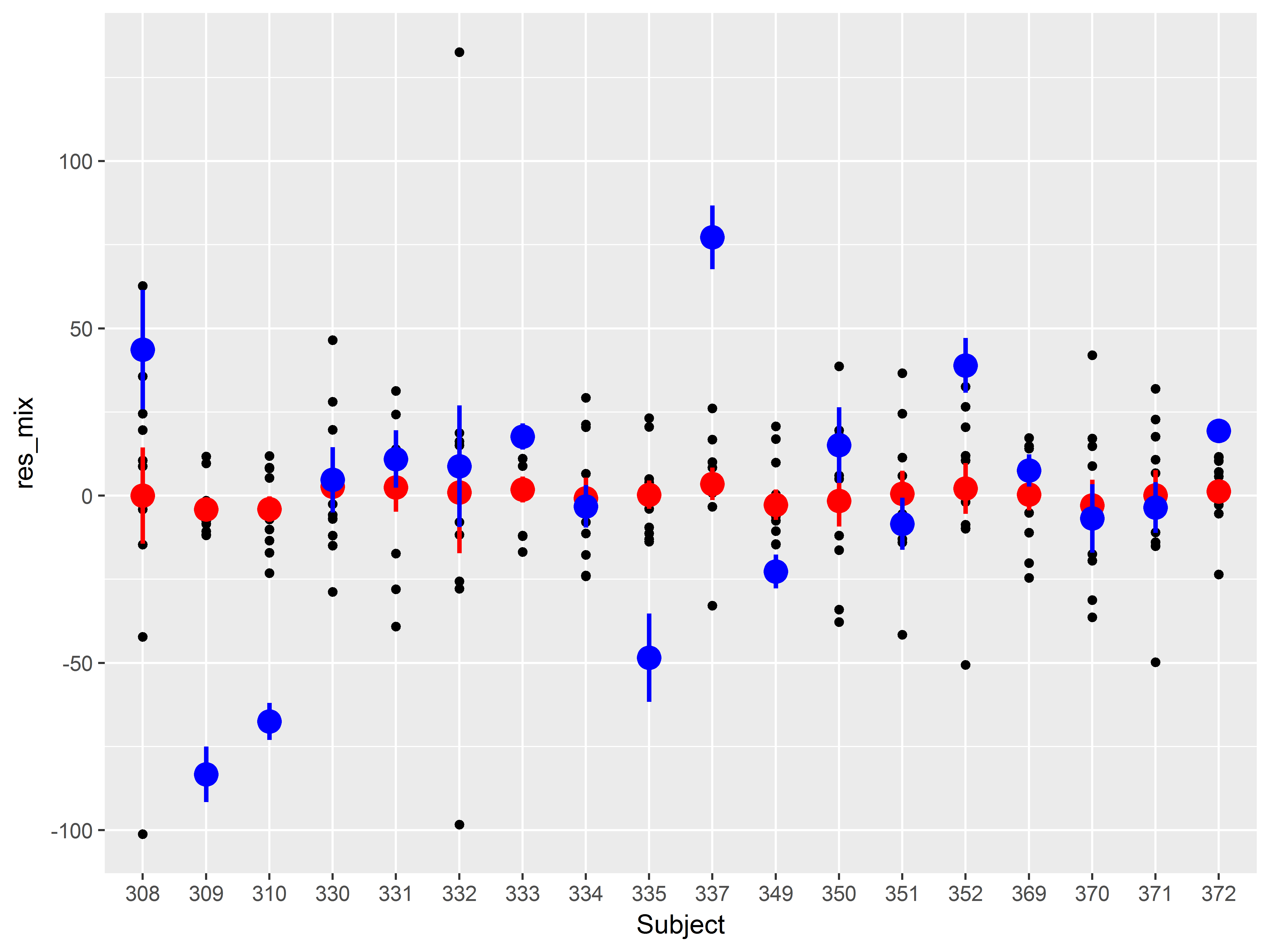
A cool addition to this graph would be the means and standard errors of the residuals from the simple linear regression model, to compare how much variance among subject has been addressed.
How would we add a layer of means and standard errors of the residuals from the first model we tried?
Add a stat_summary() layer, but change the y aesthetic in aes() to the old residuals (variable “res”). We also set the color of these means and standard errors to blue:
#residuals by subject, both models
ggplot(sleepstudy, aes(x=Subject, y=res_mix)) +
  geom_point() +
  stat_summary(color="red", size=1) +
  stat_summary(aes(y=res), color="blue", size=1)
## No summary function supplied, defaulting to `mean_se()
## No summary function supplied, defaulting to `mean_se()
Notice that all means of the residuals from the mixed model (red) lie much closer to zero than those from the linear regression model (blue).
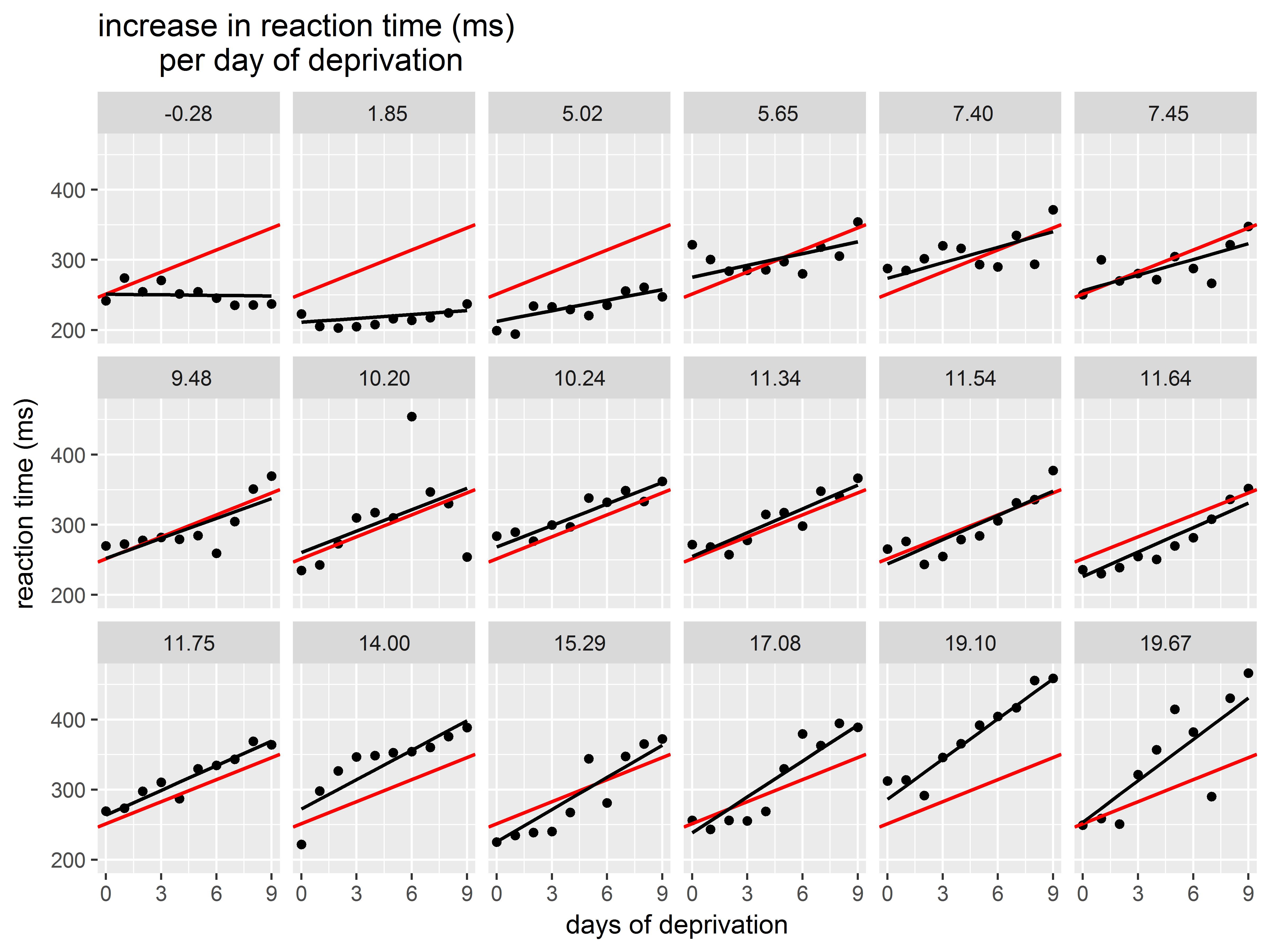
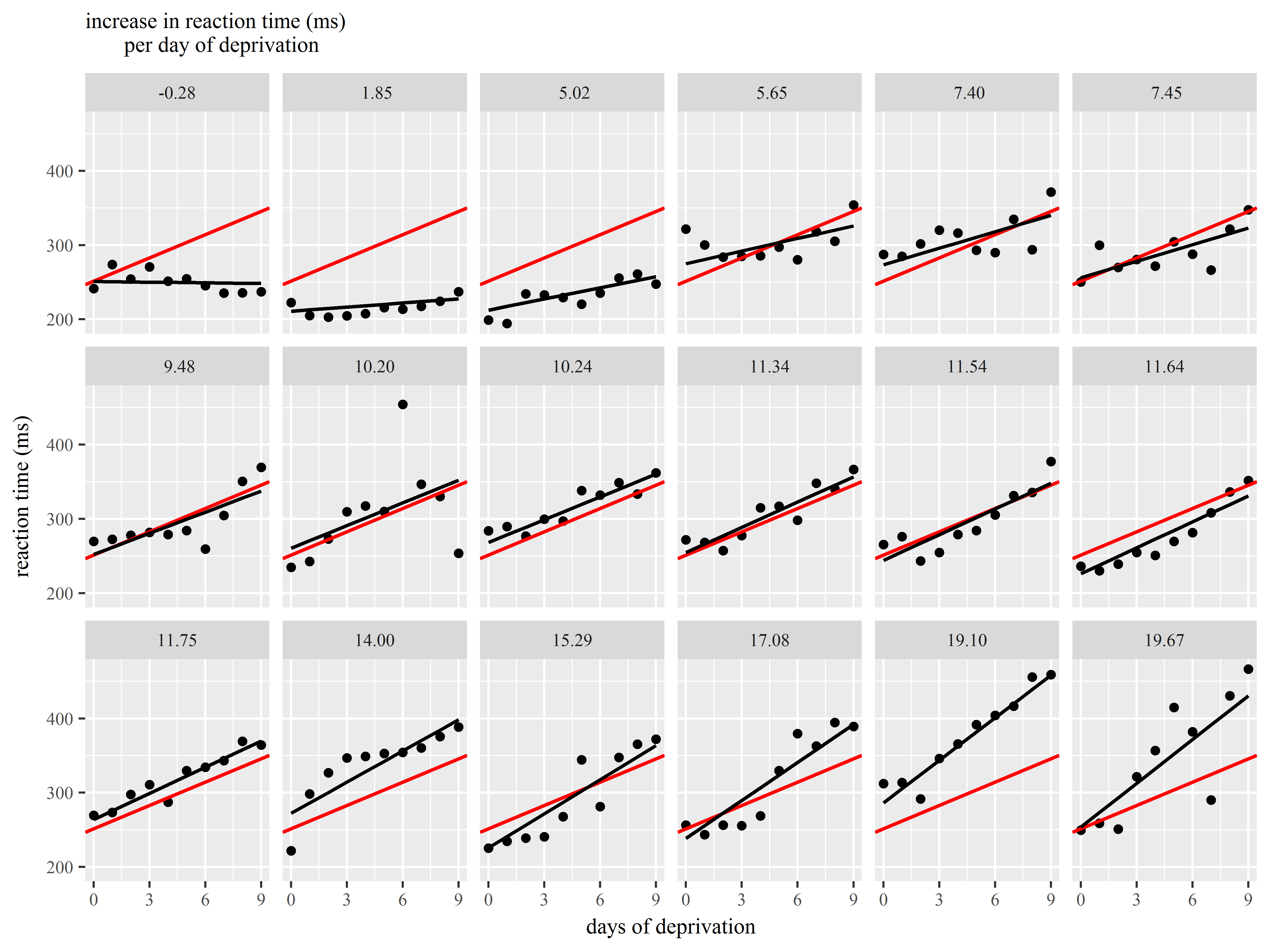
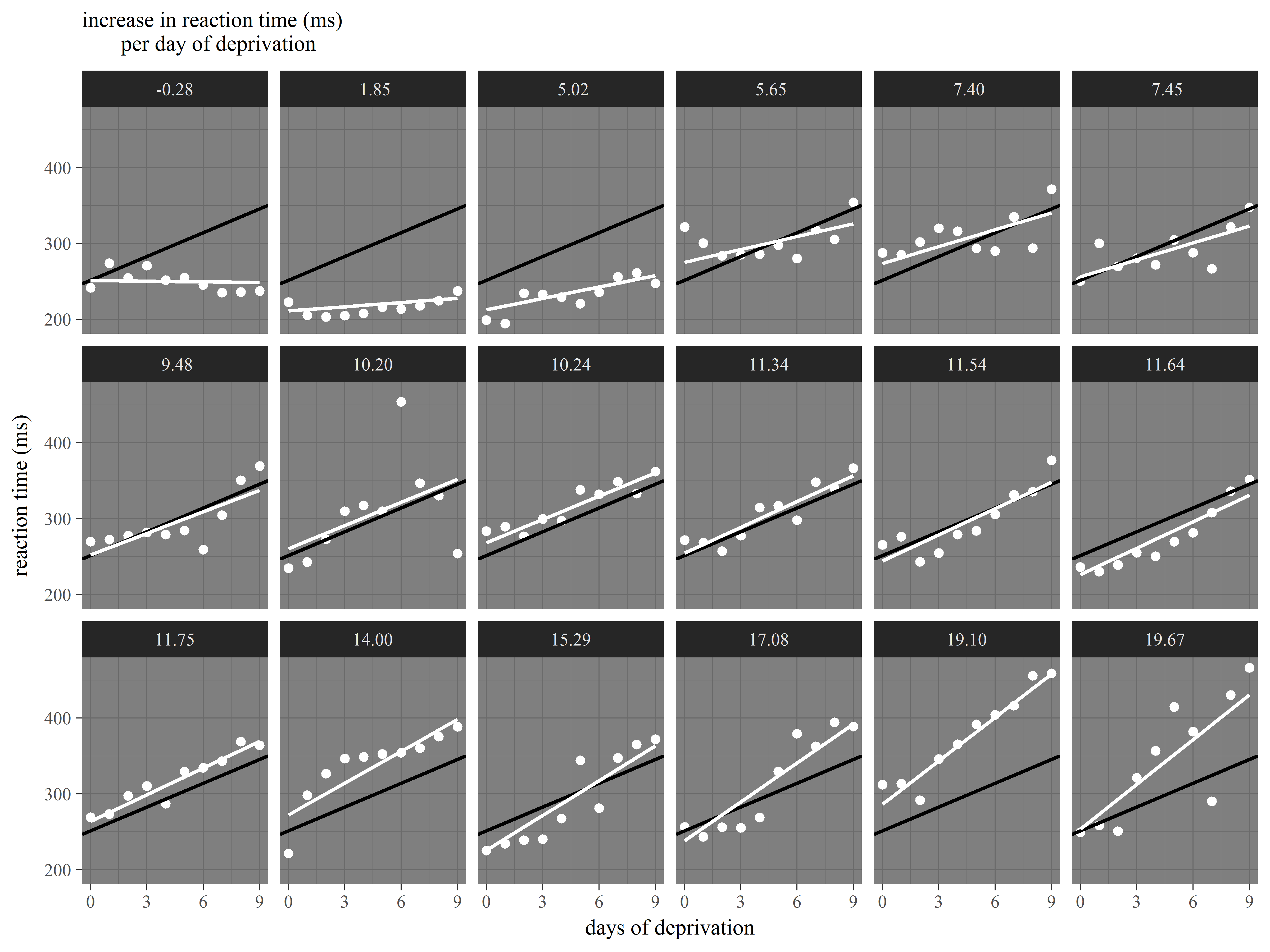
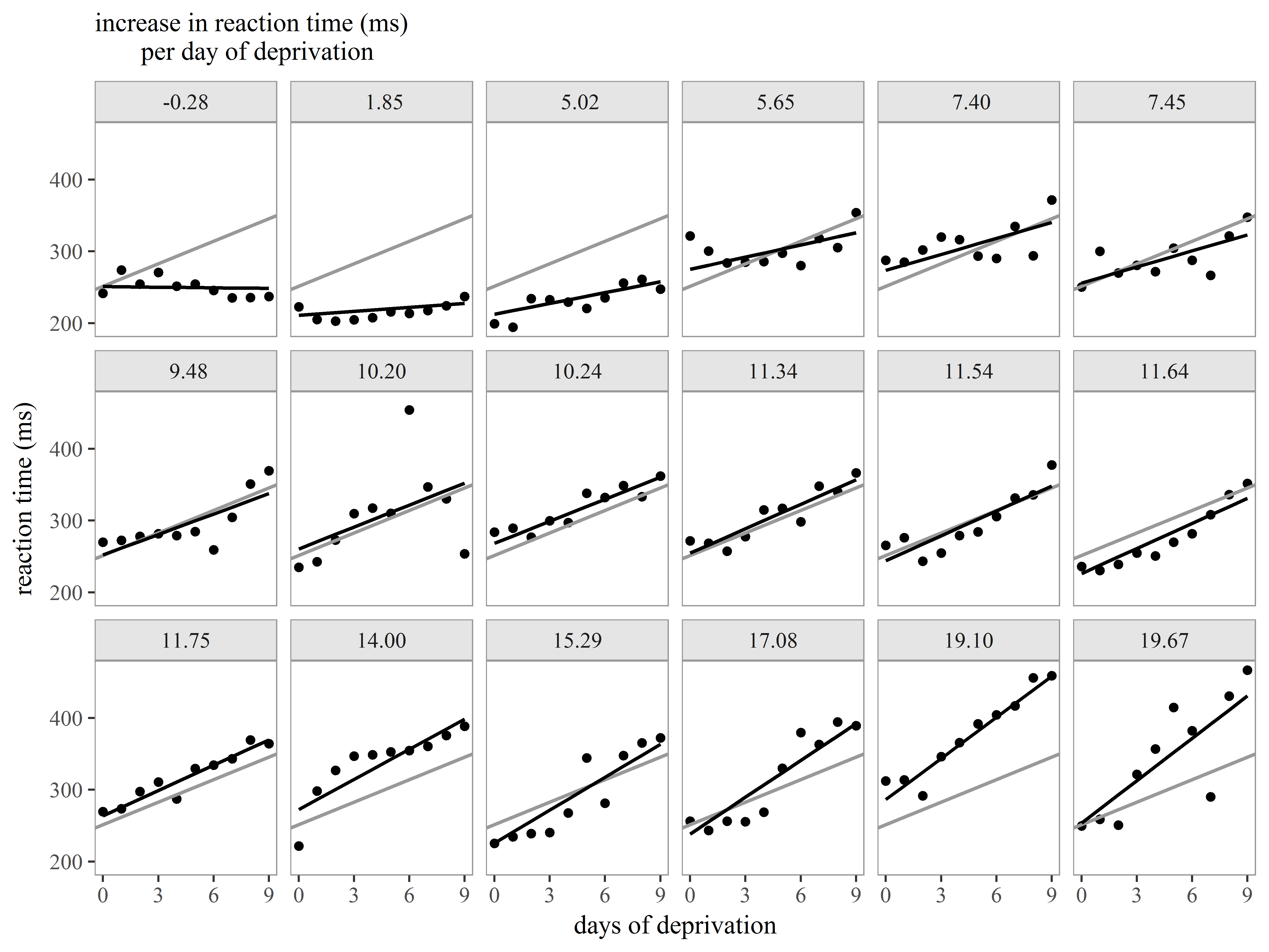
Example 3: Customizing a plot for presentation
Let’s now together create a plot of the model results for presentation to an audience.
For this figure we would like to display the following:
- observed data for each subject
- subject-specific slopes of Days of deprivation
- the mean slope of Days of deprivation across all subjects
Our plan is to repeat the same graph of observed data, subject-specific slope, and mean slope repeated for each subject.
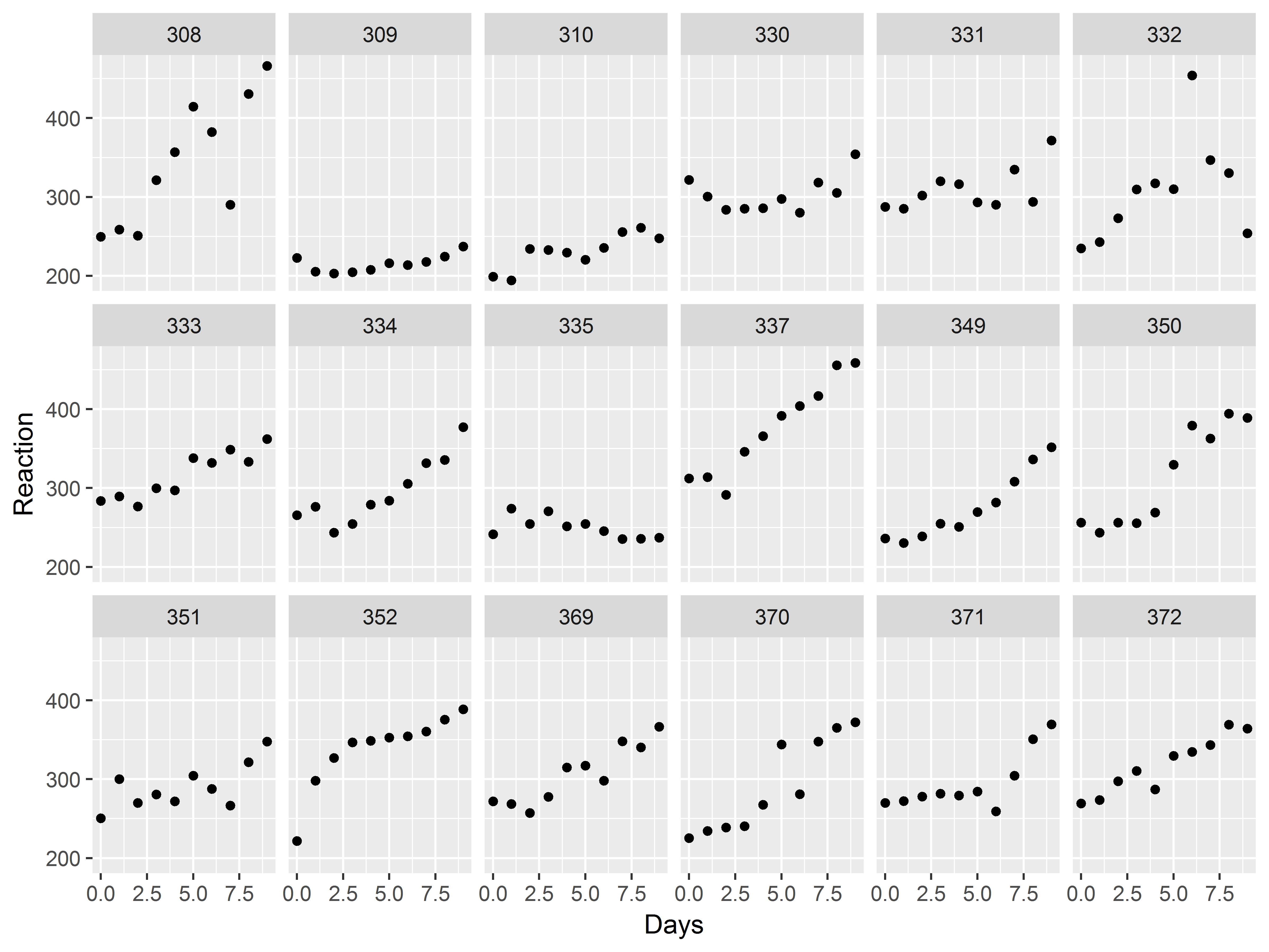
Let’s first just make a plot of the observed data. How would we generate a scatter plot of Reaction vs Days, repeated by subject?
With 18 subjects, we specify 3 rows of graphs in facet_wrap().
#model results scatter plot
ggplot(sleepstudy, aes(x=Days, y=Reaction)) +
  geom_point() +
  facet_wrap(~Subject, nrow=3)
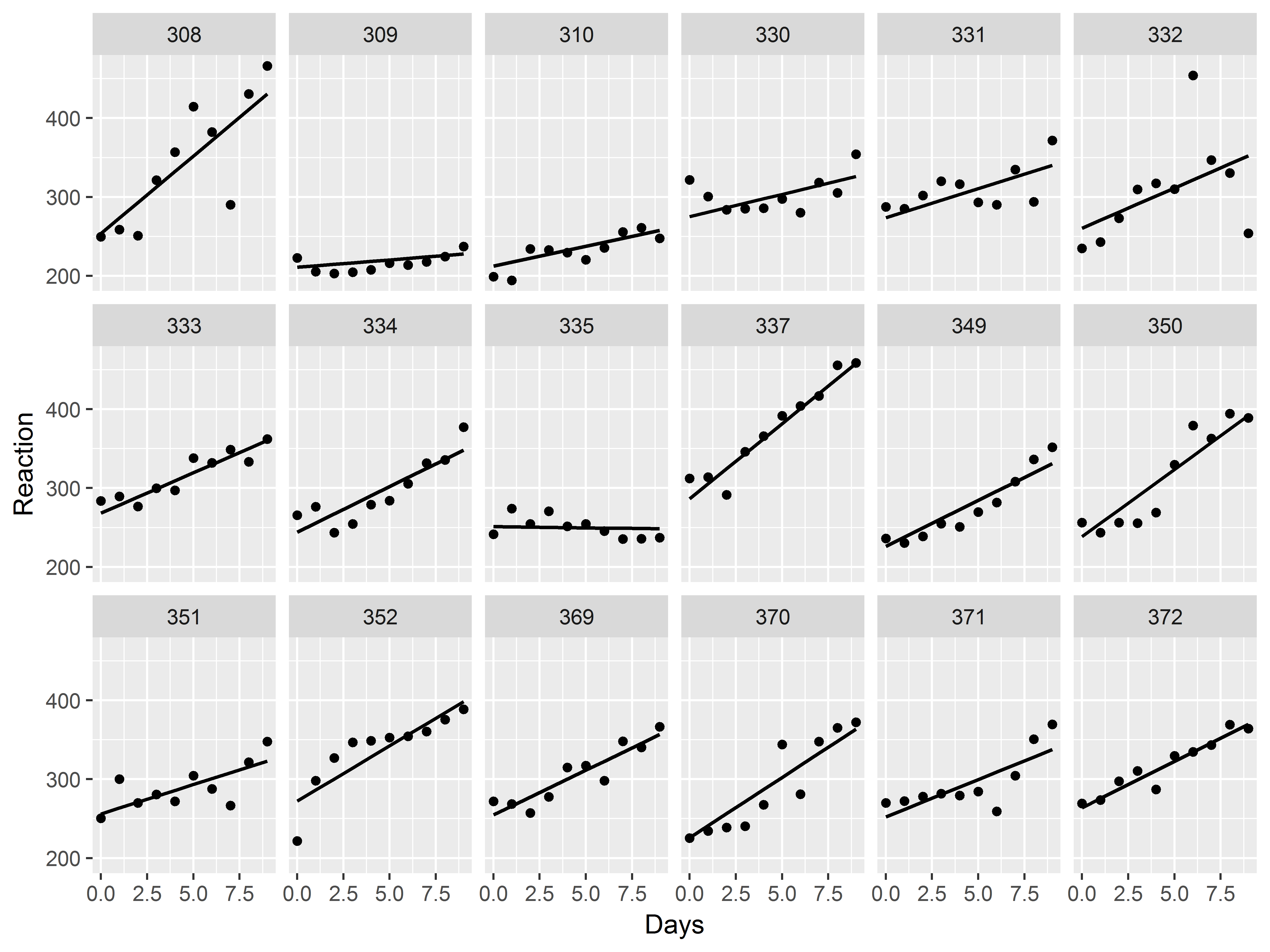
Now, let’s try graphing the slope estimate for each subject.
As in any regression model, a plot of predicted values against a predictor will display the “slope”. So first, we need to get predicted values from the mixed model:
#predicted values from mixed model
sleepstudy$fit_mix <- predict(mixed)
Now, how can we add depictions of slopes by subject to the model?
Use geom_line(), but respecify that y should be mapped to the predicted values. We thicken the lines to .75 mm.
Since, the graph is already faceted, if we add a geom_line() layer, that line will be drawn for each subject.
#model results scatter plot
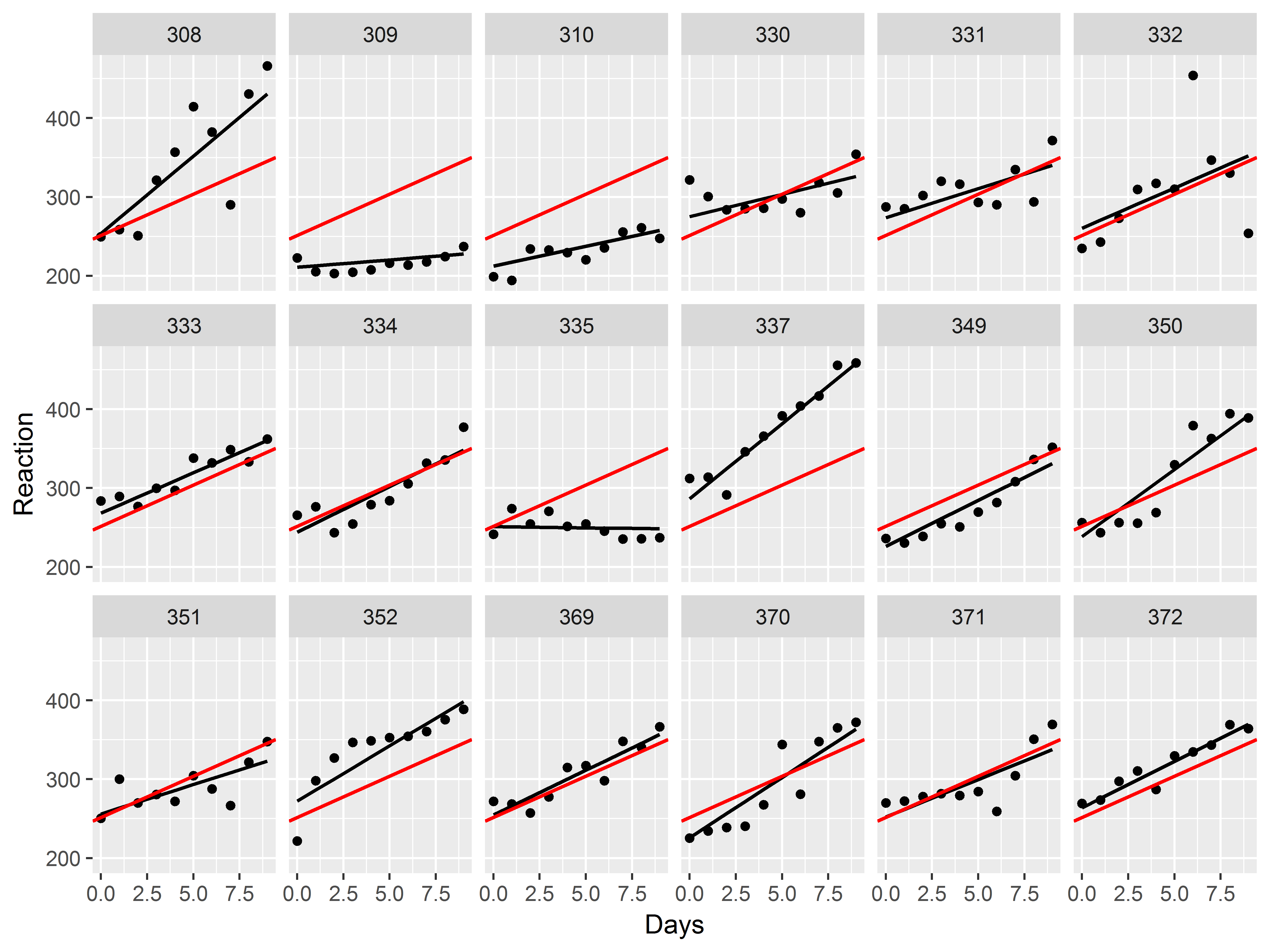
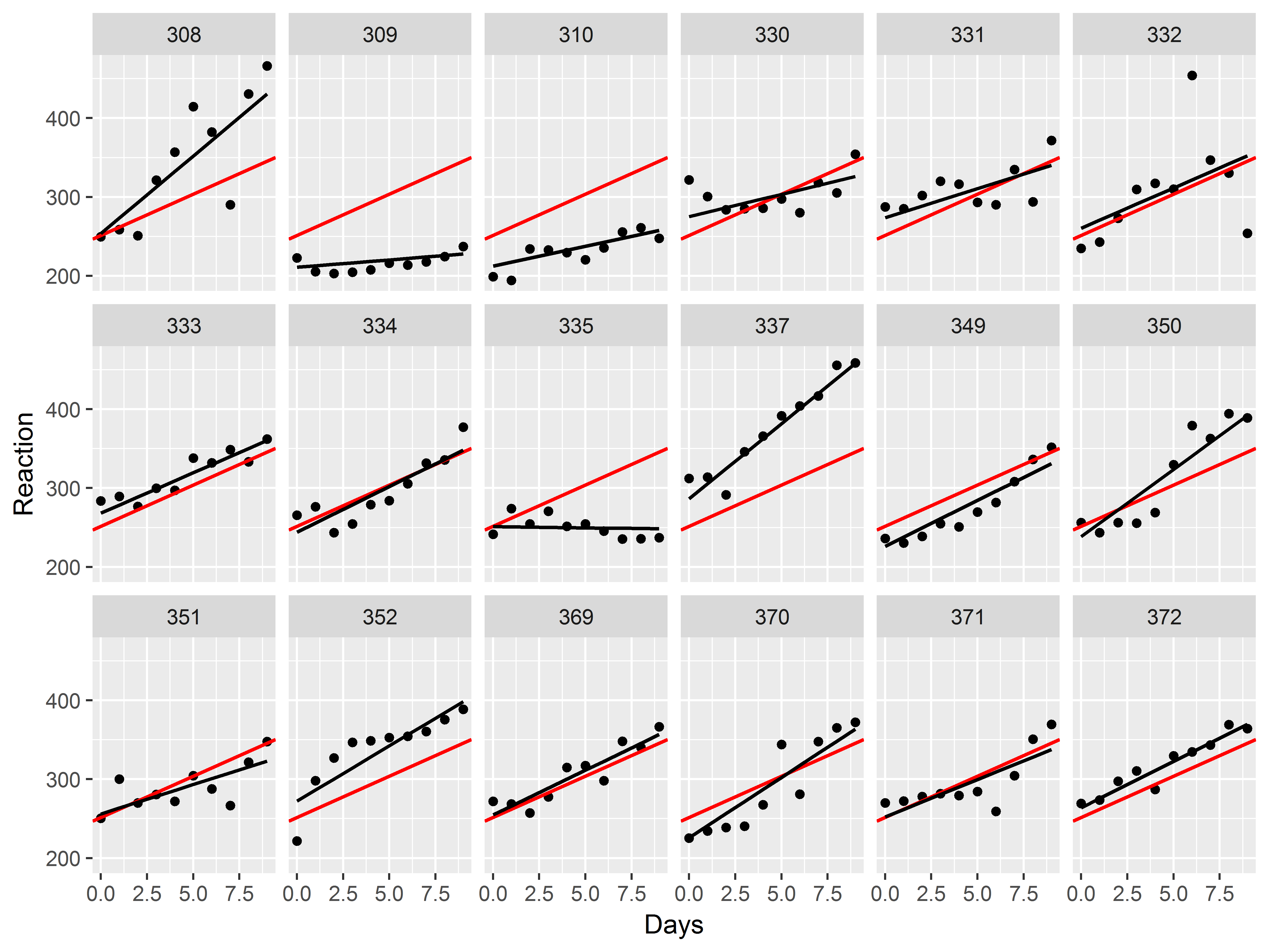
ggplot(sleepstudy, aes(x=Days, y=Reaction)) +
geom_point() +
facet_wrap(~Subject, nrow=3) +
geom_line(aes(y=fit_mix), size=.75)
Great! We can already see the heterogeneity among the slopes.
Now, let’s try to add the overall mean intercept and mean slope to each graph.
The mean intercept and slope for our model can be obtained by running fixef() on the mixed model object. We save the individual estimates in separate objects.
#mean intercept and slope
fixef(mixed)
## (Intercept)        Days
##   251.40510    10.46729
#give them easy names
mean_int <- fixef(mixed)[1]
mean_slope <- fixef(mixed)[2]
How can we add a line defined by an intercept and slope to a plot?
geom_abline() can plot a line defined by the aesthetics intercept and slope.
In geom_abline(), we color the mean slope red and thicken it to .75mm. Notice that we do not use aes() at all in geom_abline() because all aesthetics of the line are constant.
#adding mean intercept and slope to each graph
ggplot(sleepstudy, aes(x=Days, y=Reaction)) +
  geom_point() +
  facet_wrap(~Subject, nrow=3) +
  geom_line(aes(y=fit_mix), size=.75) +
  geom_abline(intercept=mean_int, slope=mean_slope,
              color="red", size=.75)
Currently, the mean reference slopes (red) lie on top of the subject-specific slopes. How might we change the specification above so that the mean slope lies underneath the subject-specific slopes?
Layers are added on top, so we just need to specify geom_abline() before geom_line() to put the reference line on the bottom.
#adding mean intercept and slope to each graph
ggplot(sleepstudy, aes(x=Days, y=Reaction)) +
  geom_point() +
  facet_wrap(~Subject, nrow=3) +
  geom_abline(intercept=mean_int, slope=mean_slope,
              color="red", size=.75) +
  geom_line(aes(y=fit_mix), size=.75)
Looking good.
But, we notice that the ordering of the graphs seems arbitrary. A look at the facet headings shows that they have been ordered by Subject ID. Perhaps we can order them in a more meaningful to help the viewer glean information more easily.
Sorting the graphs by the value of the subject’s slope estimate will show variation in the slopes better – you can easily identify the steepest and flattest slopes.
Sorting the facets by the random slopes
We first estimate each Subject’s slope, which is the sum of the fixed effect coefficient for Days and the estimate of the random effect of Days (BLUP) for that subject. We already have the fixed effect of Days, so we use ranef() to obtain a data.frame (called “Subject”) of the random effects by Subject.
#mean intercept and slope
re <- ranef(mixed)$Subject
head(re)
##     (Intercept)       Days
## 308    2.258565  9.1989719
## 309  -40.398577 -8.6197032
## 310  -38.960246 -5.4488799
## 330   23.690498 -4.8143313
## 331   22.260203 -3.0698946
## 332    9.039526 -0.2721707
Notice that the rownames of the random effects object is the Subject ID, and that the second column contains the random slope estimates for that subject.
We will need to use the Subject ID to merge, so we create a Subject variable for the random effects object. We then rename the random slope estimates to “rand_slope”, and then merge the slopes into the sleepstudy dataset
#create Subject column out of rownames, make it a factor
re$Subject <- factor(rownames(re))
#rename column for use with ggplot
colnames(re)[2] <- "rand_slope"


#merge our random effects into our diagnostic dataset by Subject
sleepstudy <- merge(sleepstudy, re, by="Subject")
#check that merge worked
str(sleepstudy)
## 'data.frame':    180 obs. of  9 variables:
##  $ Subject    : Factor w/ 18 levels "308","309","310",..: 1 1 1 1 1 1 1 1 1 1 ...
##  $ Reaction   : num  250 259 251 321 357 ...
##  $ Days       : num  0 1 2 3 4 5 6 7 8 9 ...
##  $ res        : num  -1.85 -3.17 -21.54 38.63 63.58 ...
##  $ fit        : num  251 262 272 283 293 ...
##  $ res_mix    : num  -4.1 -14.63 -42.2 8.78 24.52 ...
##  $ fit_mix    : num  254 273 293 313 332 ...
##  $ (Intercept): num  2.26 2.26 2.26 2.26 2.26 ...
##  $ rand_slope : num  9.2 9.2 9.2 9.2 9.2 ...
Remember that random slope estimates are deviations from the grand slope, so the estimated total slope for any subject is the sum of the mean slope and that subject’s random slope estimate.
We want to display the slope estimates as the facet title, so we’ll need to trim the number of decimal places on those slope estimates so that the labels look clean. We can use the format() function to trim them to 2 decimal places:
#total slope is rand_slope + slope, the fixed effect of Days from above
mean_slope <- fixef(mixed)[2]
sleepstudy$myslope <- sleepstudy$rand_slope + mean_slope
#trim to do digits.
sleepstudy$myslope <- format(sleepstudy$myslope, digits=2)
#sort by slope and then Days
#sleepstudy <- arrange(sleepstudy, slope, Days)
#output total slope estimates by subject
unique(sleepstudy$myslope)
##  [1] "19.67" " 1.85" " 5.02" " 5.65" " 7.40" "10.20" "10.24" "11.54"
##  [9] "-0.28" "19.10" "11.64" "17.08" " 7.45" "14.00" "11.34" "15.29"
## [17] " 9.48" "11.75"

#sleepstudy$slope <- factor(sleepstudy$slope)
#sleepstudy$id <- as.numeric(sleepstudy$slope)
Now we want to use slope estimates to split and order the graphs. How can we respecify our graph so that it uses these slope estimates rather than Subject ID to split the plots?
Facet by the myslope variable instead of by Subject. ggplot will display them in sorted order by default.
#facet by myslope
ggplot(sleepstudy, aes(x=Days, y=Reaction)) +
  geom_point() +
  facet_wrap(~myslope, nrow=3) +
  geom_abline(intercept=mean_int, slope=mean_slope,
              color="red", size=.75) +
  geom_line(aes(y=fit_mix), size=.75)
Above we see that the slope estimates appear as the facet titles, and that the black slopes get steeper as we move down and to the right. We see that the slope of days of deprivation varied from flat (top left) to quite steep (bottom right).
Now we have all of the data elements on the plot. We now turn to fine-tuning the text on the graph and its graphical properties.
Relabeling ticks
Let’s relabel the ticks on the x-axis to (0,3,6,9), as data were collected on whole days. How would we adjust the tick labels?
(Hint: what grammar element controls which data values are mapped to which aesthetic values and how they are labeled?)
Use scales to control the value labeling (not titles) of legends and axes.
Here, we want the scale that controls the x-axis.
Use scale_x_continuous() since Days is continuous. The breaks argument specifies which ticks should be labeled.
#reset x-axis ticks with scale_x_continuous
ggplot(sleepstudy, aes(x=Days, y=Reaction)) +
  geom_point() +
  facet_wrap(~myslope, nrow=3) +
  geom_abline(intercept=mean_int, slope=mean_slope,
              color="red", size=.75) +
  geom_line(aes(y=fit_mix), size=.75) +
  scale_x_continuous(breaks=c(0,3,6,9))
Next we would like to add an overall title to the plot, and change the axis titles? What single function can do both of those?
Use labs() to specify the overall plot title and the axis titles.
#reset x-axis ticks with scale_x_continuous
ggplot(sleepstudy, aes(x=Days, y=Reaction)) +
  geom_point() +
  facet_wrap(~myslope, nrow=3) +
  geom_abline(intercept=mean_int, slope=mean_slope,
              color="red", size=.75) +
  geom_line(aes(y=fit_mix), size=.75) +
  scale_x_continuous(breaks=c(0,3,6,9)) +
  labs(title="increase in reaction time (ms)
       per day of deprivation",
       x="days of deprivation", y="reaction time (ms)")
Next we would like to change all fonts to “serif” and set the font sizes of the plot title, axis titles, facet titles, and tick marks.
In what function do we specify all of this?
What element function will we be using to specify all of these font changes?
Use theme() to control most of the graphical and text properties of a plot. To control text elements, use element_text().
Here we want to specify the font family and size for plot.title, axis.title, strip.text.x (facet titles), and axis.text (tick labels).
#theme sets size and font family of title, axis title,
#facet titles, and tick labels
ggplot(sleepstudy, aes(x=Days, y=Reaction)) +
  geom_point() +
  facet_wrap(~myslope, nrow=3) +
  geom_abline(intercept=mean_int, slope=mean_slope,
              color="red", size=.75) +
  geom_line(aes(y=fit_mix), size=.75) +
  scale_x_continuous(breaks=c(0,3,6,9)) +
  labs(title="increase in reaction time (ms)
       per day of deprivation",
       x="days of deprivation", y="reaction time (ms)") +
  theme(plot.title=element_text(family="serif", size=10),
        axis.title=element_text(family="serif", size=10),
        strip.text.x=element_text(family="serif", size=8),
        axis.text=element_text(family="serif", size=8))
Now, we’d like to change the overall look of the graph with one single function. How do we do that?
Overall look: Look 1
Use built-in themes to change the overall appearance of a graph.
For the first look, we use theme_dark() to give the graph a nighttime feel (it’s a sleep study!). We change the colors of the reference line to black, and the observed datapoints and subject-specific slopes to white. NOTE: In the R code, we use base_family to change all fonts used in theme_dark() to “serif”. Because we do this, futher changes to font must follow theme_dark().
#use theme_dark for a nighttime theme
#place theme font specifications after theme_dark to ensure
# that they are obeyed
ggplot(sleepstudy, aes(x=Days, y=Reaction)) +
  geom_point(color="white") +
  facet_wrap(~myslope, nrow=3) +
  geom_abline(intercept=mean_int, slope=mean_slope,
              color="black", size=.75) +
  geom_line(aes(y=fit_mix), size=.75, color="white") +
  scale_x_continuous(breaks=c(0,3,6,9)) +
  labs(title="increase in reaction time (ms)
       per day of deprivation",
       x="days of deprivation", y="reaction time (ms)") +
  theme_dark(base_family="serif") +
  theme(plot.title=element_text(size=10),
        axis.title=element_text(size=10),
        strip.text.x=element_text(size=8),
        axis.text=element_text(size=8))
Not bad!
How about a different look that we create ourselves?
Overall look: Look 2
We also present a graph using ink/color more minimally, without the use of a built-in theme.
Below, we use theme() to change the backgrounds color of both the graphing area (panel.background, no fill, gray border) and the strip headings (strip.background, very light gray fill, gray border).
The value NA sets a property to blank.
We also specify the color of the grid lines (panel.grid.major and panel.grid.minor), which are normally set to “white”, to make the axes appear notched. The various gray colors become lighter as the number (from 0 to 100) following increases.
#specify background and grid elements using theme
#grays become lighter as number increases
ggplot(sleepstudy, aes(x=Days, y=Reaction)) +
  geom_point() +
  facet_wrap(~myslope, nrow=3) +
  geom_abline(intercept=mean_int, slope=mean_slope, size=.75, color="gray60") +
  geom_line(aes(y=fit_mix), size=.75) +
  scale_x_continuous(breaks=c(0,3,6,9)) +
  labs(title="increase in reaction time (ms)
       per day of deprivation",
       x="days of deprivation", y="reaction time (ms)") +
  theme(plot.title=element_text(family="serif", size=12),
        axis.title=element_text(family="serif", size=12),
        strip.text.x=element_text(family="serif", size=10),
        axis.text=element_text(family="serif", size=10),
        panel.background=element_rect(fill=NA, color="gray60"),
        strip.background=element_rect(fill="gray90", color="gray60"),
        panel.grid.major=element_line(color=NA),
        panel.grid.minor=element_line(color=NA))
Conclusion
Understanding the components of the grammar of graphics that underlies ggplot2 is critical to unlocking its potential as a graphing system. Because ggplot2 plots are produced layer-by-layer rather than being premade, you get to decide what appears on the plot.
We provided code for both simple and more complex graphs to demonstrate that ggplot2 is appropriate for use by both users new to R and statistical graphing and by experienced users wishing to make beautiful, illustrative graphs for presentation.
Most importantly, we hope we have conveyed the underlying grammar clearly enough to inspire you to create new graphs to display data variation in novel ways.
References
- Books
- Wickham, H. (2009). ggplot2 Elegant Graphics for Data Analysis. Springer: New York.
- Wilkinson, L. (2005). The Grammar of Graphics. Springer: New York.
- Tufte, E. R. (2001). The Visual Display of Quantitative Information. Graphics Press: Cheshire. (For guidance on making clear and informative statistical graphs)
- Websites