On the SPLUS FAQ page How do I change the colors of my trellis graphs? we explain how to change the color scheme of a grouped data plot. However, for each type of trellis plot there are different parameters that may be changed and the on this page we give guidelines for finding which parameters govern which specific trellis graph and the general scheme for change the different parameters for the different types of trellis graphs.
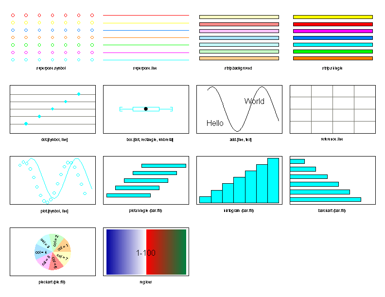
In order to find out which parameters are used in a particular type of trellis graph it is often useful to view the contents of the show.settings function. This function will bring up a graph with an example of the different types of trellis graphs and the names of the parameters used in each type of graph. This list of graphs and their parameters is not exhaustive but a great starting point.
show.settings()
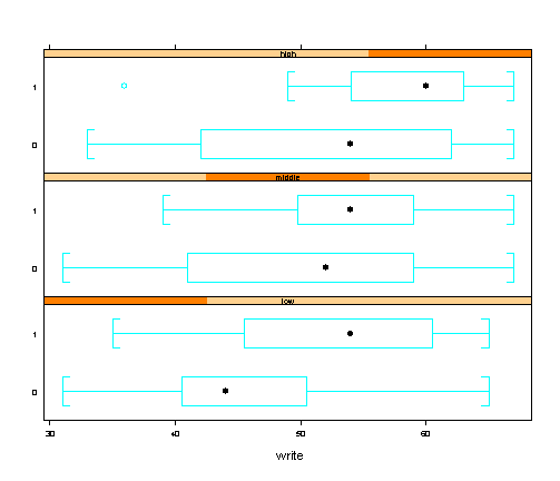
An example of how a box plot looks using the default settings using the hsb2 data set.
Hsb2
For each type of trellis graph the parameters are stored as an object which can be retrieved using the trellis.par.get function. For example, if we wish to see which parameter specifications were available for the box plot then we would use the trellis.par.get function for each of the components for the box plot including box.dot, box.rectangle, box.umbrella. This will also show us the current specification for each of the parameters that we may choose to change.
trellis.par.get("box.dot")

$cex:
[1] 1

$col:
[1] 1

$font:
[1] 1

$pch:
[1] 16

trellis.par.get("box.rectangle")

$col:
[1] 2

$lty:
[1] 1

$lwd:
[1] 1

trellis.par.get("box.umbrella")

$col:
[1] 2

$lty:
[1] 1

$lwd:
[1] 1
From this we see that for the dot which indicated the location of the median we can change the character expansion (box.dot$cex). (The character expansion is the size of the character relative to device’s standard size. For example, when cex = 2, characters are twice as big as normal for the device.) We can also change the color (box.dot$col), the font (box.dot$font) and the symbol (box.dot$pch) of the dot. For both the rectangle and the umbrella of the box plot we can change the color (box.rectangle$col and box.umbrella$col), line type (box.rectangle$lty and box.umbrella$lty) and line width (box.rectangle$lwd and box.umbrella$lwd). Note: If there are settings for which the abbreviations are unfamiliar please refer to the SPLUS documentation for “par“, “trellis.args” or “trellis.3d.args“.
For the box plot that we are creating we wish to change the symbol that indicates the location of the median in the box plot. We also wish to make the color of the rectangle a dark red and increase the line width to make the box easier to see. But we are satisfied with the parameter specification for the umbrella of the box plot.
To accomplish this we need to save the box.dot object and the box.rectangle object as objects we can access. Then we assign the new specifications to the new objects and use the trellis.par.set function to set box.dot and box.rectangle objects to the changed objects. Finally, we check that the new specifications are being used by using the trellis.par.get function again.
#saving the object box.dot as the object symbol
symbol
#assigning the new symbol to the object symbol
symbol$pch
#setting the trellis parameters for box.dot using the specifications in symbol
trellis.par.set("box.dot", symbol)
#checking that the new specifications are in effect
trellis.par.get("box.dot")

$cex:
[1] 1

$col:
[1] 1

$font:
[1] 1

$pch:
[1] 5

#saving the object box.rectangle as the object rectangle
rectangle
#assigning the new color to the object rectangle
rectangle$col
#assigning the new line width to the object rectangle
rectangle$lwd
#setting the trellis parameters for box.dot using the specifications in symbol
trellis.par.set("box.rectangle", rectangle)
#checking that the new specifications are in effect
trellis.par.get("box.rectangle")

$col:
[1] 8

$lty:
[1] 1

$lwd:
[1] 5
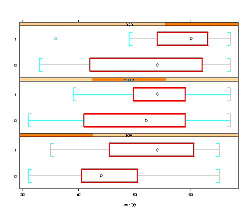
We have verified that we will be using a diamond to mark the location of the mean and that the box will be marked by thick red lines. This is how a box plot with the new parameters looks like.
bwplot(female~write | ses , Hsb2, layout=c(1,3))
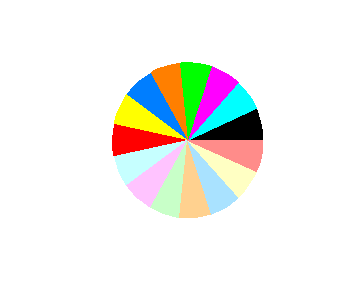
To see which color correspond to which number please refer to the color wheel. The colors are numbered in a counter-clockwise order starting with the black slice which is number 1.
pie(rep(1, 15), col=1:15)